Be Inspired May--Monochromatic!
/Hi friends! Welcome to another Be Inspired Blog Hop! This month our theme is ‘monochromatic’ which I have decided to use the 5 NEW In Colors to create 5 monochromatic cards with! This is something that I do every new year when we get our new color options!
I just love when we have new colors to play with, which is why I could not wait to make a batch of cards using our 5 new colors:
—Peach Pie
—Shy Shamrock
—Summer Splash
—Petunia Pop
—Pretty in Pink (if you have been stamping a while you might have thought this color name sounded familiar and you would be right—it was a core color many years ago!)

This is my take on monochromatic! I created one card featuring each of our new colors—repeating the same design and only using Basic White as my neutral element.
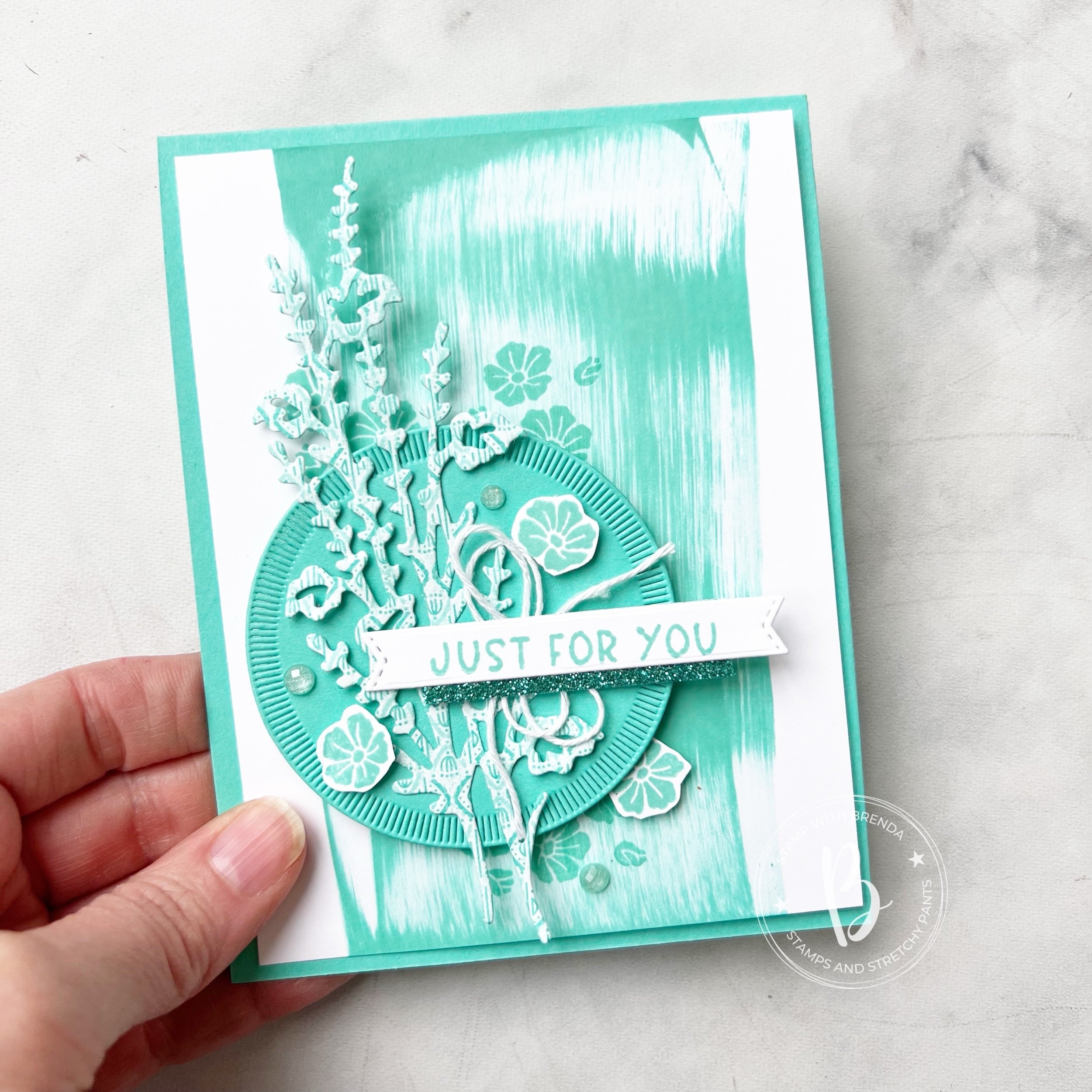
I wanted these card to have a bit of a ‘technique’ to them so I used the ink pad swiping technique. You simply drag your ink pad from the top to the bottom of your card stock. Each attempt with look a bit unique as well as you can see in my 5 cards. Don’t apply too much pressure when you are dragging, you want it to look like a swipe! That is part of the charm!
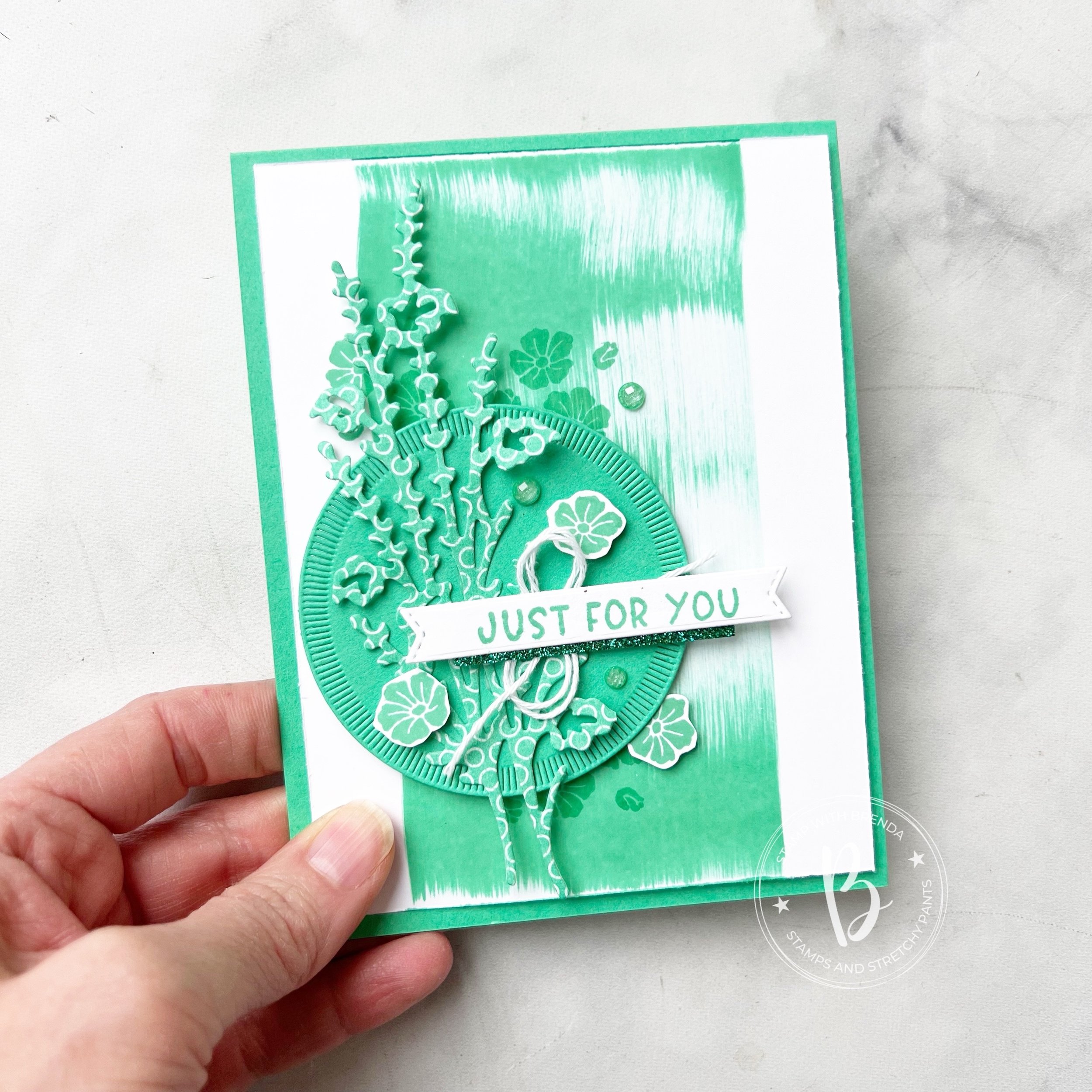
Each ‘monochromatic’ card has the same base elements—card base matches the color of choice, a die cut from the Spotlight on Nature Dies, which are a definite #addtocart item!
A die cut using the new Flowers of Beauty Dies, a sentiment and stamped flowers from the Labeled with Love stamp set, white Bakers Twine and a little bit of the In Color Glimmer Paper and In Color Shimmer Gems!

Once you have your initial design done, its so easy to create a batch of these fun monochromatic cards!
I added a bit of background stamping on top of the ink pad swiping as well as you get that tone on tone look which is really fun.
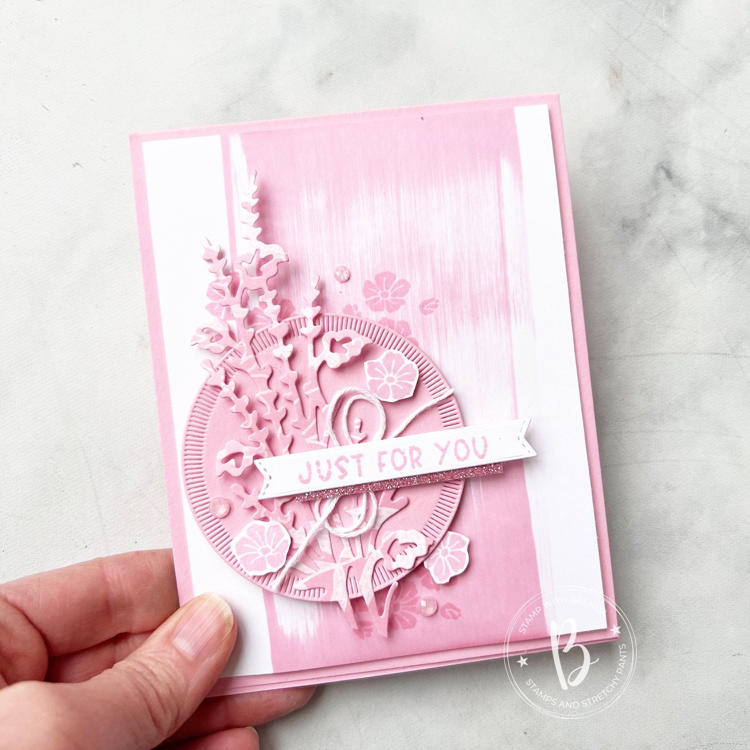
If you look close at the die cut image you can see that each is cut from the new 6x6 In Color DSP stack—this year they also changed up the patterns on the paper as well. So each card has a bit of different look to the die cut depending on the pattern that was used.
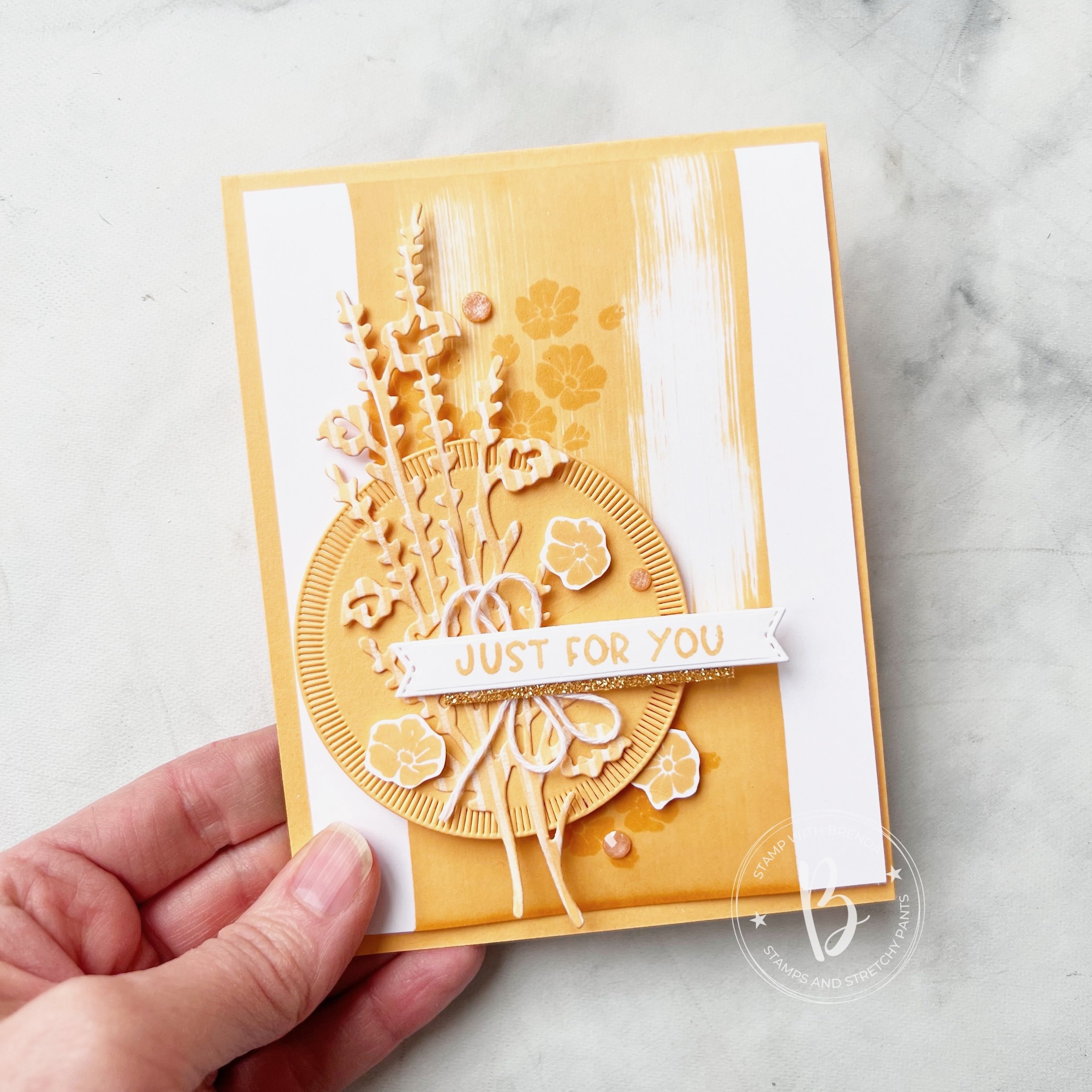
I really enjoyed putting these 5 cards together—I think the little strip of Glimmer Paper underneath the sentiment helps it shine a bit too! And everything is better with glitter—right?

I can’t wait to see what the rest of the design team created and their unique interpretations of ‘monochromatic’! I can’t even pick a favorite version of the cards above because each of our new 5 In Colors are so amazing. They look fabulous together and work so well with our existing color line up!
You can click on the ‘NEXT’ button to see what the amazing Artisan Design Team member, Maheswari, has designed this month!

And if you are inspired, please consider shopping my online store so I can continue to LOVE WHAT I DO :)
Click any link to shop my store!
Product List")


 Designer Series Paper")
 Specialty Paper")


