Photography Tips 101
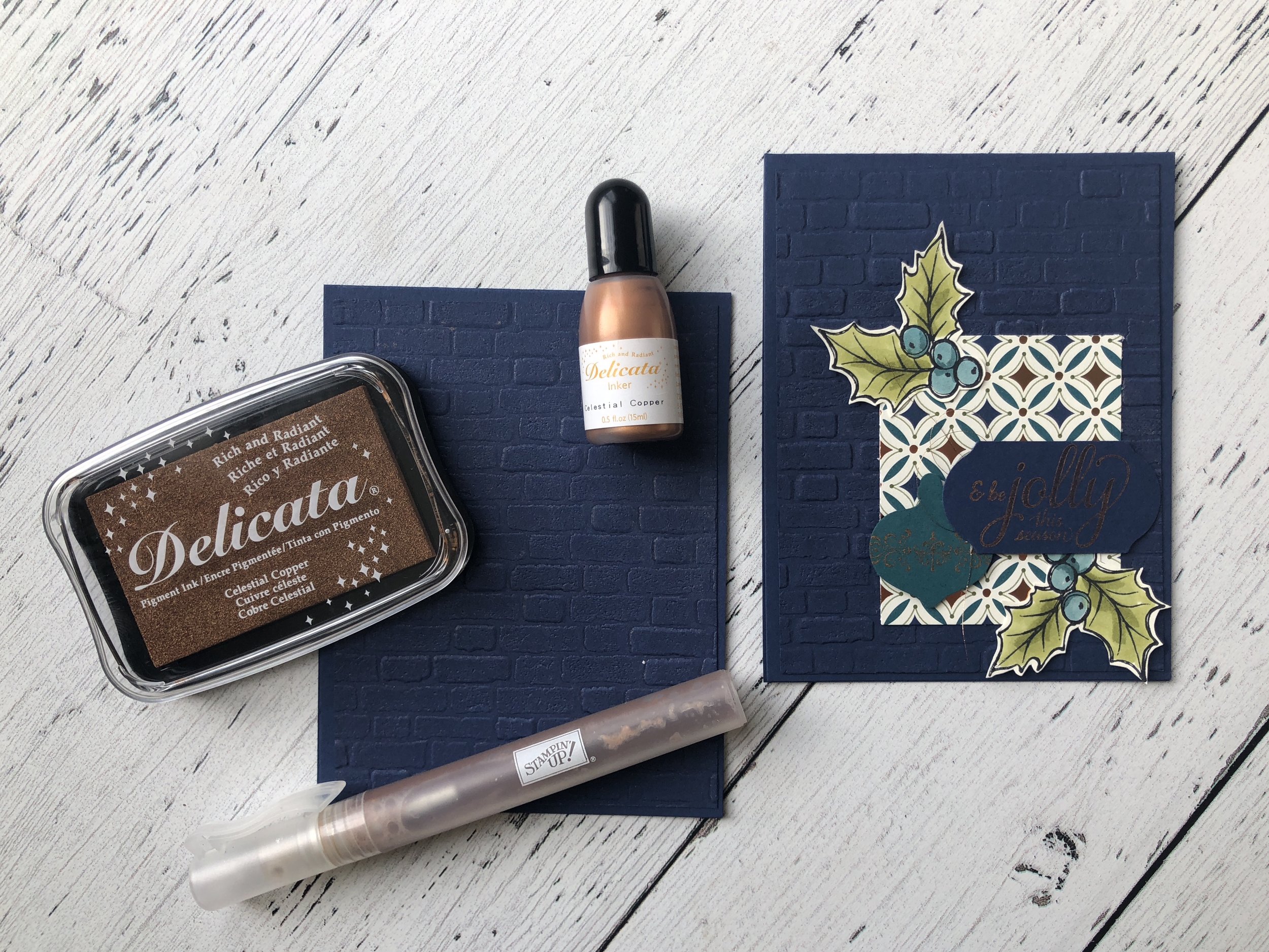
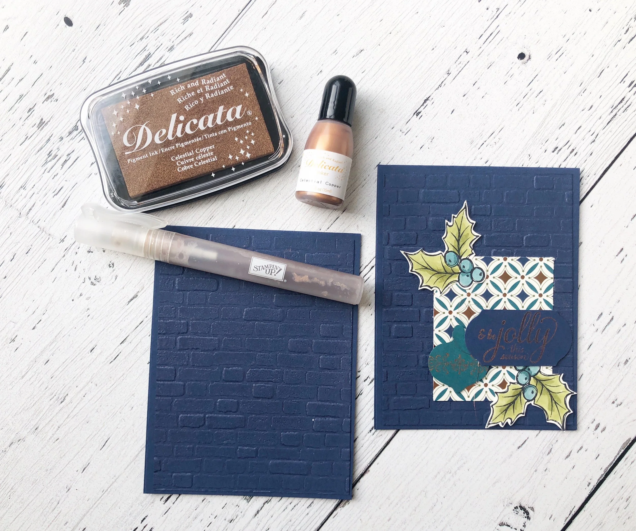
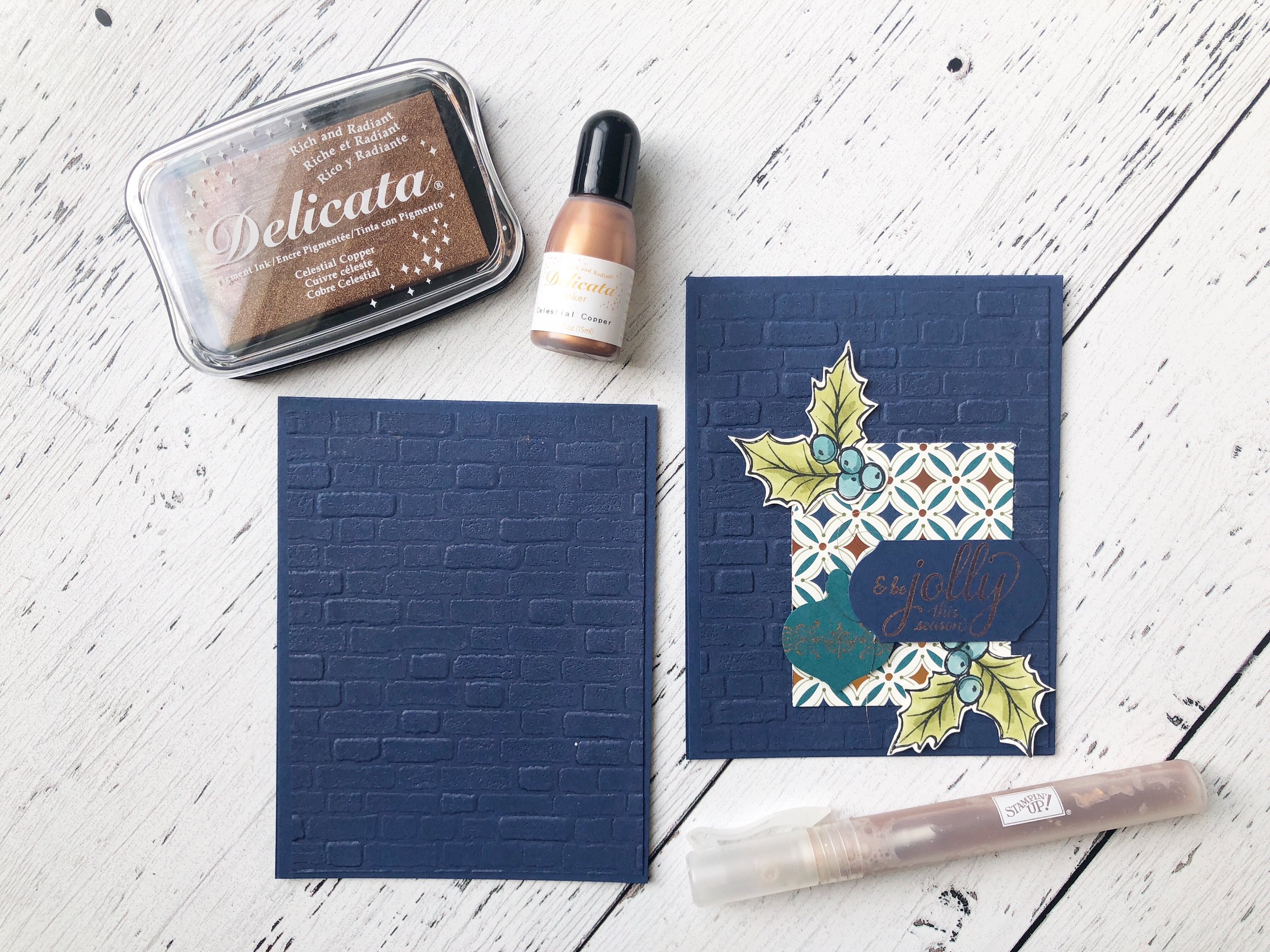
/So my awesome friend Pam, who did all of my branding photography, did me a solid last night and came and spoke at my Glitter Girls Team meeting! She created an amazing power point to help us all create better flat lays to showcase our creative work. She walked us through the process from choosing the right background, what lighting to use, and how to showcase our cards using the rule of thirds, triangles, left to right placement and more. It was absolutely fascinating! Below are my attempts to employ some of the tips she shared. Which one is your favourite? I am curious which was catches your eye! Please comment below and share any feedback!


