Color Fusers--March 2023
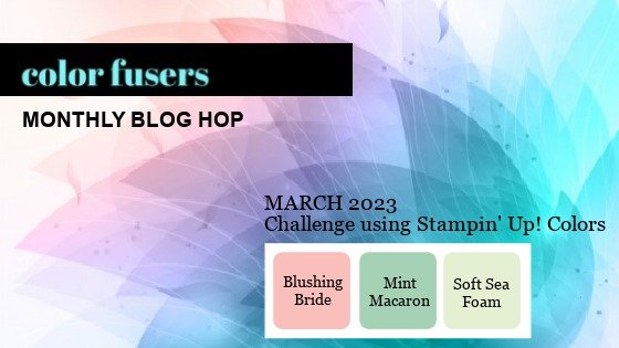
Hello friends—welcome to the Color Fusers Blog Hop! I am so excited about this month as I absolutely LOVE this color combo that we are creating with this month—Blushing Bride, Mint Macaron and Soft Seafoam!

I love the soft feel of these colors—they feel like spring and Easter and I thought they were absolutely perfect for a scrapbook page featuring one of our new Online Exclusive stamp sets—Irresistible Blooms.

The base of my page is Blushing Bride and then I layered Basic White on top. I anchored most of the design on the top right of the page for something that feels a bit different but you could easily center everything in the middle of the page if you prefer that look.

I used a 6x6 piece of Mint Macaron DSP from the Country Gingham collection to act as my large photo mat and to ground the picture. I decided to add gold accents to my design so along with a Mint Macaron photo mat, I added a layer of the Fine Shimmer Paper. If you have not ordered this paper yet—you NEED to #addtocart! Its absolutely AMAZING!


I knew I wanted to use the new Irresistible Blooms bundle on my page so I decided to stamp the 2 blooms from the stamp set with Whisper White ink and embossing powder. I then used my Blending Brushes to add Blushing Bride ink to the flowers for an emboss resist technique.

I did the same technique with the leaves using both Soft Seafoam and Mint Macaron.

I also pulled out an old favorite die, Scallop Contours, for the amazing stitched scallop border die. I thought it was a the perfect accent piece to run underneath the DSP layer.


You can actually create quite a bit of depth and tones of ink by just using an ink pad and Blending Brush!

One of the best parts of the Irresistible Blooms dies is the dotted circle wreath (for a lack of what else to call this). When you die cut it on a square of paper it is actually still connected to the paper, but with a few snips with my Paper Snips I was able to free it to add a really fun wreath accent to my design. For my page, I wanted this to blend softly into the design so I decided to cut it out with Vellum.

This picture was taken when me and the kids went to see Reese play in a soccer tournament. These moments together are even more special since he went away to school 8 hours away.

There are two sentiments on my page—one is from Irresistible Blooms—I Like You and the other is from Happy Labels and I added some Gold Shimmer Ribbon underneath. The sequins are the Pastel Adhesive Backed Sequins and have been one of my favorite embellishments from the Occasions Catalogue.

I hope this project inspires you to create something amazing with this color palette! I can’t wait to see what the rest of the Color Fusers team has created this month. I am always inspired by them!

Next up on the Hop is Bonnie O’Neill— I know she has something amazing to share! You can go all the way through by visiting Bonnie next or go in reverse by clicking on Previous. This will take you to the talented Sue Vine!

If my scrapbook page has inspired you to #addtocart you can click on any image to shop my online store. Thank you in advance!

Be Inspired--February Blog Hop!

Hello friends! Welcome to the Be Inspired Blog Hop! I recently joined this Blog Hop back in November and then had a couple month hiatus! But I am back crafting with them again! This months theme is “Brights” and I took this to mean two things—incorporating some colors from the Brights family and making a bright project!

As you can see I chose Poppy Parade and Granny Apple Green (my two favorite Brights colors) as the focus of my page and then added in some other supporting colors from other color families. In my opinion I think this is the way Stampin’ Up! intended our colors to work together. Supporting and uplifting each other. AND there is the rumoured color refresh happening so I am so excited and curious to see how the color families are going to change!

Normally I always add a picture to my layouts but in this case I wanted to share one without a photo to really help you focus in on the design.

I cut six swatches of DSP from the host stack of DSP Flowers & More in the brightest patterns I could find (I also used some from the retired stack from last years annual catalogue). Sometimes it is intimidating to know how to craft with these bright colors and patterns. So paring them down to smaller segments I find often works best. All of these panels are 3 x 4 so you can also get a lot out of one sheet of DSP.

I decided to use three stamp sets to add to my page design, Happy Labels and Love for You. This was my first time crafting with the Brushed Bouquet bundle and I really love the shape and design of the flowers. I always love when a stamp set has multiple sizes of flowers.

The multi stripped piece of DSP was the anchor for my page design as it let me bring in all the different colors. It is very bright and fun! I wanted to add it to the top left of my page to create a little vignette and having this pattern in the bottom right corner helps your eye look around the page.

I stamped out 3 different flowers and use the leaf dies to embellish the sentiment. The sentiment is cut using the new Happy Labels Pick a Punch. I love how you can use one punch to create multiple looks.


The bright bold patterns of this page are definitely softened by the Basic White base. I think it really helps the colors pop off of the page, especially the bold So Much Love which is stamped in Poppy Parade and die cut with the Stylish Shapes Dies.

I added tons of blooms and leaves to frame the sentiment. Placing it on the right helps to balance the layout.

I really love how this page turned out and I can’t wait to add a photo to it! I think it is a great page for February, the month of Galentine’s and love, friendship and family. These are all the things I think of for February. I love mixing and matching colors but anchoring many of the details with Poppy Parade and Granny Apple Green to create a bright fun layout with wild patterns! I used up some retired products too (the Pale Papaya ribbon and gems) with brand new products to encourage all my fellow crafters to #useyourstash which is my new personal goal for 2023. I think all crafters tend to hoard a teeny bit, don’t we? Hahaha!

I can’t wait to see what Janneke Dijkstra - de Jong has designed for us this month. You can click on the NEXT button to see what Janneke has created but make sure that you follow all through the Hop to see all the fabulous creations featuring ‘Brights’!

If my design has influenced you, please consider shopping my online store. This allows me to continue to love what I do! You can click any image to go directly to my store! AND if you are local to YEG and are interested in attending one of my many scrapbook page classes please reach out! I would love to share my passion with you!