Color Fusers--January 2024!

Welcome to 2024! It is hard to believe it is the start of an new crafty year, and of course a new year means NEW stamp sets, Designer Series Papers and color combinations!

This month our design team is creating projects with Parakeet Party, Daffodil Delight and Melon Mambo! What a bright cheery combo to kick of the new year!

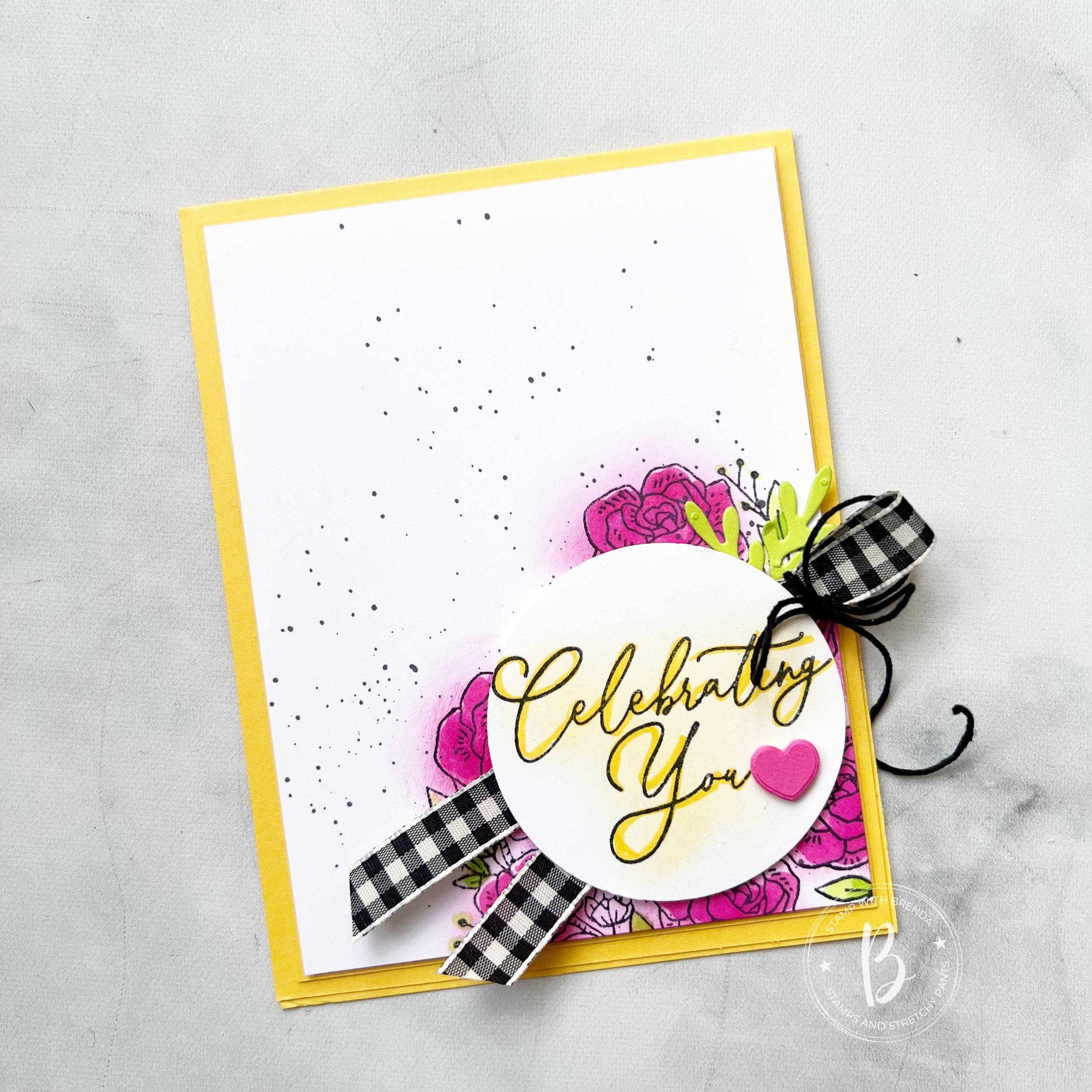
I was in the mood to make a card this month and of course I knew I wanted to play around with a new stamp set. I decided to use the new Adoring Hearts Bundle to design my project.

I started with a base and first layer of Daffodil Delight. I also used this color over top of my sentiment. The Adoring Hearts stamp set has some really beautiful script fonts. I used my Blending Brush with Daffodil Delight lightly over top of the script and then took my Stampin’ Write Marker to trace over the script. It is a really easy way to help your sentiment come to life. The little heart beside the sentiment is from the Adoring Hearts Dies—-these dies are full of hearts!

The background of the card is actually my favorite aspect!

I stamped the large floral image from the set a few times using Memento Ink in the bottom right corner. I used my Melon Mambo and a Blending Brush over top of the flowers—this is a great way to create a ‘color halo’ over a stamped image. I did add some more color with my Melon Mambo blend, however I didn’t want the blooms to look perfect. Hence, the initial layer with the Blending Brush.

I colored the leaves with my Parakeet Party Blend and added a few little die cut sprigs.

I also flicked my Black Stampin’ Blend marker over the background of the card to take away the ‘white’.

Honestly, in my opinion, there isn’t a project that the Black & Very Vanilla Gingham ribbon can not make better! Haha! It looks great with everything, especially this card with a little black Baker’s Twine tied in a bow.

I hope you like this project are inspired to give the Adoring Hearts Bundle a try! It is so much more than just a ‘Valentine’s Set’ ! Don’t be fooled by that one sentiment in the set!

Up next on our Hop is Melissa Kerman! Melissa is actually the one who keeps us on in check each month, and I am grateful for her reminders and patience with us (we know who we are! hahaha!). I can’t wait to see what she has designed for her first project of 2024~

If you need to go backwards or if something happens to our links, you can check out my fellow Canadian friend, Kim McGillis (she is also a former Artisan Design Team member as well!)

As always, thank you for stopping by my blog, following me on Instagram and Facebook @stampwithbrenda

Please consider shopping my online store so I can continue to do what I love! Please keep in mind that the Adoring Hearts Bundle cannot be ordered until the Occasions Catalogue goes live on January 4th (what a great birthday gift to me!)

Color Fusers--March 2023

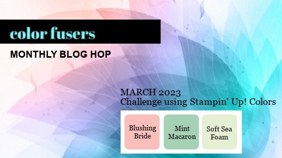
Hello friends—welcome to the Color Fusers Blog Hop! I am so excited about this month as I absolutely LOVE this color combo that we are creating with this month—Blushing Bride, Mint Macaron and Soft Seafoam!

I love the soft feel of these colors—they feel like spring and Easter and I thought they were absolutely perfect for a scrapbook page featuring one of our new Online Exclusive stamp sets—Irresistible Blooms.

The base of my page is Blushing Bride and then I layered Basic White on top. I anchored most of the design on the top right of the page for something that feels a bit different but you could easily center everything in the middle of the page if you prefer that look.

I used a 6x6 piece of Mint Macaron DSP from the Country Gingham collection to act as my large photo mat and to ground the picture. I decided to add gold accents to my design so along with a Mint Macaron photo mat, I added a layer of the Fine Shimmer Paper. If you have not ordered this paper yet—you NEED to #addtocart! Its absolutely AMAZING!


I knew I wanted to use the new Irresistible Blooms bundle on my page so I decided to stamp the 2 blooms from the stamp set with Whisper White ink and embossing powder. I then used my Blending Brushes to add Blushing Bride ink to the flowers for an emboss resist technique.

I did the same technique with the leaves using both Soft Seafoam and Mint Macaron.

I also pulled out an old favorite die, Scallop Contours, for the amazing stitched scallop border die. I thought it was a the perfect accent piece to run underneath the DSP layer.


You can actually create quite a bit of depth and tones of ink by just using an ink pad and Blending Brush!

One of the best parts of the Irresistible Blooms dies is the dotted circle wreath (for a lack of what else to call this). When you die cut it on a square of paper it is actually still connected to the paper, but with a few snips with my Paper Snips I was able to free it to add a really fun wreath accent to my design. For my page, I wanted this to blend softly into the design so I decided to cut it out with Vellum.

This picture was taken when me and the kids went to see Reese play in a soccer tournament. These moments together are even more special since he went away to school 8 hours away.

There are two sentiments on my page—one is from Irresistible Blooms—I Like You and the other is from Happy Labels and I added some Gold Shimmer Ribbon underneath. The sequins are the Pastel Adhesive Backed Sequins and have been one of my favorite embellishments from the Occasions Catalogue.

I hope this project inspires you to create something amazing with this color palette! I can’t wait to see what the rest of the Color Fusers team has created this month. I am always inspired by them!

Next up on the Hop is Bonnie O’Neill— I know she has something amazing to share! You can go all the way through by visiting Bonnie next or go in reverse by clicking on Previous. This will take you to the talented Sue Vine!

If my scrapbook page has inspired you to #addtocart you can click on any image to shop my online store. Thank you in advance!

Color Fusers June 2022--Day 6 of Seven Days!

Today is really a double whammy! The Color Fusers Team is creating with the NEW In Colors and some of my Artisan Alumni friends are spending a week sharing scrapbooking projects so of course I combined these two concepts into ONE project!

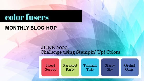
Each month this awesome design team created projects featuring a color scheme, of course this month we are featuring our 5 new In Colors—Parakeet Party, Sweet Sorbet, Orchid Oasis, Starry Sky and Tahitian Tide!

My current favorite new In Color is Starry Sky? What is yours?

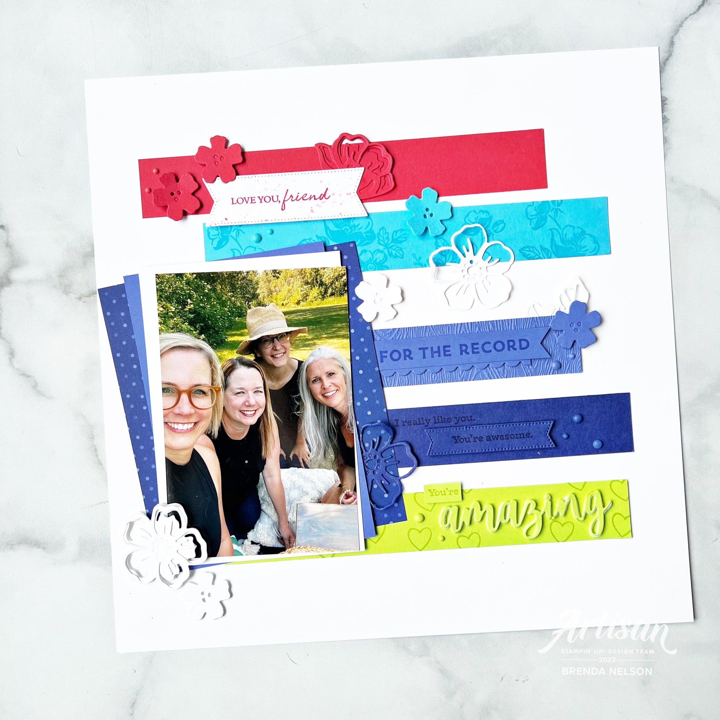
This is my project featuring all 5 of the new In Colors—I love how it turned out! Each year I do try and create a scrapbook page that incorporates all the new colors together. Sometimes its a challenge and sometimes its easy and in this case, its easy as these 5 new colors look absolutely spectacular together! What do you think?

I started with a base of Basic White and used Basic white elements along with the new colors. I feel like they really pop on this crisp base. Last summer a couple of my long time bestie’s and I got together for a girls weekend and besties photo shoot. Our awesome photographer is also a friend so of course I had to snap my own girlfriends selfie and I thought it was a fun picture to add to this page. I layered our picture on Basic White, Orchid Oasis and a piece of the Starry Sky DSP from the In Color 6x6 stack.

I have known these amazing gals for over 20 years. It is a blessing to have such fantastic lifelong friends!

I mashed up a whole bunch of products on this page! That is my favorite thing to do! I used the For the Record stamp set, Summer Shadows Dies, Shaded Summer stamp set, Stylish Shapes Dies and the Amazing Thanks Dies. I even ran the Orchid Oasis card stock through the TImber 3D folder.

Each row of color has a stamped and die cut element to bring it to life along with some of the Matte In Color dots. And each row of color is working to build the story of this page, starting with the sentiment ‘Love You, Friend’.

and ending with “For the Record, I really like you, You’re Awesome and You’re Amazing”. I love taking a bunch of individual sentiments and building them into a broader more encompassing phrase.

I can’t wait to see what every one else on the Color Fusers team has created this month using one or all of the new In Colors—and if you are following along with #sevendaysofscrapbooking then you know you are going to see some amazing projects shared today! Make sure to check things out in my Instagram Stories.

The keep going with our Blog Hop you can go NEXT to see what my awesome former Artisan Design Teammate (#artisanalumni) Janneke has created. And if you want to go in reverse you can see what my current Artisan teammate, Tami, has designed. Make sure to hop all the way around and see what everyone has designed using our amazing new In Colors!

Thanks so much for following along on this Blog Hop and make sure you scroll back through my blog for some scrapbooking and card inspiration!

Color Fusers--October Blog Hop!

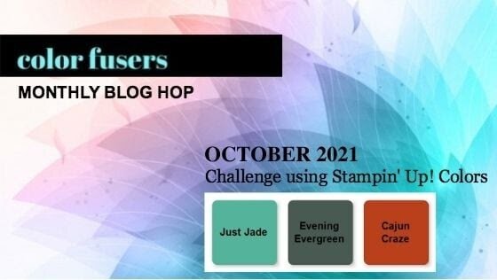
Hello friends! Welcome to the most SPOOKTACULAR month of the year! Our Color Fusers Blog Hop this month is featuring the color combo of Just Jade, Evening Evergreen and Cajun Craze and it was a good challenge to create a Halloween Project—since that is the theme of my blog this month!

colorfusers oct.jpeg

The project I created to share this month is a mashup of the Detailed Pumpkins Dies, the Adorning Designs Decorative Masks and the Banner Year stamp set. All of these elements came together to create a unique Halloween card!

final (1) 7.jpg

I started with a card base of Just Jade and used one of the masks or stencils with my Just Jade ink pad and Blending Brush to create a fun tone on tone design on my card front. I also angled the mask so that it was a diagonal for something a little bit different!

I cut a thin strip of Evening Evergreen card stock and attached it following this diagonal to bring more attention to that detail. After I stamped out the sentiment, Happy Haunting (in Evening Evergreen ink) I used the same stencil over top with Just Jade ink. This is a really fun way to jazz up your sentiments and to blend these two greens together. I added some retired Cajun Craze Twine (I seriously need to quit being a hoarder) and some of the new awesome Chevron Evening Evergreen Ribbon behind the sentiment.

final (4) 5.jpg

The two Cajun Craze pumpkins are from the Detailed Pumpkins Dies. Both of the dies, in their original form, have area that you can ‘see’ through. I wanted my big pumpkin to be more solid so I glued it to another piece of Cajun Craze card stock and then trimmed around the edges with my paper snips!

final (1) 8.jpg

Bling makes everything better of course, so I couldn’t resist adding some In Color Jewels in Evening Evergreen for a little sparkle!

If you are just joining our awesome hop here you can go back to see what my fellow Artisan Design Team member, Tami Hewlett, has designed or you can keep going forward and loop around. Next up on the hop is the amazing Melanie Hockin!!! Whatever route you take I hope you visit everyone along the way!

Color Fusers--July 2021 Blog Hop

Hello friends! I really appreciate you taking the time to pop by and enjoy our Color Fusers Blog Hop! I love color challenges as they help stretch my creativity! This month’s color challenge is amazing and I am so excited with the project I designed using Basic White, Basic Black, Petal Pink and Gold!

IMG_9468.jpg

When I was mentally toying around with this color palette, I had the idea to create something with stripes. I ended up including them but on the diagonal to create a focal point for my scrapbook page!

I also chose this particular picture because my mom and daughter are wearing black and white and call me crazy, but my photos have to coordinate somewhat with my page designs. In fact I hardly EVER create a page without my pictures first. I can make exceptions for specific holidays, like Father’s or Mother’s Day, but typically I always chose my picture first!

I also chose this particular picture because my mom and daughter are wearing black and white and call me crazy, but my photos have to coordinate somewhat with my page designs. In fact I hardly EVER create a page without my pictures first. I can make exceptions for specific holidays, like Father’s or Mother’s Day, but typically I always chose my picture first!

I decided to start off with a Basic White background for my scrapbook page and I added a spray of black using my Stampin’ Blends marker. I flicked the Blend across my page where I was intending to add in some flowers.

The flowers are from the Blossoms in Bloom stamp set and are stamped in Petal PInk. I pinched up the edges to give them a little more interest and depth. This page is quite minimalist for me but I am so happy with how it turned out!

final (22).jpg

The best part of this whole page is this 4 x 10 diagonal panel that I created to bring in the Basic Black, Petal Pink and Gold colors of this challenge. I cut a separate piece of Basic White card stock to 4 x 10. I then covered it with Tombow Glue—I think this is key, because there is wiggle time with this glue to get things perfect unlike Stampin’ Seal. I added in my strips which are 1 1/4 wide. Once I had them in place, I flipped over the Basic White and trimmed off the excess to create this fun panel.

The sentiment “Love is What Makes Us Family” is from the stamp set Lovely You.

I also added in a few Gilded Gems for a little extra pop of gold.

final (21).jpg

The sentiment “I like you a lot” is from the Blossoms in Bloom stamp set.

I cannot wait to see what the others in the Hop create with this color combo. If I am your first stop make sure you Hop all the way around and leave a comment! If you live in Canada you can shop with me using my Hostess Code or visiting my online store :)

You can go back to see what amazing project Melanie has created by clicking below,

To see what my fellow Artisan Design Team member Tami has designed please click below

Thank you so much and hope you all have an amazing JULY! Happy Stamping!