12 Days of Christmas--Day 1

Hello my friends! I am so excited to share 12 Days of Christmas with you—with a twist! My awesome friend Melanie from @melsinkyfingers and I have decided to team up to each share 12 awesome holiday projects with you! At the end of each of my posts there will be a link to go visit her blog and see her project of the day. In the end, you will actually have 24 project ideas!

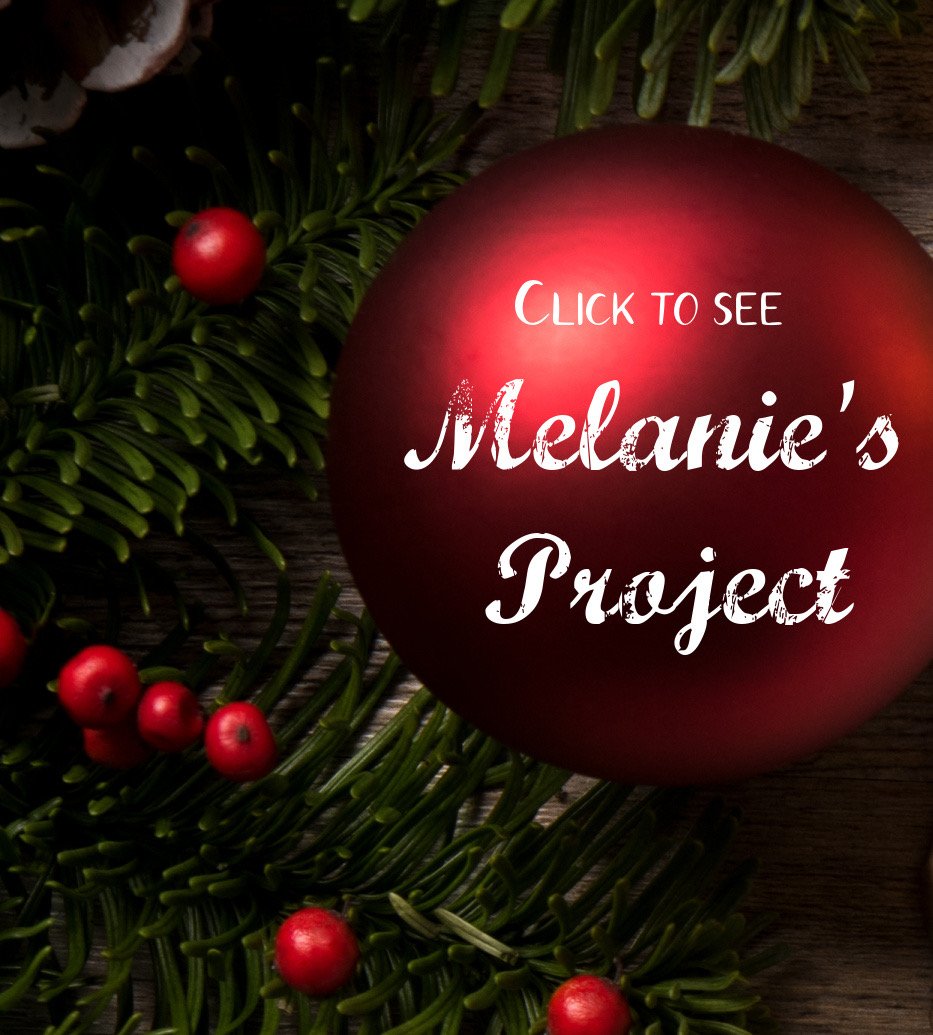
Thanks Melanie for making this cute graphic for us!

I can’t wait to get started! My first project is this fun notecard set and basic box. I got this project template from another talented friend Lisa Althouse @stampaholic. I just love our stampin’ community!

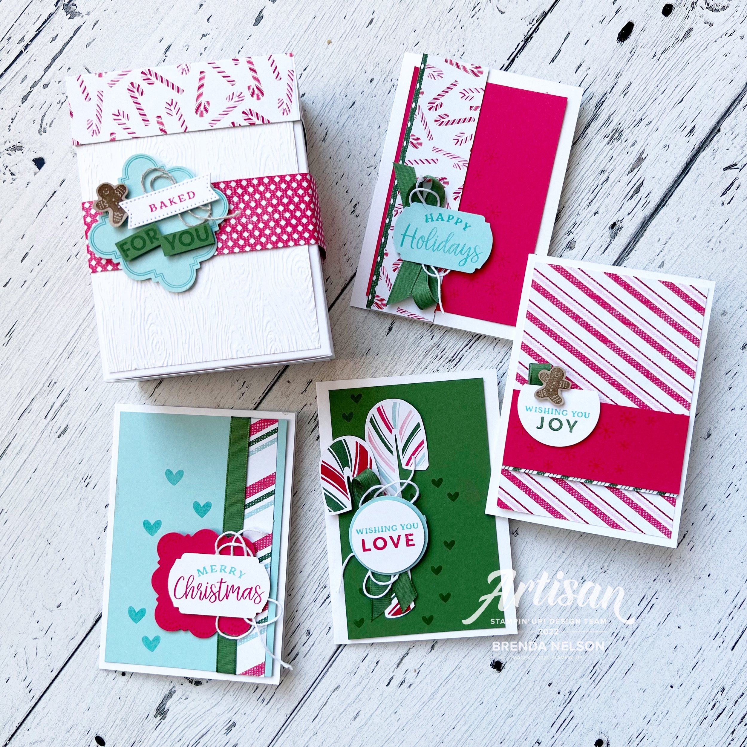
This basic box is perfect for holding 4 notecards and envelopes. You could even create this project without a lid and use the box to hold holiday snacks or treats (like Oreo Popcorn! I have this recipe on my blog under Lifestyle—Favorite Recipes).

I used the Sweetest Christmas DSP as my color inspiration and paired it up with the Handmade Wishes Bundle. I just love this bundle because the stamp set is so versatile. You can created so many different phrase/sentiment combinations. And the design of the label punch is really unique!

The label on this box is designed to reflect that a treat will be in the box. I plan to add a single card and a little holiday treat inside these boxes! I added another panel to the front of my box that I ran through the Timber 3D folder.


Sweet Sorbet has definitely been my favorite red this season. I added a panel to the front of my card and stamped some little snowflakes as an accent.

A couple strips of DSP (its so fun to mix and match patterns), and a cute sentiment stamped on Pool Party card stock in Coastal Cabana, make this notecard so fun. Of course I had to add some Garden Green Ribbon and white Bakers Twine.

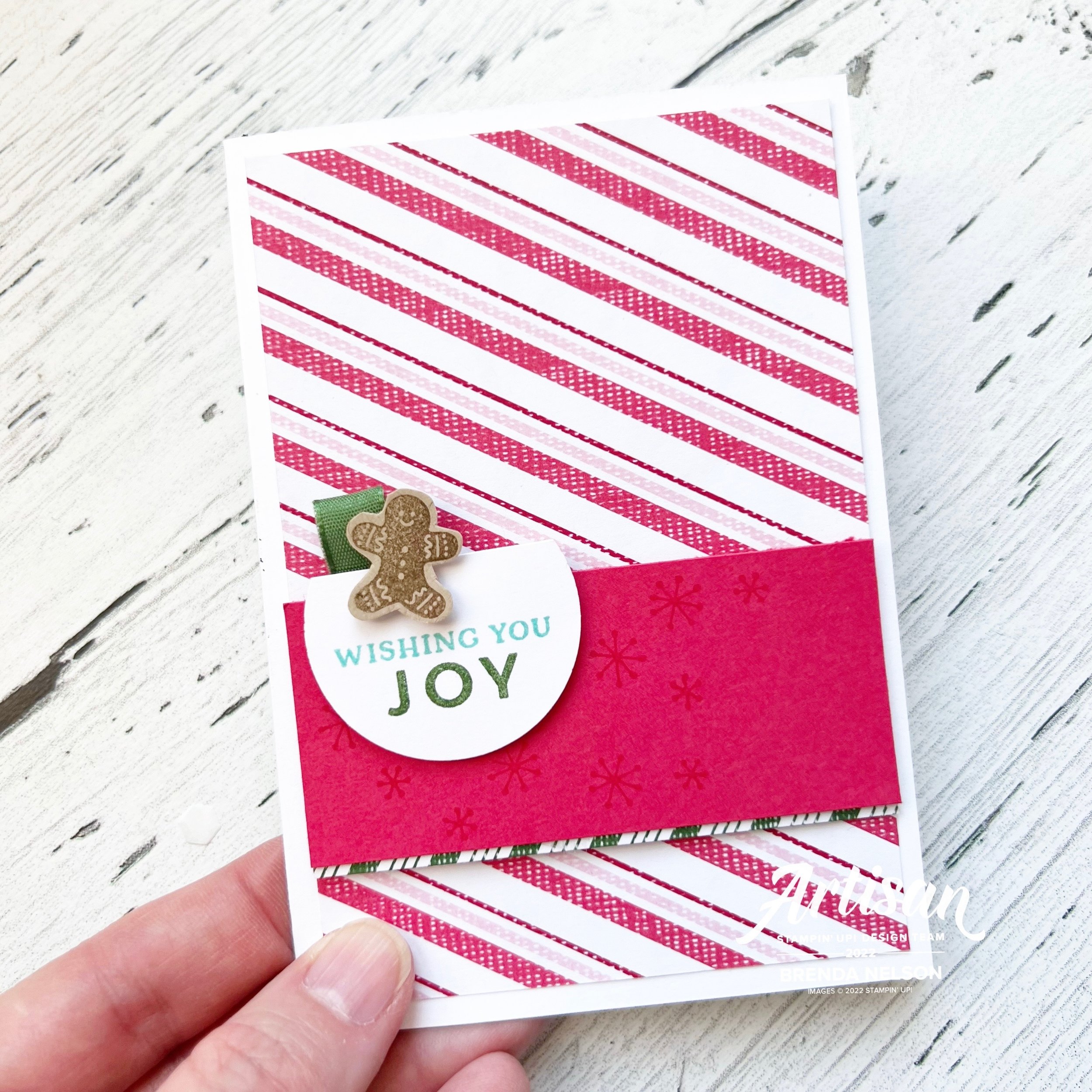
I love a good stripe pattern and this Sweet Sorbet/ Blushing Bride one is just perfect for a card front! I softened the front with a panel of card stock and a bit of stamping. The little gingerbread man was the perfect fun add on to this sentiment!


I love to stamp little hearts on my projects, they just make everything perfect. This little notecard has DSP with a ribbon border, the punch and sentiment and of course some Bakers Twine. This is such a ‘Good Card Design’!

The best part of this little notecard is the candy canes that are die cut, right from the DSP! Isn’t that brilliant? It makes creating this card so easy!

I hope you have fallen in love with this project as much as I have! I shared it with my team last month and it was so well received, I knew it would make the best project to kick off 12 days of Christmas. I have a few other 3D projects to share, some cards and of course some scrapbooking/mini album inspiration projects. I hope you will check back each day and go over to Melanie’s blog to see her awesome projects as well!

Click here to get to Melanie’s first 12 Days of Christmas post! I can’t wait to see what she made!


Color Fusers June 2022--Day 6 of Seven Days!

Today is really a double whammy! The Color Fusers Team is creating with the NEW In Colors and some of my Artisan Alumni friends are spending a week sharing scrapbooking projects so of course I combined these two concepts into ONE project!

Each month this awesome design team created projects featuring a color scheme, of course this month we are featuring our 5 new In Colors—Parakeet Party, Sweet Sorbet, Orchid Oasis, Starry Sky and Tahitian Tide!

My current favorite new In Color is Starry Sky? What is yours?

This is my project featuring all 5 of the new In Colors—I love how it turned out! Each year I do try and create a scrapbook page that incorporates all the new colors together. Sometimes its a challenge and sometimes its easy and in this case, its easy as these 5 new colors look absolutely spectacular together! What do you think?

I started with a base of Basic White and used Basic white elements along with the new colors. I feel like they really pop on this crisp base. Last summer a couple of my long time bestie’s and I got together for a girls weekend and besties photo shoot. Our awesome photographer is also a friend so of course I had to snap my own girlfriends selfie and I thought it was a fun picture to add to this page. I layered our picture on Basic White, Orchid Oasis and a piece of the Starry Sky DSP from the In Color 6x6 stack.

I have known these amazing gals for over 20 years. It is a blessing to have such fantastic lifelong friends!

I mashed up a whole bunch of products on this page! That is my favorite thing to do! I used the For the Record stamp set, Summer Shadows Dies, Shaded Summer stamp set, Stylish Shapes Dies and the Amazing Thanks Dies. I even ran the Orchid Oasis card stock through the TImber 3D folder.

Each row of color has a stamped and die cut element to bring it to life along with some of the Matte In Color dots. And each row of color is working to build the story of this page, starting with the sentiment ‘Love You, Friend’.

and ending with “For the Record, I really like you, You’re Awesome and You’re Amazing”. I love taking a bunch of individual sentiments and building them into a broader more encompassing phrase.

I can’t wait to see what every one else on the Color Fusers team has created this month using one or all of the new In Colors—and if you are following along with #sevendaysofscrapbooking then you know you are going to see some amazing projects shared today! Make sure to check things out in my Instagram Stories.

The keep going with our Blog Hop you can go NEXT to see what my awesome former Artisan Design Teammate (#artisanalumni) Janneke has created. And if you want to go in reverse you can see what my current Artisan teammate, Tami, has designed. Make sure to hop all the way around and see what everyone has designed using our amazing new In Colors!

Thanks so much for following along on this Blog Hop and make sure you scroll back through my blog for some scrapbooking and card inspiration!

A Card a Day in May--Day 3!!

Hello my friends! Instead of seeing a card project first you are going to have to look at my happy face as its NEW CATALOGUE DAY! I hope by the time you get to this post you have placed your first of many orders from this fabulous new Annual Catalogue!

I was telling my coworkers its like Christmas, its exciting and fun, and when my box arrives its literally THE BEST DAY EVER!! I am so lucky to love what I do and have so much doing it! This is also a great time to join the SU family and community of crafters. Its been 16 years for me and I still going strong!

My card share for today features some brand new products, which is so fun! And I have to say the Hues of Happiness is probably my favorite new suite in the catalogue. The color palette of the Designer Series Paper is my jam, like literally my personality in a paper. If that could be a thing!

This card is actually a part of my May Class to Go Kit which means if you love it and live in Canada, you can purchase my Class to Go Kit until May 15th! I will have all the details ready to share under my Class to Go Tab underneath the Stamp with Brenda tab. And if you are wondering what is under my Lifestyle tab it has fun stuff like recipes!

I love how crisp and light this card feels, don’t you? The base is Basic White with a nice layer of Night of Navy and another layer of Basic White that I ran through the Timber 3D Embossing Folder. I added a small strip of the Hues of Happiness DSP and a underneath that I tucked a piece of Basic White that I ran through one of the amazing die strips in the Blossoming Happiness Dies.

The sentiment is stamped and die cut with the Stylish Shapes Dies accentuated with a bit of the Starry Sky Bakers Twine.


The flowers from the Happiness Abounds stamp set are stamped in Momento Ink and then colored with a technique that I like to call ‘Lazy Watercoloring’.

I use my Water Painter with the ink colors in Parakeet Party, Fresh Freesia, Blushing Bride and Pool Party to color the flowers and leaves. Its fast and furious and just how I like to make cards! hahaha

Add a few of the Glossy Dots Assortment and In Color Opal Rounds and this card is perfect!

I hope this card inspires you to take a peek in the new catalogue and start your wish list! If you are inspired or would like to purchase my May Class to Go Kit please send me a message or click on Shop Now to be directed to my online store!

Around the World on Wednesday--My Favorite Month!

I am really excited about the theme for this month’s Around the World on Wednesday Blog Hop! Our theme is our FAVORITE month…and it was a tricky one for me as my birthday is in January so obviously I LOVE BIRTHDAY MONTH but its also cold AF so my love of summer wins out!

July is my FAVORITE month because it is the month that we spend a week at the lake with the entire Nelson family. 19 grandkids and cousins! Isn’t that spectacular?

Deciding on the month of July as my favorite month also coincided perfectly with a new bundle of products that I was recently able to order. This bundle was a perk for Demonstrators attending On Stage this month and it will be available in the upcoming January-July Occasions Catalogue. You will LOVE this catalogue, hands down this publication is in my Top Ten favorites of all time. All I will say is Rainbows, Cactuses and Pineapples oh my!

This is our annual family picture that we take at Greenwater Lake each year. We have been visiting this lake since my oldest son was an infant—17 summers!

I knew I wanted to use this family picture and I wanted to make sure to honor the tones of the water and the trees in my design. I used a base piece of paper from the Hand-Penned Designer Series collection that was Garden Green with a white floral print.

I layered a piece of Basic White 12x12 that I trimmed down to 11 1/2 x 11 1/2 inches. As the main photo mat I used a piece of DSP from the new Heart & Home Designer Series Paper collection. One side of all of the papers is this amazing wood panel design in Basic Grey. There are several patterns of a wood look so I chose the one that looked like a tree to continue with the nature element.

I also added a striped piece of DSP in Mint Macaron from the Hand-Penned Designer Series collection. I made sure the stripes were going horizontal in nature to help elongate the page.


I love to create focal points or vignettes (areas of interest) on my scrapbook page that help tell the story. Sentiments are very important to me and they are honestly the criteria by how I pick most stamp sets. I absolutely love the sentiment “What a Beautiful Day for Love”. Obviously you can use this for a wedding or a baby’s arrival, but should it not be how we approach all of our days? Every day is a beautiful day for love and I never leave those words unsaid to my kids. I tell them all the time and it fills my heart when my teenage son will repeat them back to me on the phone or with his friends!

I stamped this gorgeous floral image, one of two in the stamp set Blessings of Home, in Momento Ink. I then colored it in with a term I have coined “Lazy Watercoloring”. I simply add ink to one of our clear blocks and use my Water Painter (the fine tip) to the ink with a very small amount of water. I then colored in the flowers with Bumblebee, Blushing Bride, Coastal Cabana and Garden Green ink. It barely took me any time at all which is why I love it!

I die cut the shape with the new Flowers of Home Dies and added it to a So Saffron die cut. I cut this using the Seasonal Labels Dies and ran it through the Timber 3D folder. I love how this page is a mix of so many different products from 3 different publications!

Stamping softly in the background added such a beautiful element to this page. I used the smaller floral image in Smoky Slate ink.

The sentiment is stamped in Bumblebee Ink and is also cut with the Seasonal Labels Dies! I added some white twine from the Bakers Twine Essentials Package and some of the Blushing Bride Frayed Grosgrain Ribbon behind my sentiment.

A few sprigs cut in Garden Green cardstock from the new Flowers of Home dies and this little area was complete—-or was it? No it wasn’t, it also need to add an embellishment so I chose some from the Classic Matte Dots (another upcoming new product). You will love these as you get 2 sizes and 4 colors—-white, vanilla/pearl, grey and black.

I created another focal point on the top right of my page. I stamped the smaller flower in Momento ink and colored it with Blushing Bride, Bumblebee and Garden Green ink. What I really love about this area is there is not a stamp in the set that actually says “Perfect Day”. I used my Stampin’ Write Basic Grey marker to combine two individual sentiments into one that better suited my page. I love how we can customize so many of our Stampin’ Up! products!

I added the same twine, ribbon and Matte Dots to this area plus a few sequins from the Subtle Shimmer Sequins. I love these sequins so much and hope they are available after the Holiday Catalogue period ends.

I am so in love with this page and creating it right now was perfect therapy for me. The days are shorter now and the weather has changed but making this page took me right back to the lazy days of summer.

I can’t wait to see what the rest of the Hop creates this month! There are some seriously talented people on this hop and the inspiration is unbelievable!

I am one of your Canadian ‘stop’s on this hop and next up you are going to the United States to see what Tricia Butts has designed for this challenge!


Color Fusers November 2021

Hello friends! Wow, did October ever go by quickly! Its now November 1st and officially Christmas season. Fall and halloween are dead, bring on the holiday! Although that is NOT what I am sharing with you today! Our color combo this month could be viewed as a tricky one as the 4 tones are all quick dark, however I had the best pictures to work with this color theme!

IMG_3964.jpg

This month our crafty group is creating projects with Merry Merlot, Misty Moonlight, Cinnamon Cider and Early Espresso. Back in July I had a Besties Photo shoot with two of my long time friends and we did a little picnic afterwards. The picnic set up totally reminded me of Misty Moonlight and a pattern from the In Good Taste Designer Series stack so I used that as my inspiration to design this page.

These are two of my besties I met while in University! We hit things off working at a restaurant together.  We have actually not all lived in the same city for over 20 years but despite the distance I know they would have my back always and no matter what #friendsforever

These are two of my besties I met while in University! We hit things off working at a restaurant together. We have actually not all lived in the same city for over 20 years but despite the distance I know they would have my back always and no matter what #friendsforever

I started with a 12x12 in Misty Moonlight and on the top half of the page I stamped the large flowers from the Blossoms in Bloom stamp set. I actually love this stamp set as I love a good image that can fill in space. I stamped it in the same ink color for a tone on tone look.

The bottom of my page features the In Good Taste DSP with a couple of strips of Cinnamon Cider DSP from the retired In Color 6x6 stacks (last years design). Adding this strip felt like a natural way to incorporate this color and create division between the two sections of my page.

Are you an F Bomb kind of mom? Hahaha, we are and my friend had these cups designed especially for us!

Are you an F Bomb kind of mom? Hahaha, we are and my friend had these cups designed especially for us!


I used Early Espresso card stock as my photo mats and I ran them both through the Timber 3D Embossing Folder for a subtle effect.

It was easy to add in Merry Merlot by die cutting some flowers from the Pierced Blooms Dies. This is one of my favorite die sets in the Annual Catalogue!

I added some retired In Color Enamel Dots and the sentiment is from the Blossoms in Bloom stamp set.

final (4).jpg

You can find the sentiment “Friends Forever” in the Lighthearted Lines stamp set. NOTE: Friends Forever is part of a phrase and l used my Paper Snips to do some Stampin’ surgery on this rubber stamp as I really wanted to use this part of the phrase all on its own.

The label is also a die from the Pierced Blooms Dies and I added a bit of retired Cinnamon Cider ribbon behind and some gold thread.

final (1) 3.jpg

I am so pleased with how this page turned out using this color combination! I cannot wait to see what the other girls create this month! Please visit everyone’s blogs and share some love and comments! And if you don’t follow me on Instagram you can find me @stampwithbrenda

You can go backwards to see what Melissa has created and forwards to see what Melanie has designed! I know they will both wow you with their creativity!

Have an awesome November and see you next month! If you live in Canada and are looking for some creative inspiration I would love you to stamp with me! Please reach out at any time!