A Card a Day in May--Day 7!!

Hello friends! I have another manly man card for you today! I am excited as this card will be a part of my upcoming The Man’s Man card class in early June! So consider this a fun little sneak peek! And if you live in the YEG area I hope you will consider coming to one of my “In Person” card classes this year!


I was so excited about this new Brewed For You Bundle in our new annual catalogue. A: because I enjoy BEER and B: because BEER is Fun and C: its awesome to see some more ‘manly man’ stuff in our catalogues!

I used Night as Navy as the base and first layer for this card while stamping some fun beer mugs on the base in the same ink color.

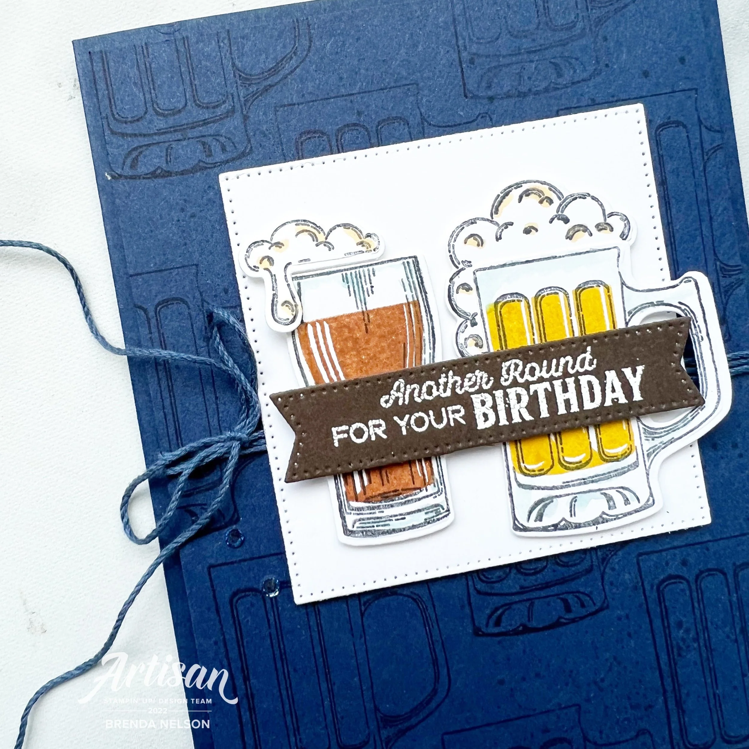
I wrapped some of the Fan Bakers Twine around the first layer and over top I added the largest square from the Stylish Shapes Dies #addtocart

Hot Tip: Click with shop with me button or product images at any time to be directed to my online store

Even though this card is in a more manly man color scheme (Night of Navy, Early Espresso, Cinnamon Cider and Crushed Curry) you can still give it to a beer loving gal pal or re-create it with a more gally gal color palette!

The two different been mugs are stamped with Momento Ink and then I very lightly added a touch of Balmy Blue ink with a Water Painter to accentuate the glass. The detail on the foam has a bit of Dark So Saffron added with the Stampin’ Blend.

Both mugs and foam are popped up on Dimensionals as well. The sentiment ‘Another Round for Your Birthday’ is stamped in white craft ink and embossed. I also used the Stylish Shapes Dies to cut the sentiment.

And lastly I added a few of the dark blue rhinestones from the Waves Rhinestones because secretly I think men like bling.

Hope you are enjoying the first WEEK of A Card a Day in May—31 projects will be shared this month! I can’t wait as I am also MAILING a card a day as well! This is great motivation for me! :)

A Card a Day in May--Day 3!!

Hello my friends! Instead of seeing a card project first you are going to have to look at my happy face as its NEW CATALOGUE DAY! I hope by the time you get to this post you have placed your first of many orders from this fabulous new Annual Catalogue!

I was telling my coworkers its like Christmas, its exciting and fun, and when my box arrives its literally THE BEST DAY EVER!! I am so lucky to love what I do and have so much doing it! This is also a great time to join the SU family and community of crafters. Its been 16 years for me and I still going strong!

My card share for today features some brand new products, which is so fun! And I have to say the Hues of Happiness is probably my favorite new suite in the catalogue. The color palette of the Designer Series Paper is my jam, like literally my personality in a paper. If that could be a thing!

This card is actually a part of my May Class to Go Kit which means if you love it and live in Canada, you can purchase my Class to Go Kit until May 15th! I will have all the details ready to share under my Class to Go Tab underneath the Stamp with Brenda tab. And if you are wondering what is under my Lifestyle tab it has fun stuff like recipes!

I love how crisp and light this card feels, don’t you? The base is Basic White with a nice layer of Night of Navy and another layer of Basic White that I ran through the Timber 3D Embossing Folder. I added a small strip of the Hues of Happiness DSP and a underneath that I tucked a piece of Basic White that I ran through one of the amazing die strips in the Blossoming Happiness Dies.

The sentiment is stamped and die cut with the Stylish Shapes Dies accentuated with a bit of the Starry Sky Bakers Twine.


The flowers from the Happiness Abounds stamp set are stamped in Momento Ink and then colored with a technique that I like to call ‘Lazy Watercoloring’.

I use my Water Painter with the ink colors in Parakeet Party, Fresh Freesia, Blushing Bride and Pool Party to color the flowers and leaves. Its fast and furious and just how I like to make cards! hahaha

Add a few of the Glossy Dots Assortment and In Color Opal Rounds and this card is perfect!

I hope this card inspires you to take a peek in the new catalogue and start your wish list! If you are inspired or would like to purchase my May Class to Go Kit please send me a message or click on Shop Now to be directed to my online store!

Color Fusers January 2022

Hello friends and welcome to another year of the Color Fusers Blog Hop! I really love participating in the Hop because it forces me to look at my SU colors in a new way and experiment with new color combos! The color combos are all submitted by the Hop Team Members. To kick off the new Year, Happy 2022 everyone!, we are playing with Night of Navy, Mint Macaron, Blushing Bride and Soft Suede.

As soon as I saw these colors I knew that I wanted to make a scrapbook page —a January winter theme page. Making this in advance will also hopefully ensure that I get outside in January to do something fun, so I have a couple of cute pictures to add to my page! This might sound ridiculous, but when its -30, trust me, you don’t really want to be outside!

This layout also works perfectly to support a monthly class that I offer, Year in Memories, where we scrapbook each month of the year. At the end you have a complete album of 2022!

I started with a base of Mint Macaron because I felt that it was the color that linked the other 3 together. Soft Suede works perfectly as an accent color, along with Blushing Bride. Night of Navy gets a bit more attention as I chose it for the photo mats. I also decided on vertical pictures, because let’s face it, we take alot of selfies.

Fun Fact: I have over 4,000 selfies on my camera roll. Guess you could say I like myselfie. Hahaha!


This page is a mix of recently retired, really retired and new products! Sometimes past products are the perfect fit for our projects so I try not to stress out too much about using them, but I always make sure there is something NEW and CURRENT on my pages too. This way I can discuss all sorts of things during my classes.

The sentiment “Celebrating another year” is actually masked from a larger phrase and is from the stamp set Well Said. This set is retired but I have hung onto it because it has some more unique phrases such as “Time for a New Adventure” which is at the bottom of my page. I thought they were both rather fitting for a January, new year, page.

The Soft Suede half circle is embossed with a retired folder too. Behind the sentiment you see some twine and a snowflake, cut from the Gingerbread dies. All 3 of the Mint Macaron snowflakes were die cut from Basic White card stock and then I ran my Blending Brush across with some Mint Macaron ink. I added my favorite new embellishment, the Iridescent Rhinestone Jewels, to the side.

The top left corner of my page features the Merry Snowflakes stamp set in the background. I mounted the 3 snowflakes from the set onto a block and used it with Mint Macaron ink to stamp across the background of my page.

The Blushing Bride die cut snowflake is from the So Many Snowflakes Dies which are in the Annual Catalogue. Paired up with some new stamps, this is a fun little area of interest! The Brilliant Rainbow Dies supplied the Soft Suede scallop border along my photo mat and I isolated “Happy” from a stamp in the Slim Sayings set, which is a new JJ catalogue release. January can be found in the set Days to Remember which was one of the best new sets in the Annual Catalogue for memory keepers! It isn’t too often that date sets come around!

The bottom little section is my favorite though because I love how “Time for a New Adventure” and 2022 work together! In the spirit of a new year, I would agree! And I am choosing to enter this new year with a positive heart and mind. The date is mounted on a circle from the Sunshine & Rainbows paper which is a free Sale-a-bration choice.

Overall I really love this color combo and I think it completely suites this page design! I can’t wait to add some photos to it! Thank you for joining us on our first Hop of 2022! I hope you will leave a comment and join us for the whole year!

Next up on the Hop is the amazing Bonnie O’Neill—I can’t wait to see what she makes with this color combo! You can also hit the Previous Tab to see Tami’s creation. We are a small group this month so make sure you give us all some love.

Dad--You're the Best Scrapbook Page

I am really on a roll with my Father’s Day projects this year! I have created a couple different pages and I am so happy to share them with you in advance! Hopefully you will be inspired and can get the supplies together you need to make them!

final 70.jpg

I always find masculine pages more challenging, you can’t just add in flowers on a masculine page! hahah! The base of these pages is Night of Navy (classic man color) and I was excited to add in some Designer Series Paper from the Well Suited collection and the returning favorite In Good Taste. In lieu of flowers I did decide to incorporate the leafy sprig image from the Artistic Dies. I also added in the pointy die from the Basic Borders dies on each of the photo mats as a unique and new accent.

final (1) 38.jpg

The hearts on both pages are from the Give it While Die and I ran them through an embossing folder for some texture.

I always like to add a variety of sentiments onto my scrapbook pages. On the top left “It’s Your Day” is stamped in Night of Navy ink from the A Good Man stamp set. The main sentiment on this page is from the Handsomely Suited stamp set. While I don’t gravitate towards the ties in this set, I do really enjoy the variety of phrases it has. To draw attention to the ‘Father’s Day’ aspect of the phrase, I stamped it on Smoky Slate and hand cut it to add over top with a Mini Dimensionals. The main sentiment is cut with the Switched So Sweetly Dies. A fan favorite!

I added in some Linen Thread and a bit of retired crumb cake ribbon for a lighter natural feel. Plus a few Resin Hearts because I couldn’t resist and I will be sad when they are retired.

final 69.jpg

You will notice this partner page has some carry over elements. This is important to me to create balance and connection across my two layouts. However, it is important to add some unique features too. Here I have added in a the new Smoky Slate Textured Ribbon behind the top sentiment. This sentiment is from A Good Man and is die cut with the Stitched Rectangles.

You’re the Best is from the same stamp set with a different ribbon behind but layered on the shape from the Artistic Dies. I also like having photo mats that go in both directions for a bit of variety!

I have one more ‘Dad’ themed page that I created that I am planning to share next week! I hope you will pop back for a visit!

Color Fusers-December 2020


Hello everyone! I am SO EXCITED and honoured to be a new participant in the Color Fusers Blog Hop. The talent line up in this Hop is truly like no other so when they reached out to ask me to join, I had to pinch myself!

colorfusers.jpg

If you haven’t followed along before, welcome! Each month we create projects that feature a trio of colors. There are so many fantastic colors offered by Stampin’ Up! and this is a great way to showcase them and get you stamping with different color combos!

For December we are playing with Night of Navy, Pretty Peacock and Granny Apple Green (my favorite of all our greens!).

IMG_8865.jpg
final 3 4.jpg
 

Because it December I wanted to create a fun holiday card using these colors and the cute polar bear from Warm & Toasty. He is just too much fun!

I started with Pretty Peacock as my card base and first layer. I then took a piece of Shimmery White, its a little thicker and can hold water a bit better, and using the widest brush tip from the Water Painters I made some stripes in the three colors.

Granny Apple Green, Pretty Peacock and finally Night of Navy.

final 3 3.jpg

Its actually quite easy to create custom stripes on your projects. If you don’t have the Water Painters, you can even use your Stampin’ Blends.

However in this instance I used the large Water Painter brush and added the three colors onto our acrylic blocks. I just smash the ink pad a couple of times onto the block to leave some ink behind. You then squeeze a bit of water onto the ink on the block and start creating!

final 3 4.jpg

Once my background was done I colored my polar bear’s scarf and toque with my Stampin’ Blends, which are offered in all three of these colors! You will need to hand cut this little guy as this stamp set does not have coordinating dies.

The tree is cut from Granny Apple Green cards stock with the Stitched Triangle Dies and ran through an embossing folder from the Wrapped in Texture duo.

The circle is the largest offering in the Circle Dies and I stamped little bitty snowflakes in the background with Night of Navy Ink.

The sentiment is stamped in Pretty Peacock and I flicked my Water Paper across it for a splash of green. A few of the Holiday Rhinestones were the perfect touch.

I am really happy with how this card turned out and I have already made a different one with a different color combo that I will be sharing later this month! Thank you for hoping along!


You can head backwards if you are just going in to see what Nicole has created or you can go Next to see what awesome project Melanie has designed! Please feel free to leave a comment!

final 14.jpg