Color Fusers--September is Neutral!

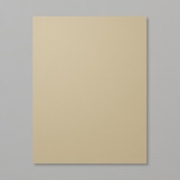
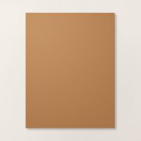
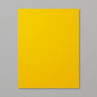
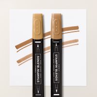
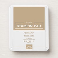
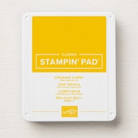
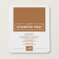
Hi friends—can you believe it is officially the start of ‘Sweater Weather’? I actually love this time of year, I can’t help but appreciate a good cardigan! And I love crafting with fall colors, especially the one we are featuring this month—Crushed Curry, Crumb Cake and Pecan Pie.

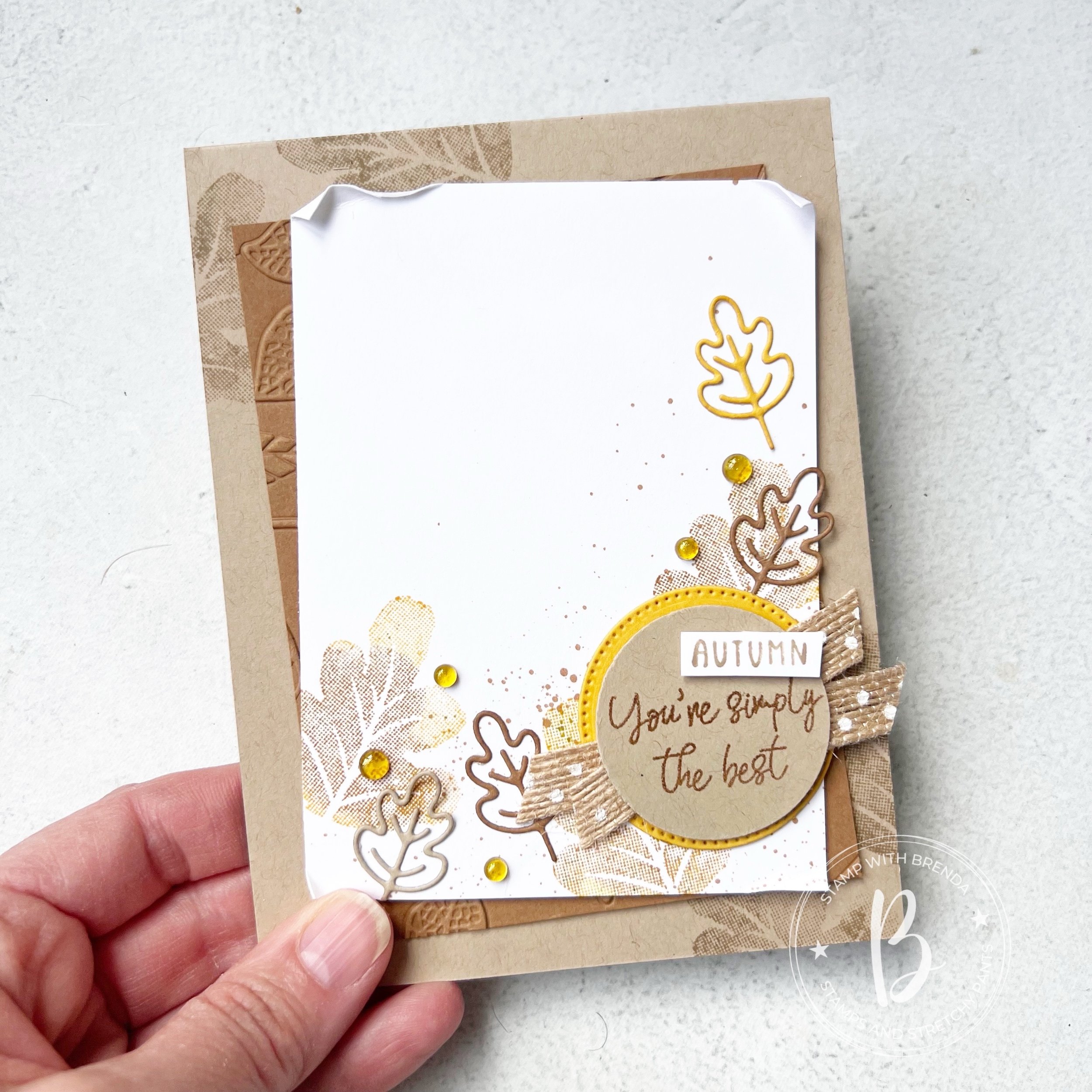
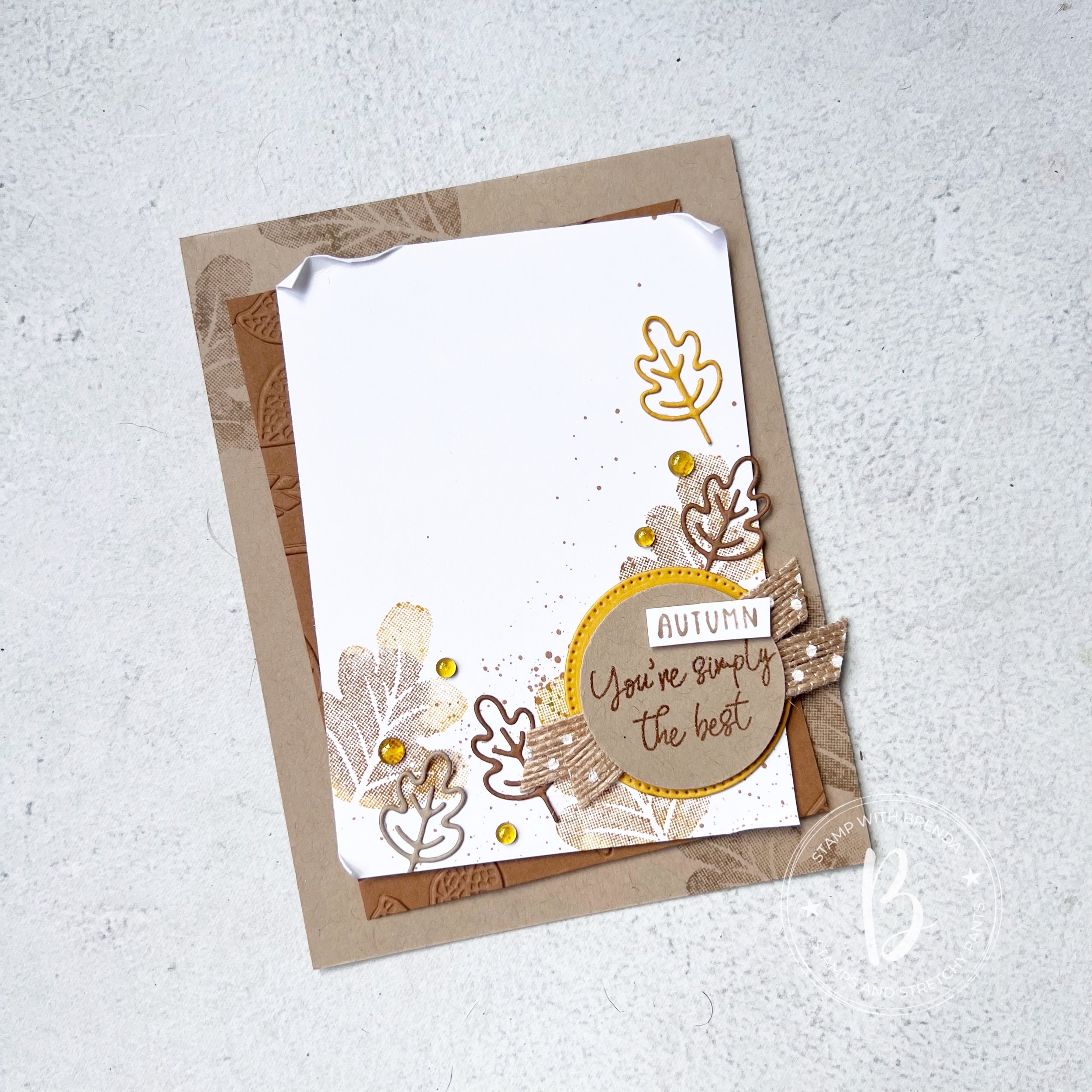
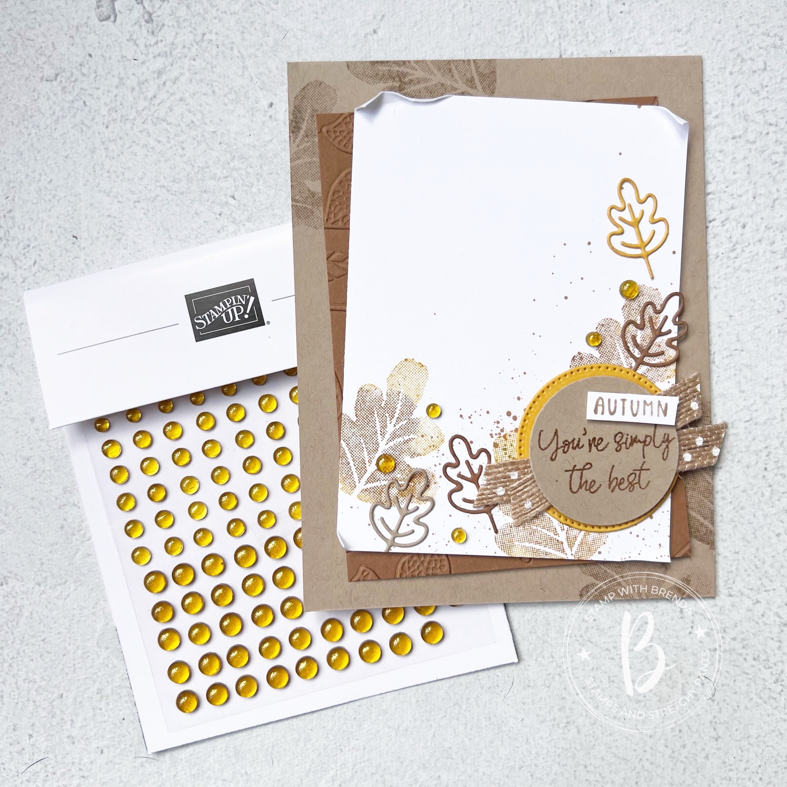
I am really excited to see what everyone designs this month and I actually decided to create a CARD versus a scrapbook page! Although I love this card so much that I will probably use it as inspiration for a future page.

I started with a base of Crumb Cake card stock and stamped some leaves from the Caring Leaves stamp set in the opposing corners in the same ink. Caring Leaves is a well priced autumn stamp set that is a great addition to some of the other fall products.

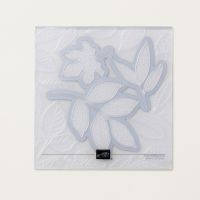
My second layer is Pecan Pie that I ran through the Changing Leaves Hybrid Embossing Folder. I love how you see just a few leaves poking through on the sides for some added texture.

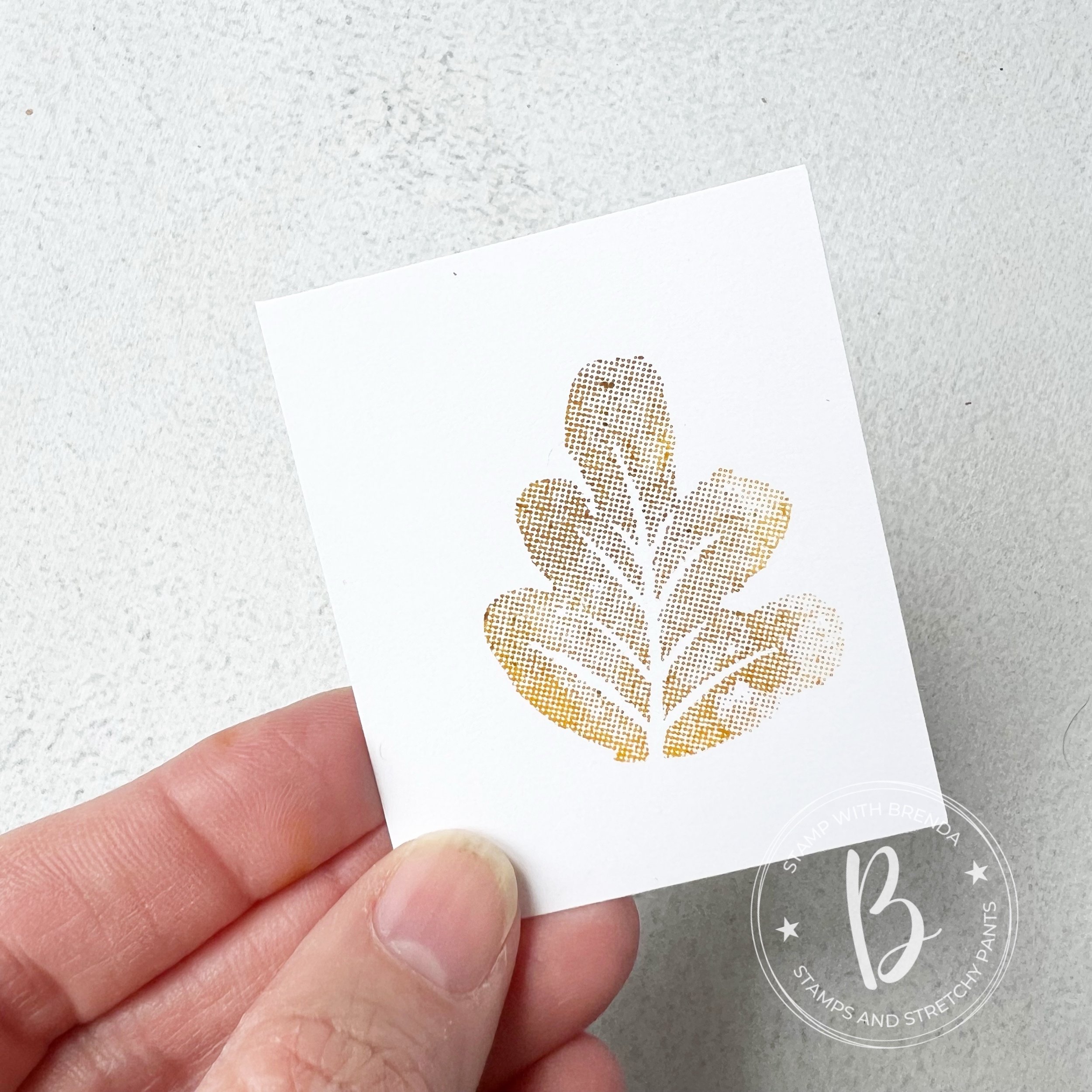
I used an easy technique to stamp the leaves on the Basic White layer. I inked up my stamp in Crushed Curry and then used a Dauber in Pecan Pie to to add a bit of color variation in the leaf.

You can use two colors or more to create a fun unique leaf design for your projects.

I really love how fun and simple this technique is and how can it make your projects feel unique as each time you stamp it will be different.

I stamped the leaf 3 times on the Basic White layer of my project and added a little spray of Pecan Pie ink over top.


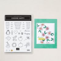
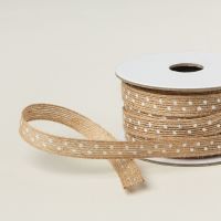
I die cut a stitched circle in Crushed Curry to layer behind my sentiment. ‘You’re Simply the Best’ is from the Caring Leaves stamp set—I used Pecan Pie ink with Clear Embossing Powder to make it pop a bit on the Crumb Cake. I used one of my favorite ribbons behind, the Natural Polka Dot ribbon. I snipped the word ‘Autumn’ from the Choose Happy stamp set.

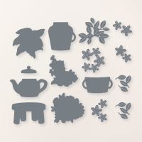
The adorable die cut leaves are from the More than Autumn Dies and are cut in the 3 colors we are featuring this month. A few of our new Gold Textured Adhesive Backed Dots. I think they will become a staple in my holiday crafting!

I can’t wait to see what the rest of the team designs this month! I am always inspired by what they make so please make sure to ‘hop’ all along so you don’t miss anything. Next up we have Melissa Kerman!

You can always go in reverse to Bonnie O’Neill as well. Either way will bring you around to our Design Team.

Here are the supplies that I used to make this card that are current as of this post. The Caring Leaves stamp set, More Than Autumn Dies and Gold Textured Dots will all be available to order once our Holiday Catalogue goes live!

Color Fusers--Soft and Fun!

Hello friends! And welcome to the Color Fusers Blog Hop for August—we are so happy you are here and I hope you find some inspiration by visiting all of our posts! If you don’t follow me on Instagram, please do @stampwithbrenda as I do post with more frequency on that platform.

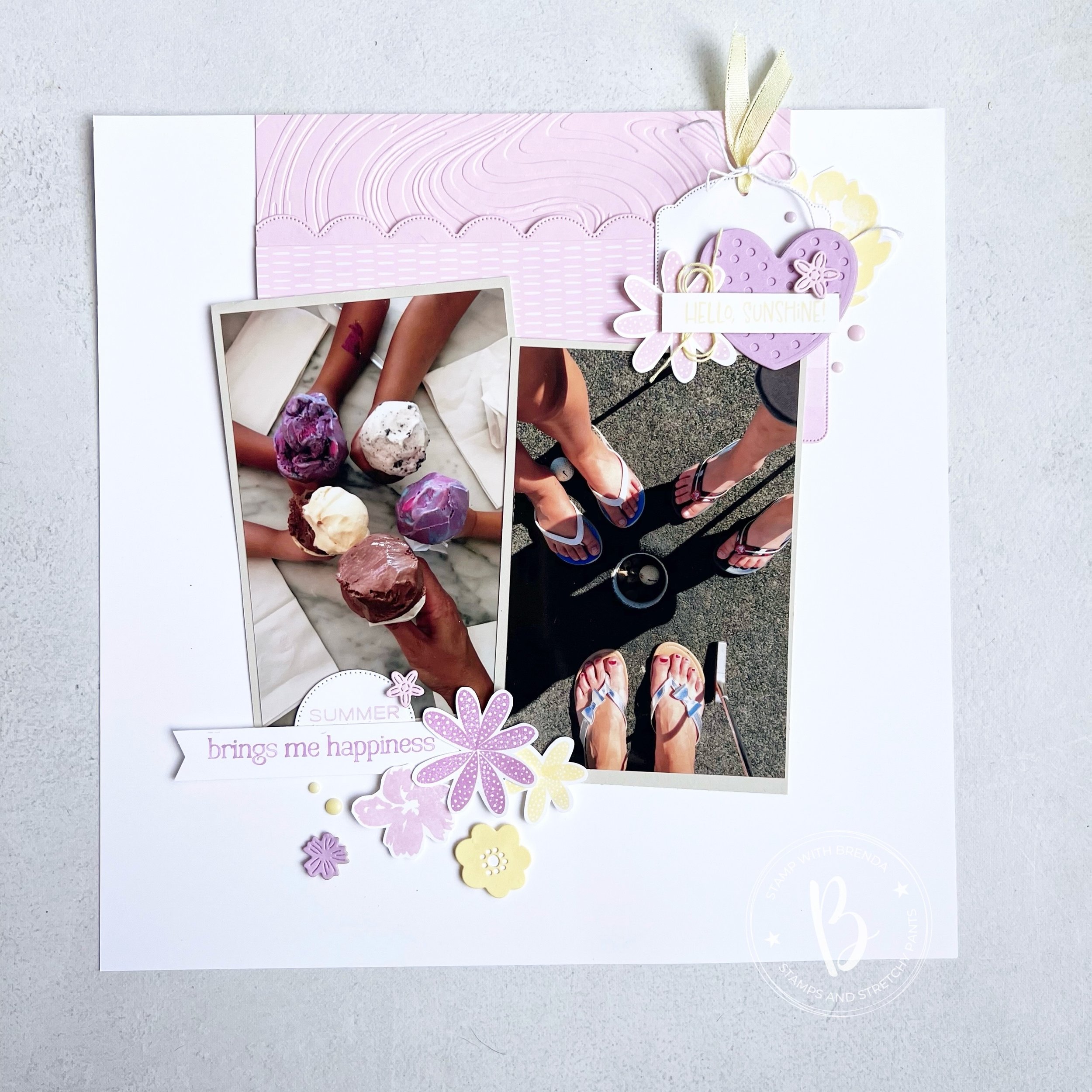
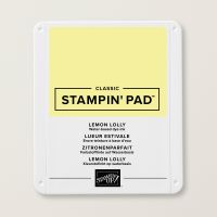
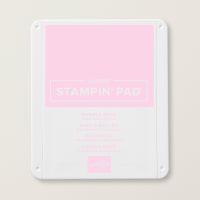
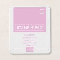
Our Hop today is focusing on probably one of my all time favorite color combinations—Lemon Lolly, Bubble Bath and Fresh Freesia which coincidentally are all apart of the Subtles color family.

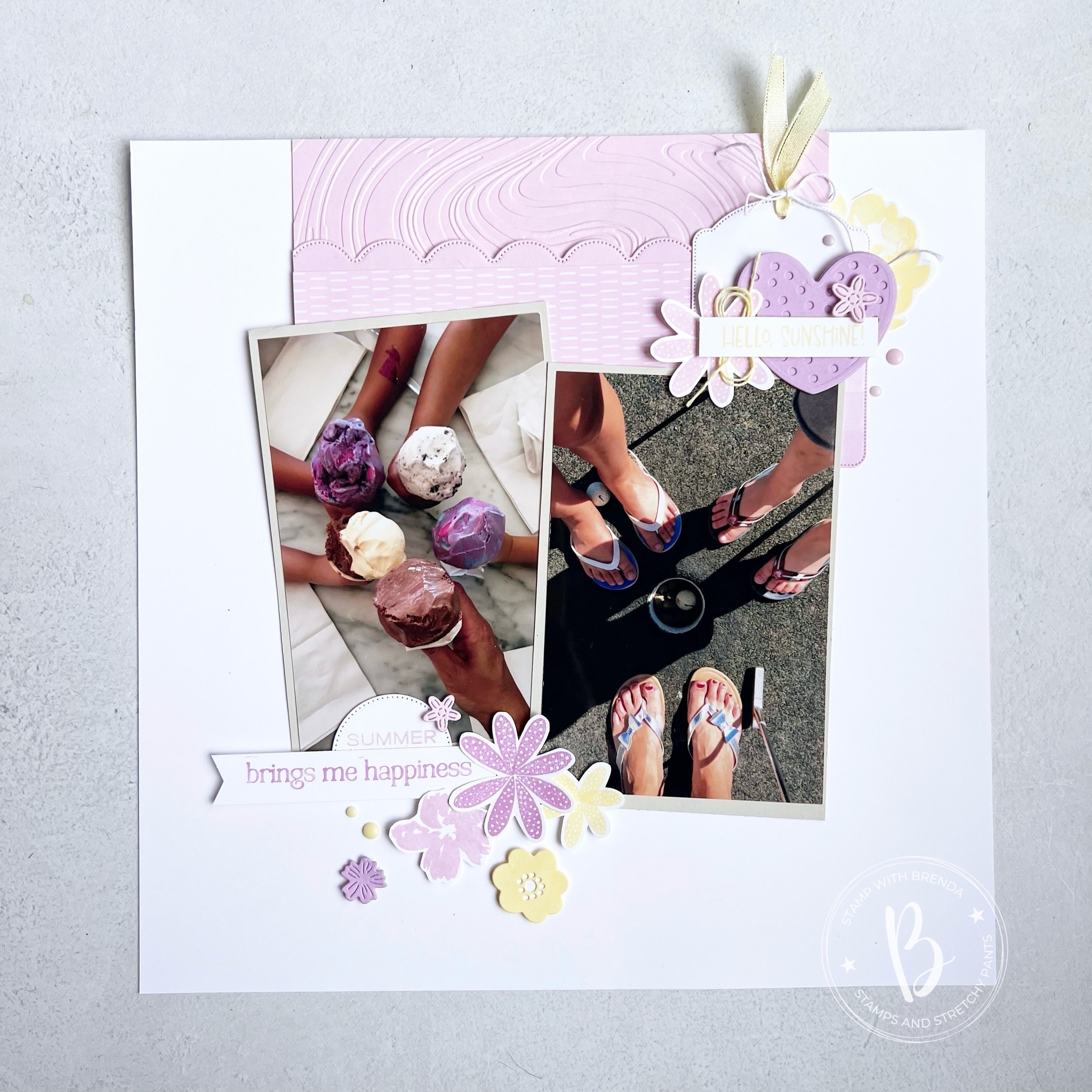
I have been really focusing on my memoring keeping lately—in fact, I make way more scrapbook related projects then I do cards. So hopefully its not a surprise that I am sharing a page with you today!

I started with a 12x12 base of Basic White and added in Basic Beige as my photo mats so that there was a slight difference behind my 4x6 pictures. I picked two fun summer pictures from a few summers past. With scrapbooking or memory keeping, you are never ‘caught up’ because you are living life and always creating new memories. I decided long ago to scrapbook whatever picture was grabbing my attention at the moment.

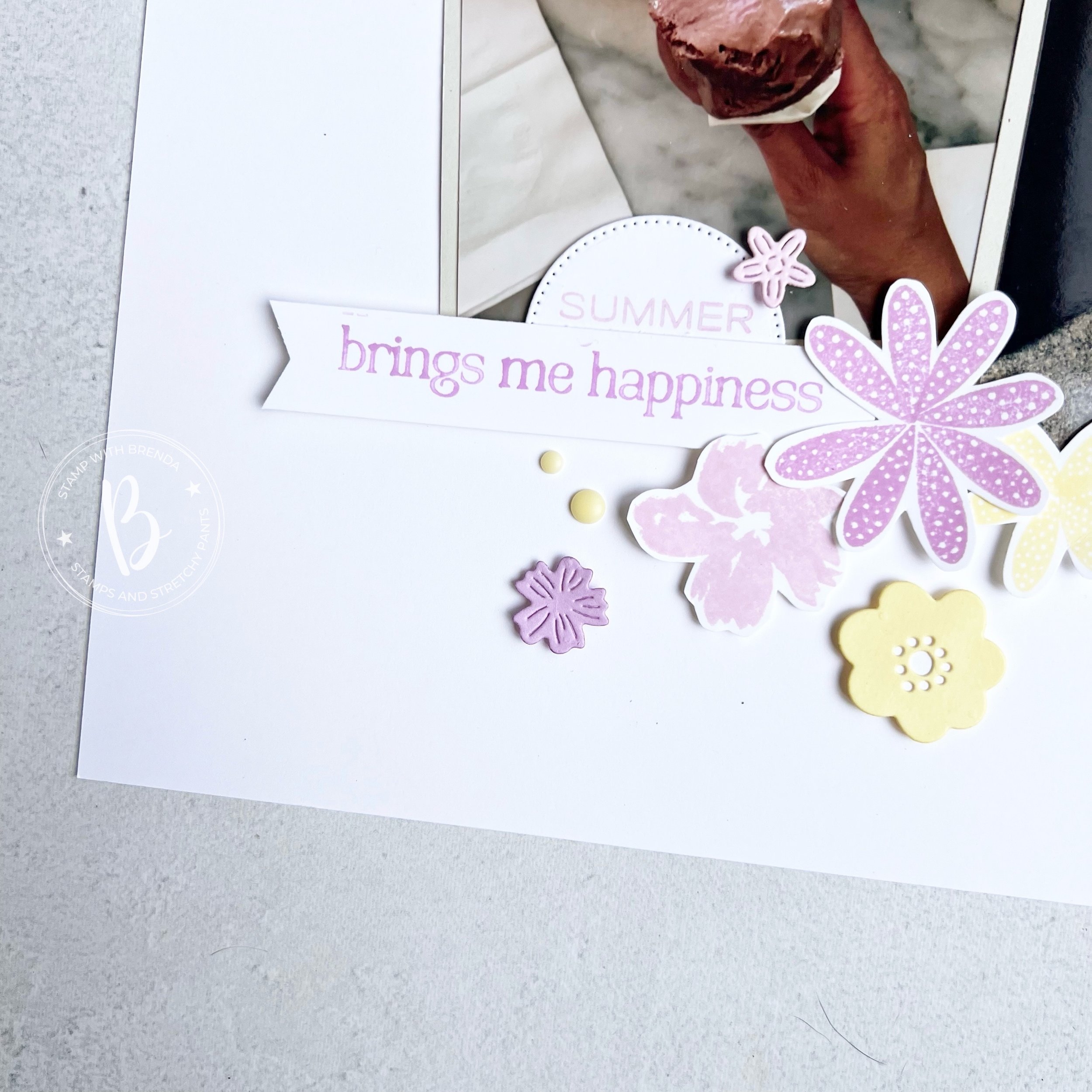
This page is the ultimate mash up of retired, current, Christmas stamps, and Paper Pumpkin stamps to create a really fun page that feels like summer to me.

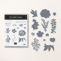
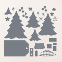
The tag is from the Merriest Trees Dies and I used retired DSP on this page—use your stash! The Lemon Lolly ribbon is from three pack that also had Bubble Bath and Azure Afternoon included. I added a flower from the Textured Floral stamp set (fun fact, it was a left over from another project that I didn’t use!

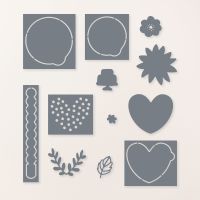
The heart die is from the Hooray for Surprises Dies—one of my fav sets! The heart is the perfect scale for cards and scrapbooking as it allows you to build other elements on top. Here I have added ‘Hello, Sunshine!’ which is from a long forgotten Paper Pumpkin kit (if anyone happens to know, please comment so I can have my memory refreshed). Basically, since its first use it has sat on a block so I can use it every summer!

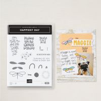
The best part of this little section is the flower stamped out from the Happiest Day stamp set—it is, in fact, created using the butterfly wings from that stamp set and then hand trimmed out.

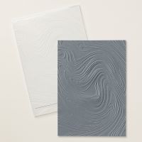
The Bubble Bath card stock at the top of the page was run through the new So Swirly Embossing Folder and I added a scallop detail with a retired die and then some retired DSP.

I created a fun ‘Summer brings me happiness’ stamp by using a long retired stamp ‘summer’ and pairing it up with a new set that actually reads ‘A friend like you brings me happiness’—-I love that we can customize our stamps using our Stampin’ Write Markers. The sentiment is from the upcoming Winterly Tree Tops stamp set.

I used both butterfly wing stamps from the Happiest Day stamp set to create a couple more flowers and added some die cut flowers from Hooray For Surprises and Country Flowers die sets.

I am really pleased with how this scrapbook page turned out. I hope it inspires YOU to create a page or use some of the elements on a card. To me, the top section is all stuff you could easily add to the front of a card!

I can’t wait to see what the rest of the team has designed this month with Lemon Lolly, Bubble Bath and Fresh Freesia. Next up on the hop is Melissa Kerman—who has been organizing and managing a our Blog Hop team for a number of years. Recently she has stepped back and we so appreciate her efforts! You can click this image to head to her blog!

You can always go in reverse as well which will take you to Sue Vine’s fantastic creation! Make sure to visit everyone on the hop, you will find tons of design variety and inspiration!

Thank you for popping by! I have been a terrible blogger lately and I do appreciate that you here! If anything on my project has inspired you, please consider shopping with me so I can continue to love what I do!

Color Fusers--Black & White!

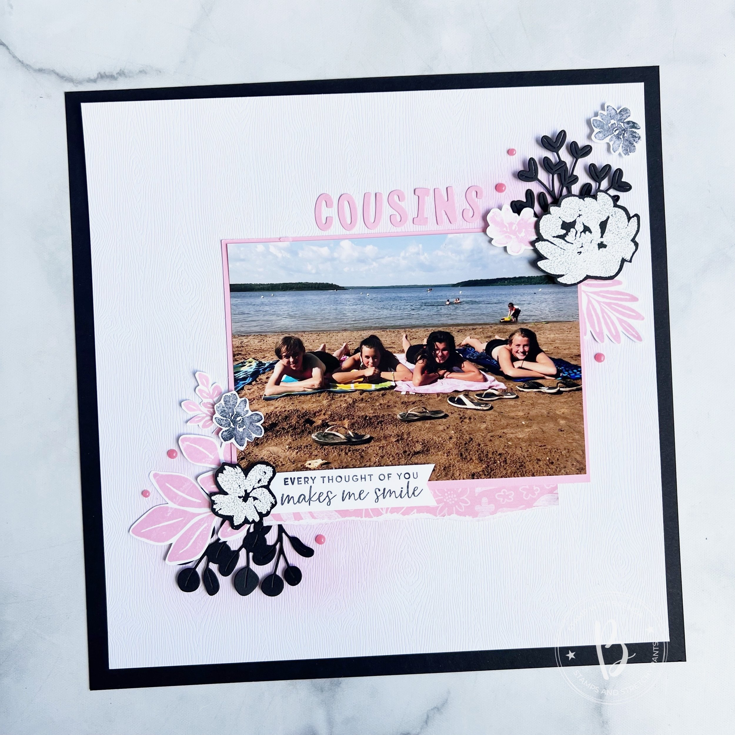
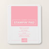
Welcome to the Color Fusers Blog Hop for July! This month the team is crafting with Black, White and a color of our choice. I picked Pretty in Pink as my color!

I decided to use one of my 12 x 12 Basic Black card stock sheets that I have been hoarding. I am hoping these will be available again in the fall for Halloween crafting—fingers crossed!


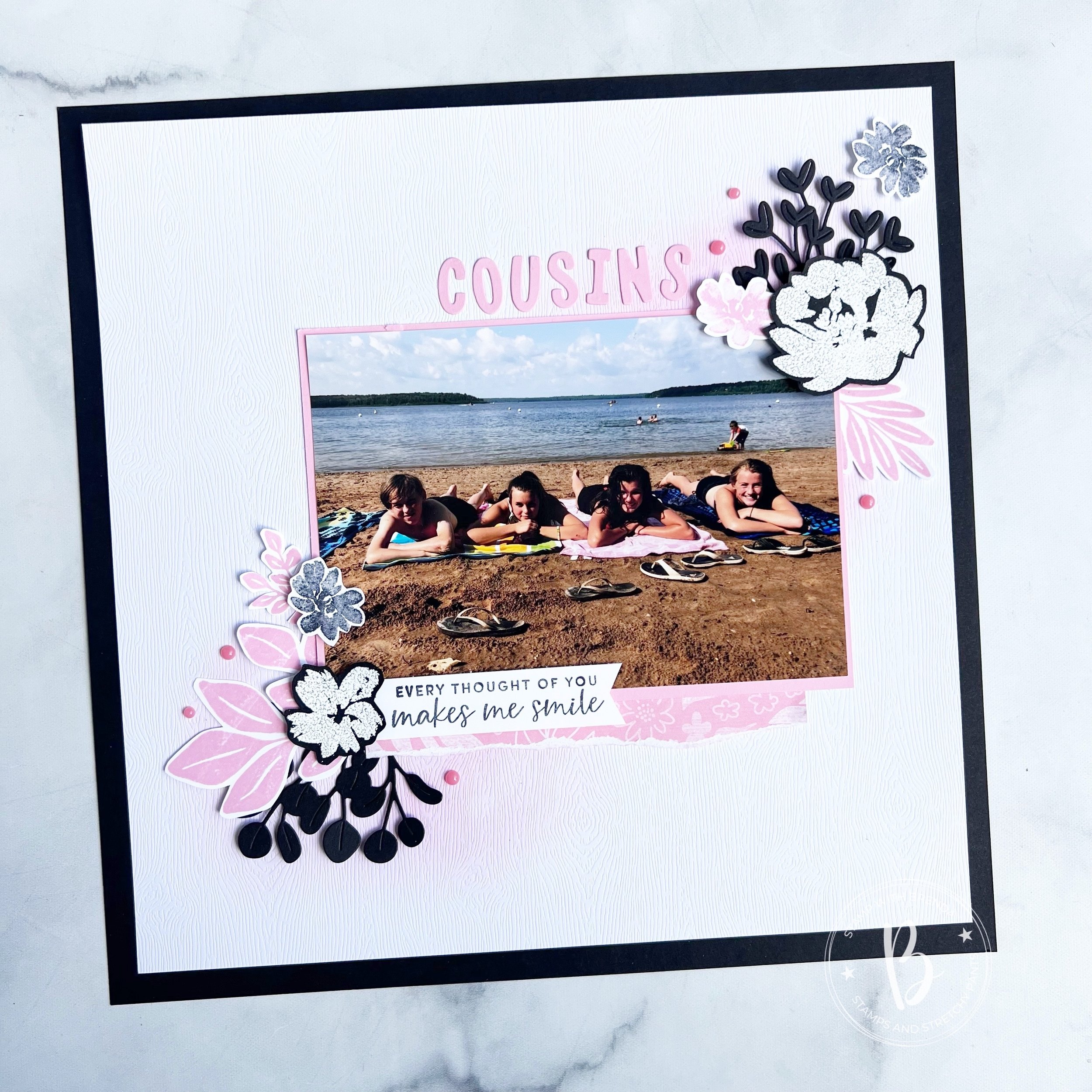
I layered the new awesome Wood Textured Specialty paper over top that I blended with some Pretty in Pink ink. This paper is a hidden gem in the Annual Catalogue and is definitely going to replace Basic White in some of my scrapbook designs!

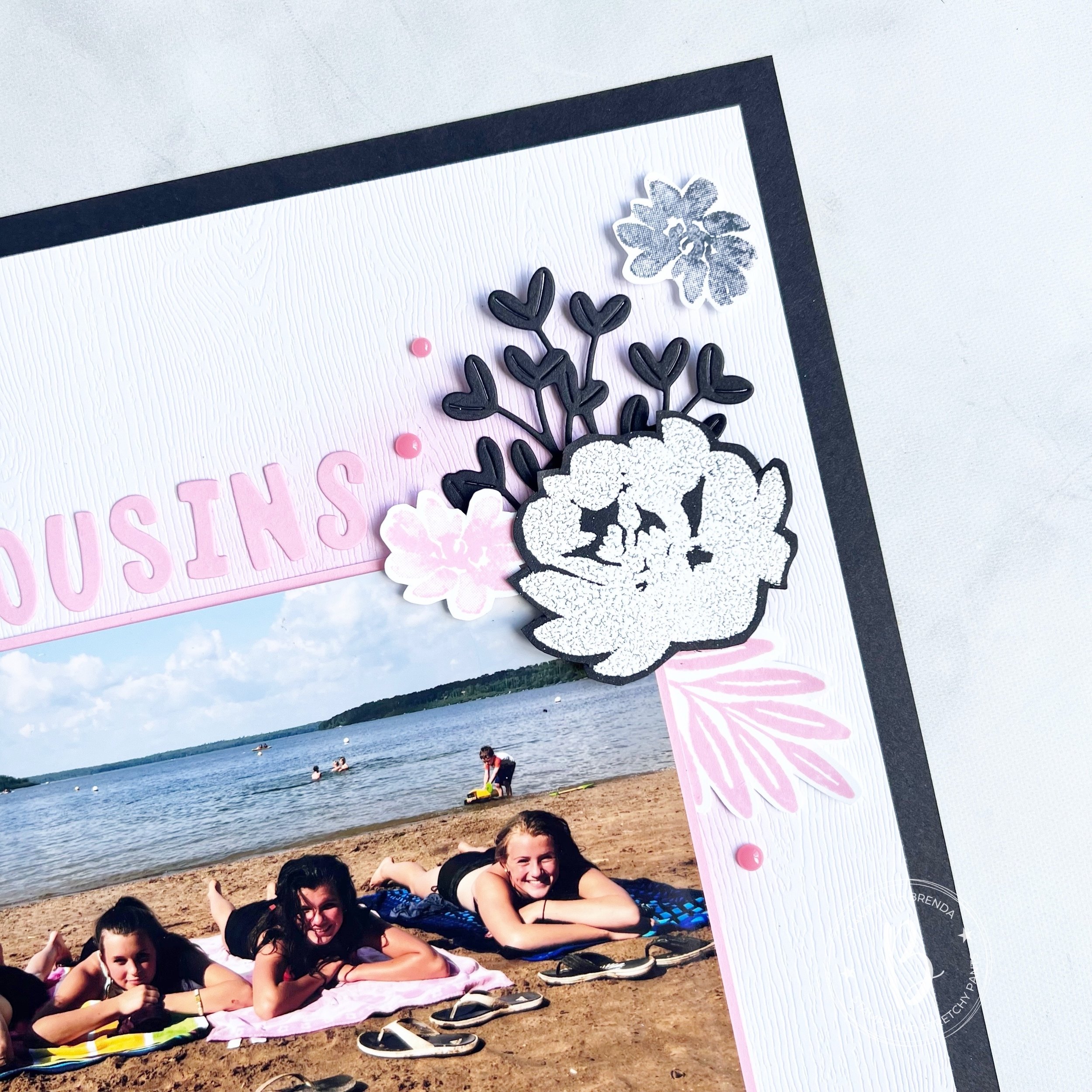
This is one of my favorite pictures of Reese and my 3 nieces at Greenwater Lake—an annual trip we do each summer. There is nothing like a day by the water side enjoying some time with family.

I love how the blending of ink accentuates the wood grain tone in the paper! Its such a subtle wow!

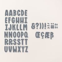
I used the Mini Alphabet Dies to spell ‘cousin’s’ in Pretty in Pink cardstock. This is such a great die because you can easily cut the whole alphabet at one time or use little scraps of paper the isolate the letters you want.

I couldn’t resist adding in something completely NEW so I used the Golden Greenery Dies to cut out these sprig shapes in Basic Black card stock. I love how these do not look ‘holiday’ at all! Another great reason to #addtocart!
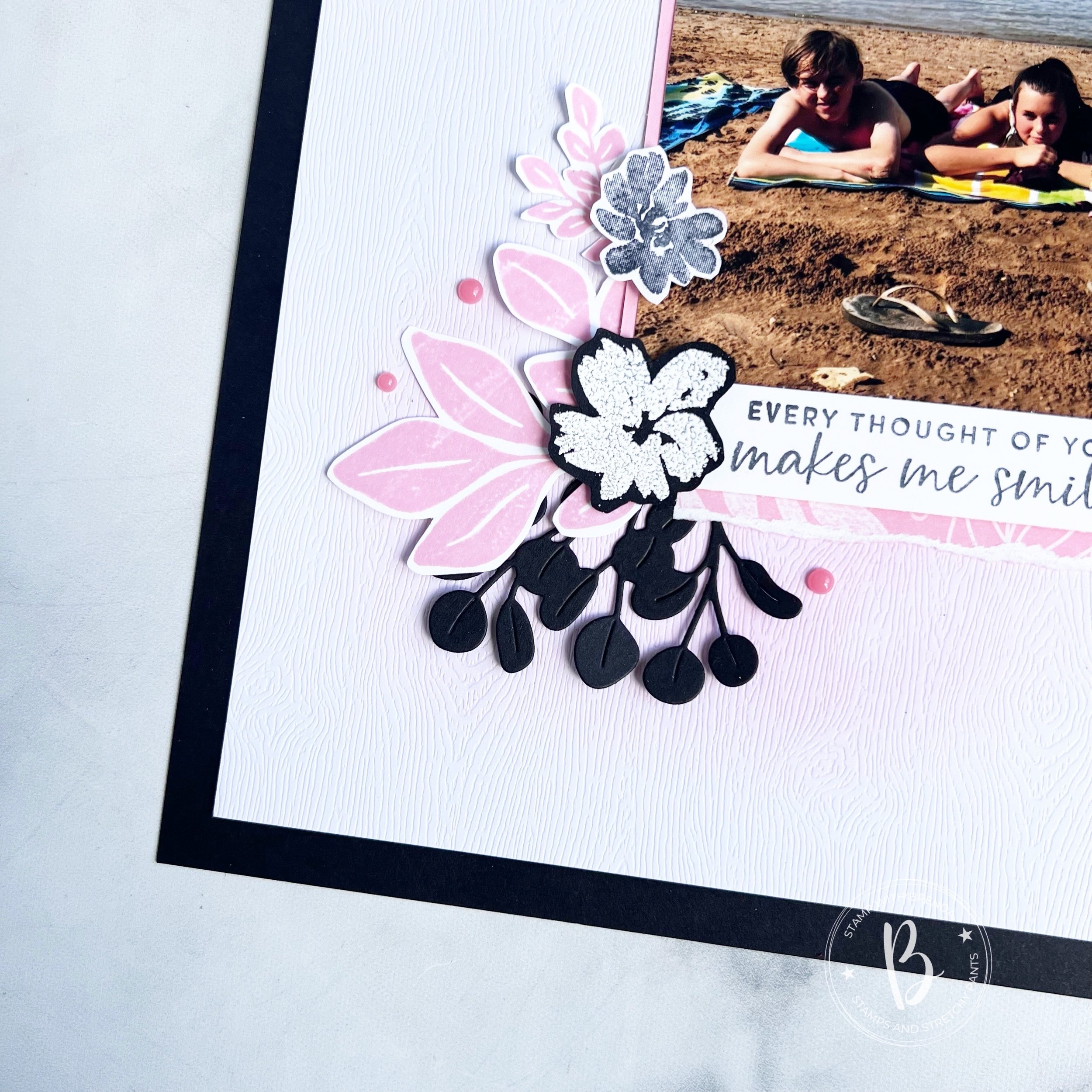
Along with the new, I added in florals from the Textured Floral stamp set. One that I have used many many times in my crafting. If you are new to this hobby, I would definitely recommend adding this to your collection.

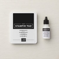
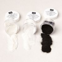
The flowers are stamped with Basic White Craft Ink on Basic Black card stock and sprinkled with embossing powder. Remember to heat from the bottom to get a better looking finished embossed image.

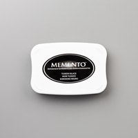
I also stamped the smallest flower from the stamp set in Memento Ink and Pretty in Pink ink.
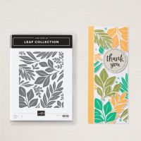
The leaves are from the large Leaf Collection background stamp. I trimmed them into separate images and added them around the page. I cut a strip of 6x6 DSP and tore the edge to tuck underneath the photo which is on a Pretty in Pink photo mat. To me this DSP from the In Color collection feels just like the Leaf Collection stamp.

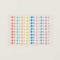
The sentiment is from the Textured Floral stamp set. I added a few pink embellishments from the Adhesive Backed Dots for Days collection.

I really love how this page turned out. It is a design that you can easily replicate with using different stamp sets and dies. We have so many to chose from!

Next up on the Hop is Melissa Kerman—I know she has created something awesome and I can’t wait to see what color she picked to add to Black and White!

If you want to go in reverse, or if the hop has a broken link, you can always go back to see what the amazing Sue Vine has created too.

Regardless, I hop you visit everyone on the hop to see what color they chose to add to the Black and White theme!

Thank you for visiting my blog today! Please leave me any feedback and if you are inspired, consider shopping my store so I can continue to do what I love!

Be Inspired--Triadic Color Theory!

Hi friends! Welcome to the Be Inspired Blog Hop! I love creating with this fun crew of people and I hope you will visit all of our blogs and leave us some comments!

This month the crew is creating projects featuring Triadic Color Theory! You can find this in the Annual Catalogue—its such a cool resource, especially if you are looking to mix things up in terms of color. I know I have my favorite go to colors, so it is nice to step outside the box occasionally!

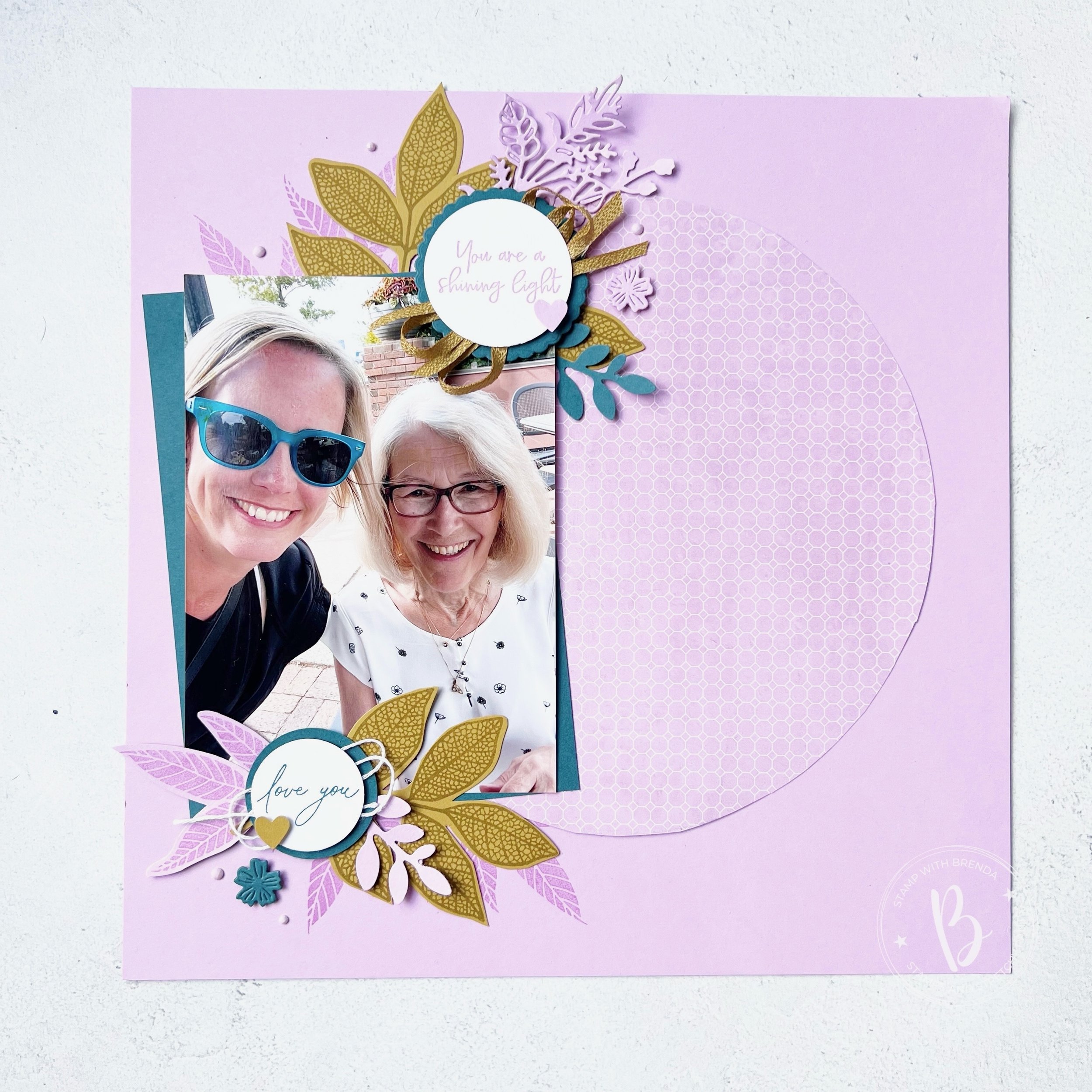
I decided to use the combination that is on the bottom of the right page— Fresh Freesia, Wild Wheat and Pretty Peacock. I can confidently say I have never crafter before with this combination, however I am IN LOVE with how my project turned out! I hope you will give this combination a try yourself after seeing how awesome it looks!

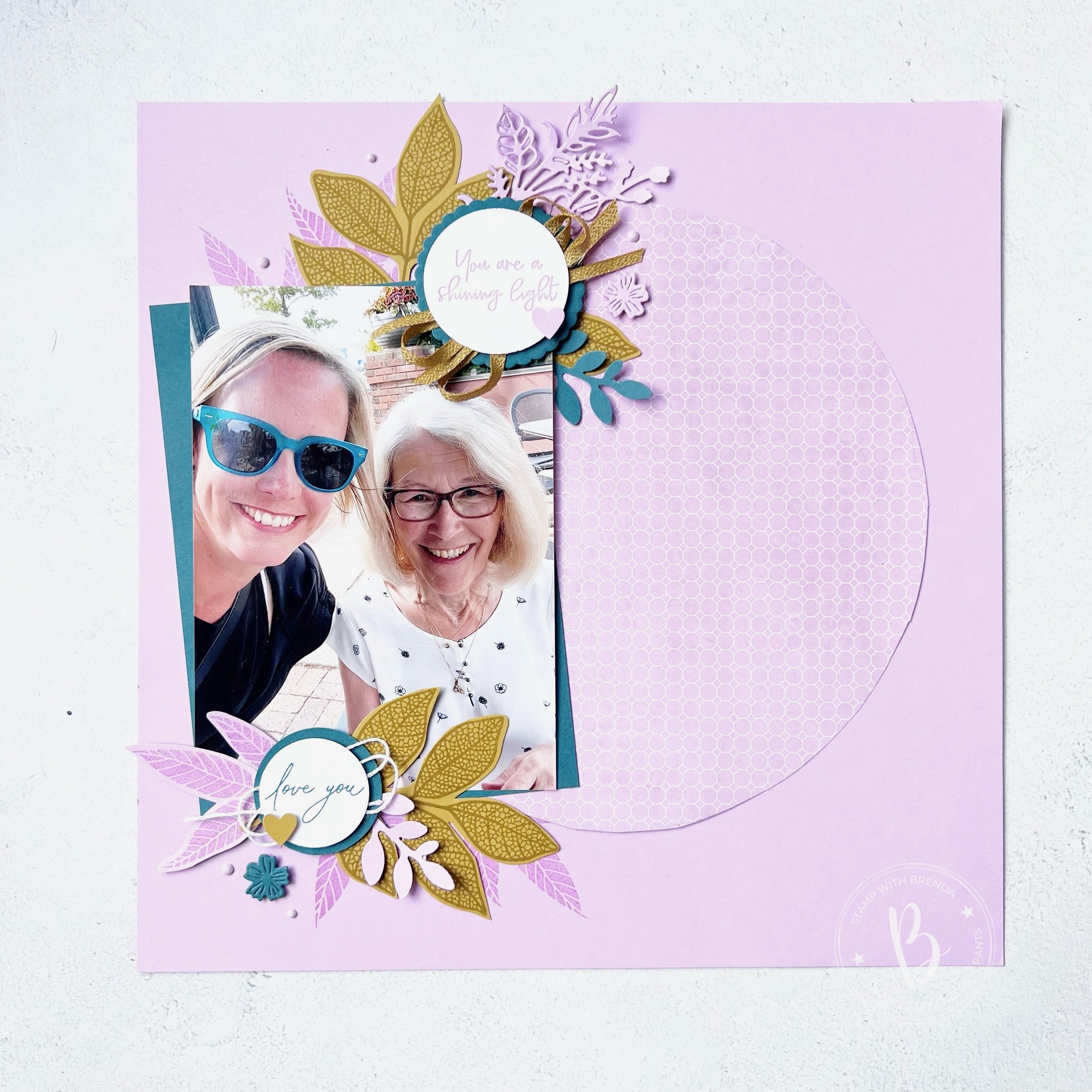
I started with a base of Fresh Freesia. I had this design in mind and I knew that in my personal stash, I have alot of 12x12 DSP to match in Fresh Freesia. This particular print is from some Sale a bration DSP. I used a 9 inch paper plate to trace the circle and just cut it with scissors! Such a fun way to use DSP, I think I might CASE myself!

My photo mat is in Pretty Peacock to showcase this picture of myself with my mom a few summers ago.

I am a fan of coordination and it is a happy accident that my sunglasses just happened to match!

On this page, the showstopper is this new bundle that will be available to order in the Online Store in July. I am obsessed. It is a MUST HAVE. It is an amazing new hybrid bundle called Changing Leaves. And while it appears ‘fall’, it definitely does not have that vibe on this scrapbooking page!

The largest of the leaves in the stamp set is stamped with Wild Wheat ink on coordinating card stock. The midsized leaf is stamped in Fresh Freesia on coordinating card stock. I added some directly to the 12 x 12 and some as elements.


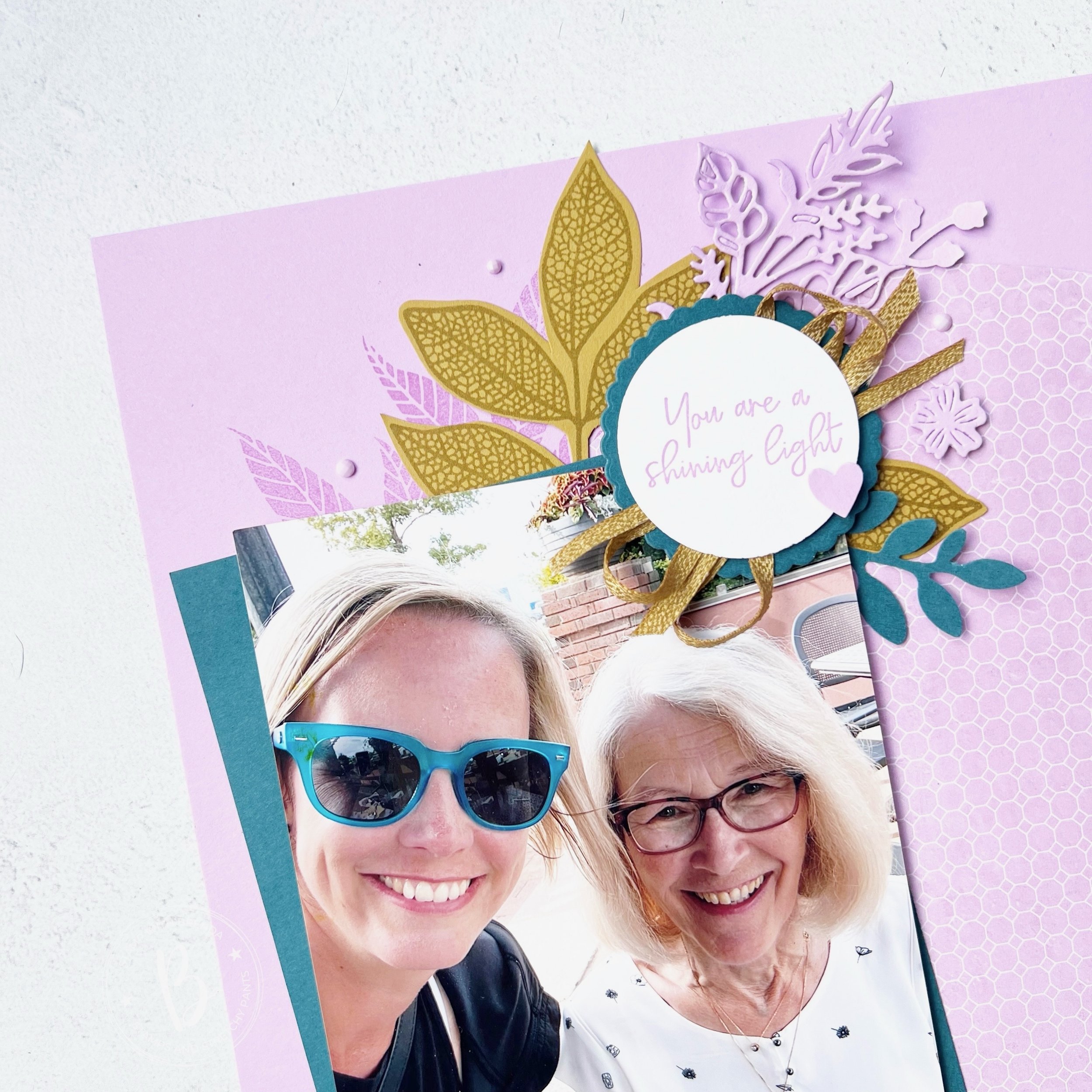
The sentiment “You are a shining light” is from the You are Beautiful stamp set in our annual catalogue. I added a scalloped circle behind, die cut in Pretty Peacock card stock using the Round We Go dies.

I used a length of Wild Wheat ribbon that I cut in half to bring life to the sentiment. I also added a die cut from the Flowers of Beauty Dies and a spring from the Bough Punch.

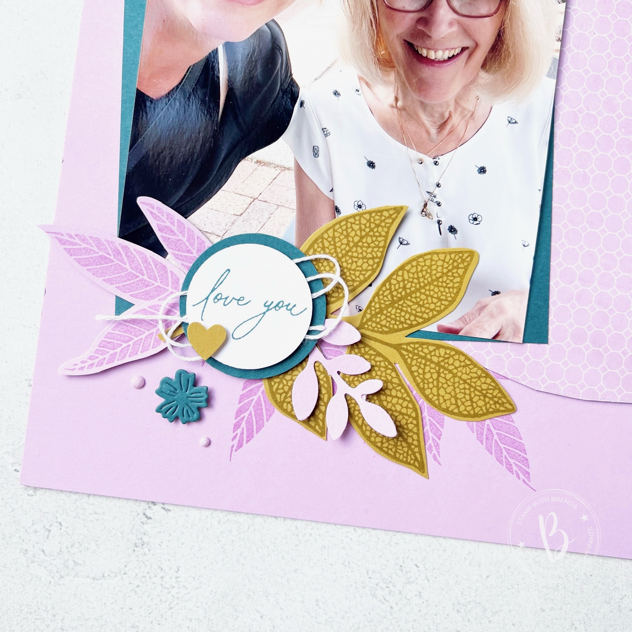
The sentiment ‘Love You’ is from another new set, Everyday Greetings, that you will be able to order in July under the Online Exclusive section. I added a bit of white thread and a cute little heart from the Bee Builder Punch.

The little die cut flowers are from an unknown die set—haha! I didn’t put it back and its been too long to remember where it goes! I am sure I am not the only person who has some ‘homeless’ dies.

I really love this scrapbooking page and I am so glad that I was encouraged to use this fun amazing new color combo! It is definitely one that I will try again, maybe on a card design!

Next up on the hop is a fellow Canadian, my friend Carolynn! She lives a couple of hours away from me and I am pretty sure she cheers for a different hockey team! haha! Go Oilers!

Click the link below to visit her blog and see her crafty project!

If you are inspired and are looking to place an order, please consider shopping my store! Your support allows me to keep doing what I love!


Color Fusers--June--New In Colors!

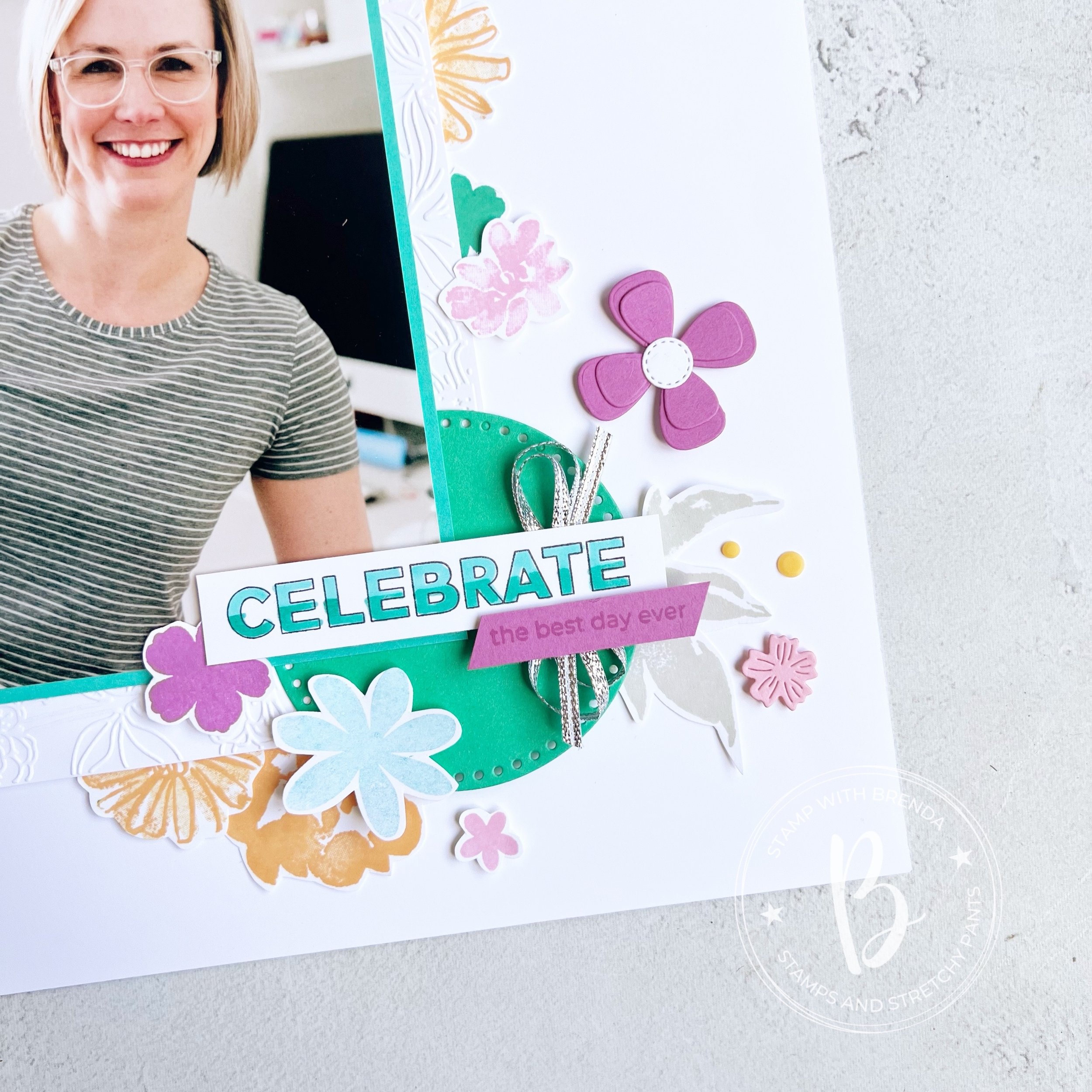
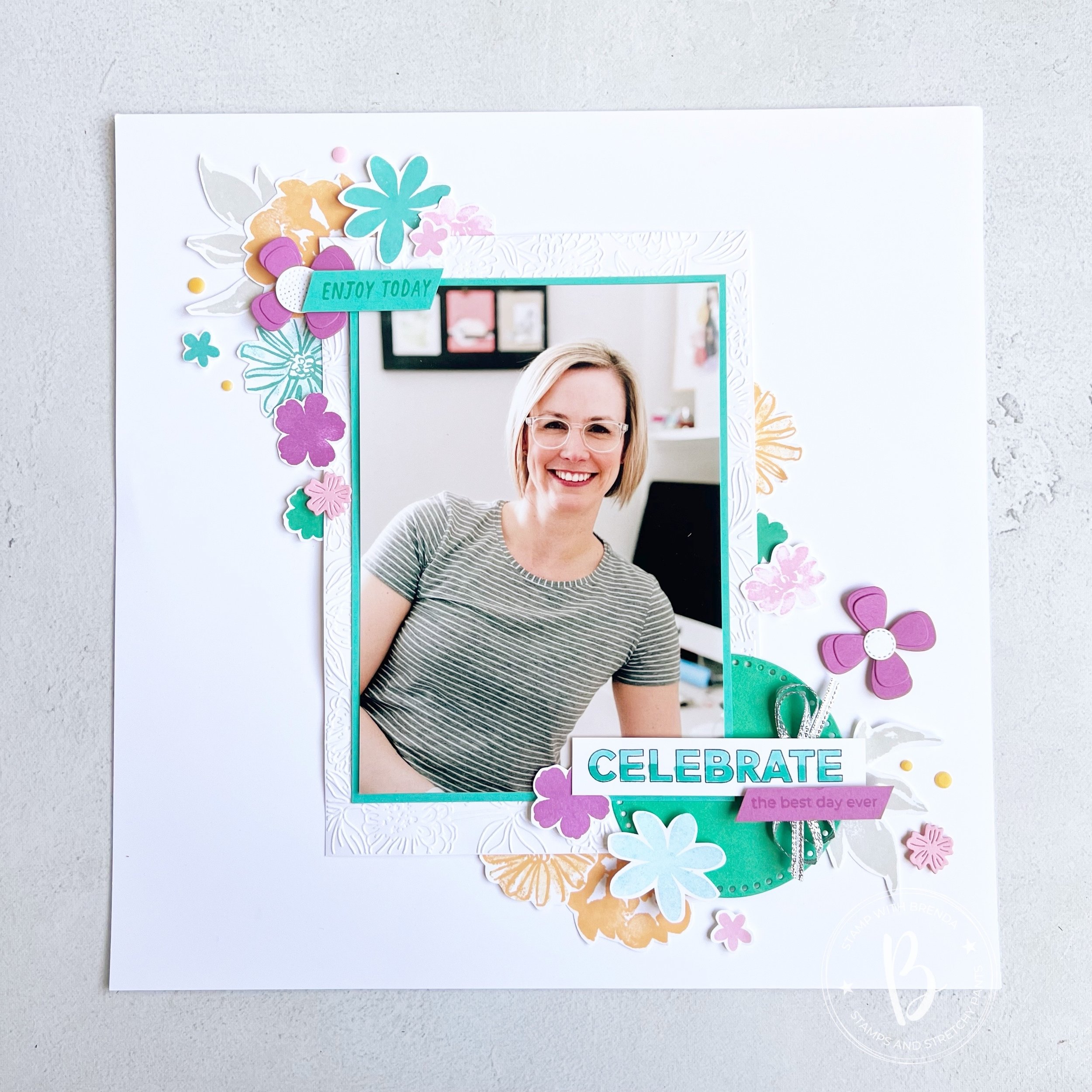
Hi friends! I am so excited to be sharing a project, a scrapbook page, with the new 2024-2026 In Colors! I am absolutely in love with this new collection—I dare say, its my favorite yet! Definitely in the last decad!

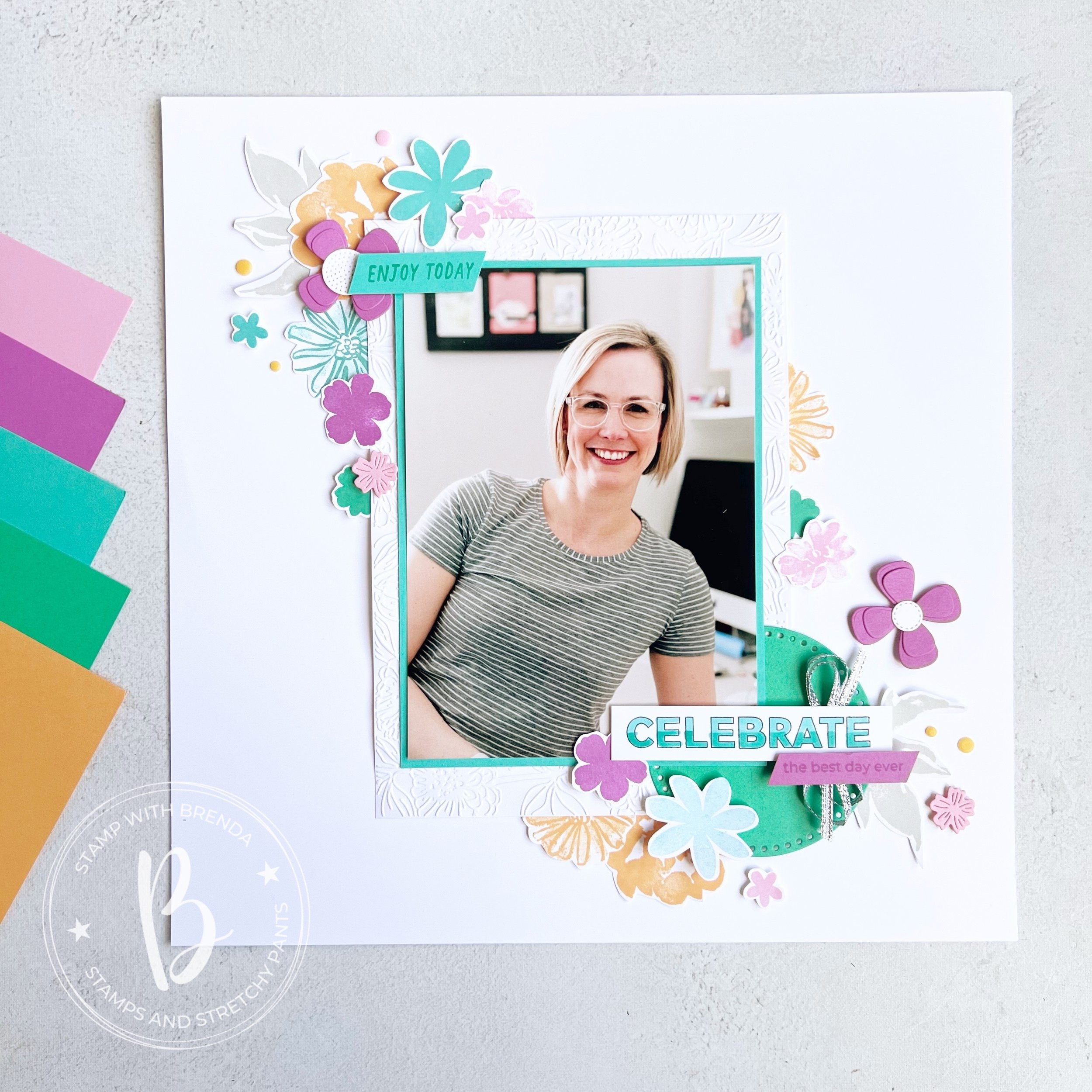
I new I had to make a scrapbook page with these colors and they literally pop off the page when added to a Basic White base. Do you have a favorite of the 5? Mine seems to switch with each new project I create, however, the fact that all of these colors work so well as a family, makes me so happy!

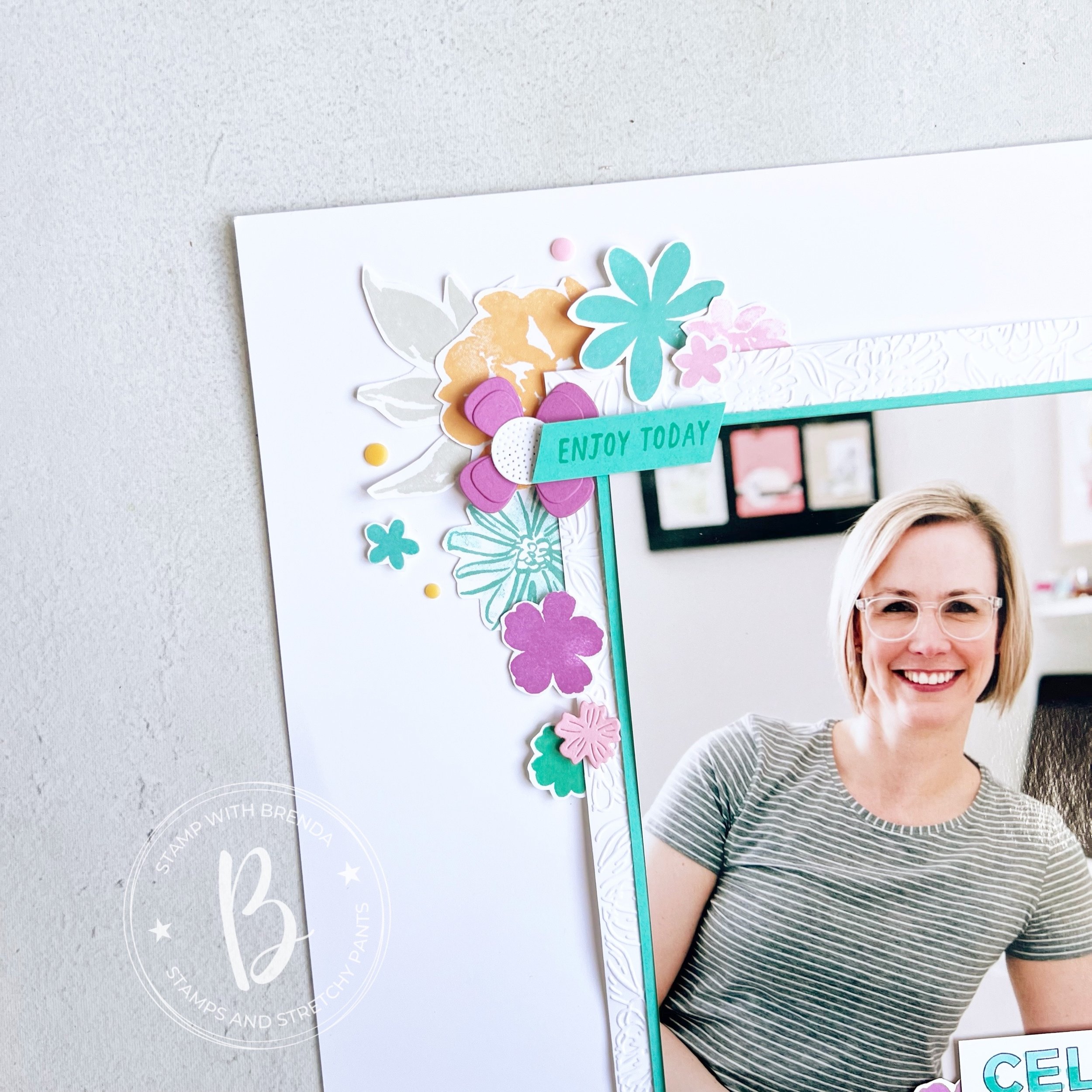
I decided to scrapbook myself, because really—who else is going to do it? I started with a 5x 7 picture that I matted with Summer Sky and then on a larger piece of Basic White that I ran through the Zinnia folder for some texture.

This page is a mashup of some of my favorite stamp sets, past and present! Because I was making this page for myself, to hang in my craft room, I didn’t work about things all being ‘current’. My very first Artisan Assignment in 2021 featured the In Bloom Bundle. It is still one of my favorites! I also used Color & Contour which is retired and the Paper Florist Dies (I was so so sad when they retired them, I will not quit using them!).

I love mixing and matching stamp set and dies and I used all five of the new colors on this layout—either in stamped or die cut form!

Many of these stamps actually have dies, but sometimes I like to just sit in one spot and be creative so I actually don’t use the Stamp Cut & Emboss Machine—gasp!

I like to layer images on top of each other and have things tucked in and behind and right on top of my photo too.

I created a really easy ombre effect on ‘Celebrate’ with my Stampin’ Blends markers which I think makes things a little more interesting. I also used the Everyday Details behind the ‘Celebrate’ to help it pop.

I didn’t want to favor a specific color so I used some of the silver ribbon from the Gold & Silver Trim Combo Pack.

I also stamped a few neutral leaves in Grey Granite so that they almost blend into the background.

I think this layout is one that you can also recreate by mixing up colors, stamp sets and die cuts. I love how the flowers frame my photo making it the feature of my page. I never think your picture should compete with the elements on your scrapbook layout.

I can’t wait to see if the rest of the Color Fusers team focused on a specific color or created a project that combined all of the colors like mine. I am so happy with how it turned out and I am excited to have it up in my craft room.

Up next on the Hop is Janneke, a former Artisan teammate! I know you will love what she has created.

If the hop links get broken or you want to go backwards, you will be visiting another former Artisan teammate, Tami’s blog! I love everything she makes so I know you will be inspired too!

If you are inspired by my design and need a few things, please hit #addtocart by shopping my online store! I would love to keep doing what I love!