Color Fusers--October!

HI friends and Happy Fall Y’all! It is officially here and so beautiful. I love everything about it, and in the words of Anne of Green Gables, “I’m so glad I live in a world where there are Octobers”.

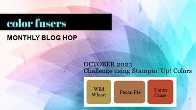
This month the Team is crafting with three amazing colors—Wild Wheat, Pecan Pie and Cajun Craze.

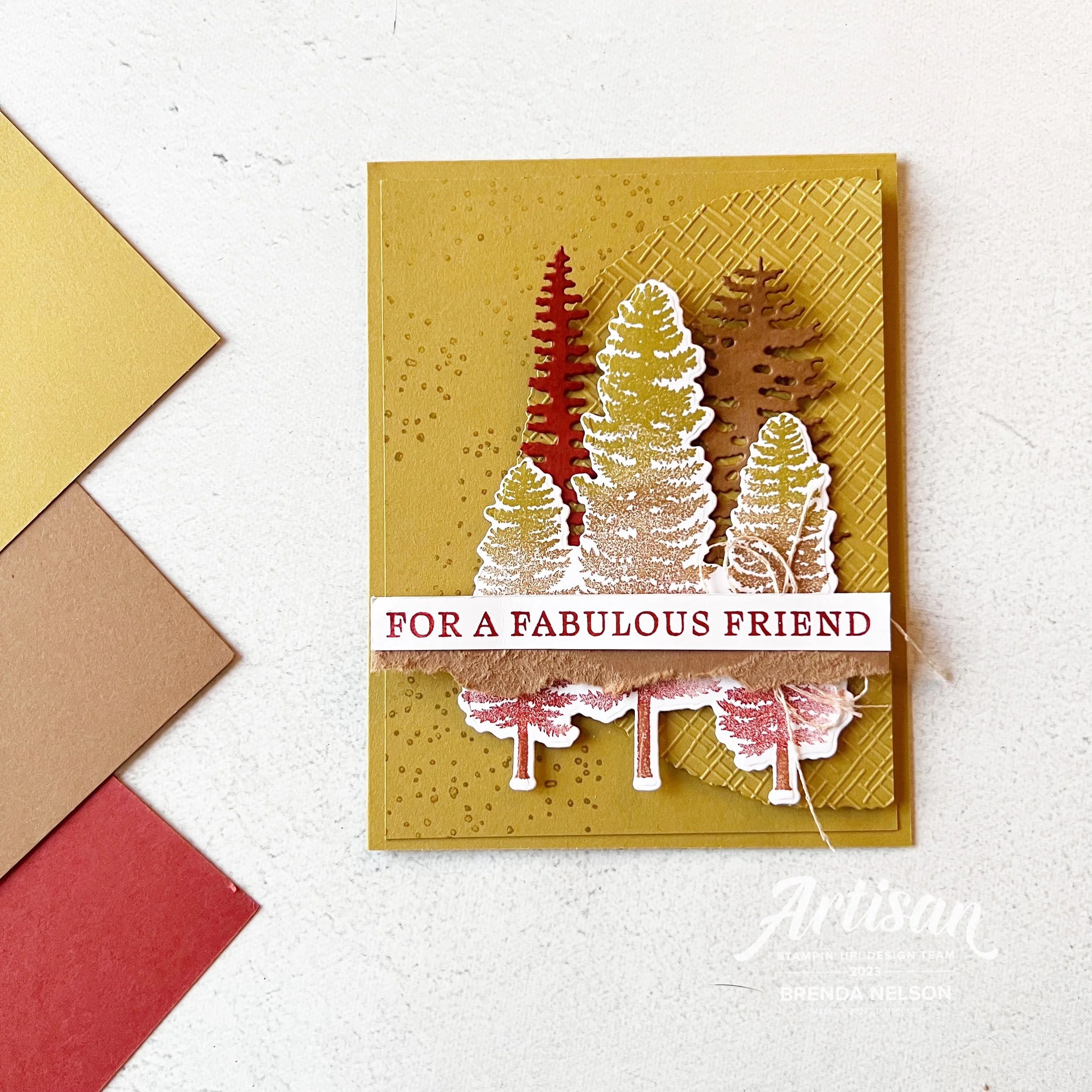
This color combination definitely feels like fall for me and I was thinking about the beautiful trees in our river valley and Banff, all the gorgeous places nearby me. The Forever Forest Bundle felt like a perfect pairing with this months color combo.

I started with a base of Wild Wheat and added a first layer with a bit of speckle stamping from the stamp set. I then die cut half of a Decked Circle Die (can you believe there are 14 dies in this set!!) and I ran this through one of the 3D Basics Embossing Folders.

HOT TIP: Have you been shopping the Online Exclusives? There are tons of amazing things over there including these MUST HAVE embossing folders!

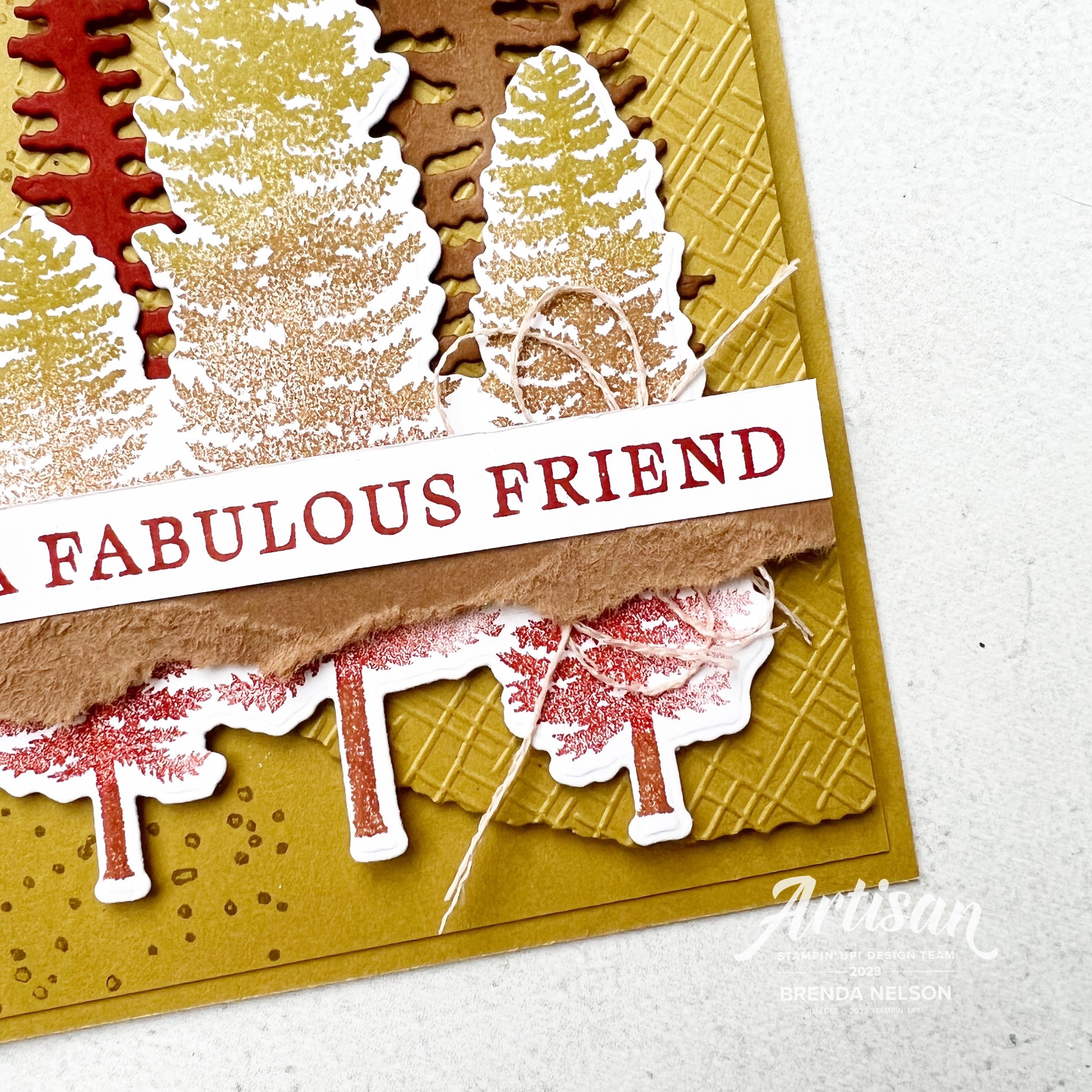
You can see the amazing detail in the die, as it has that torn edge, and the embossing folder.

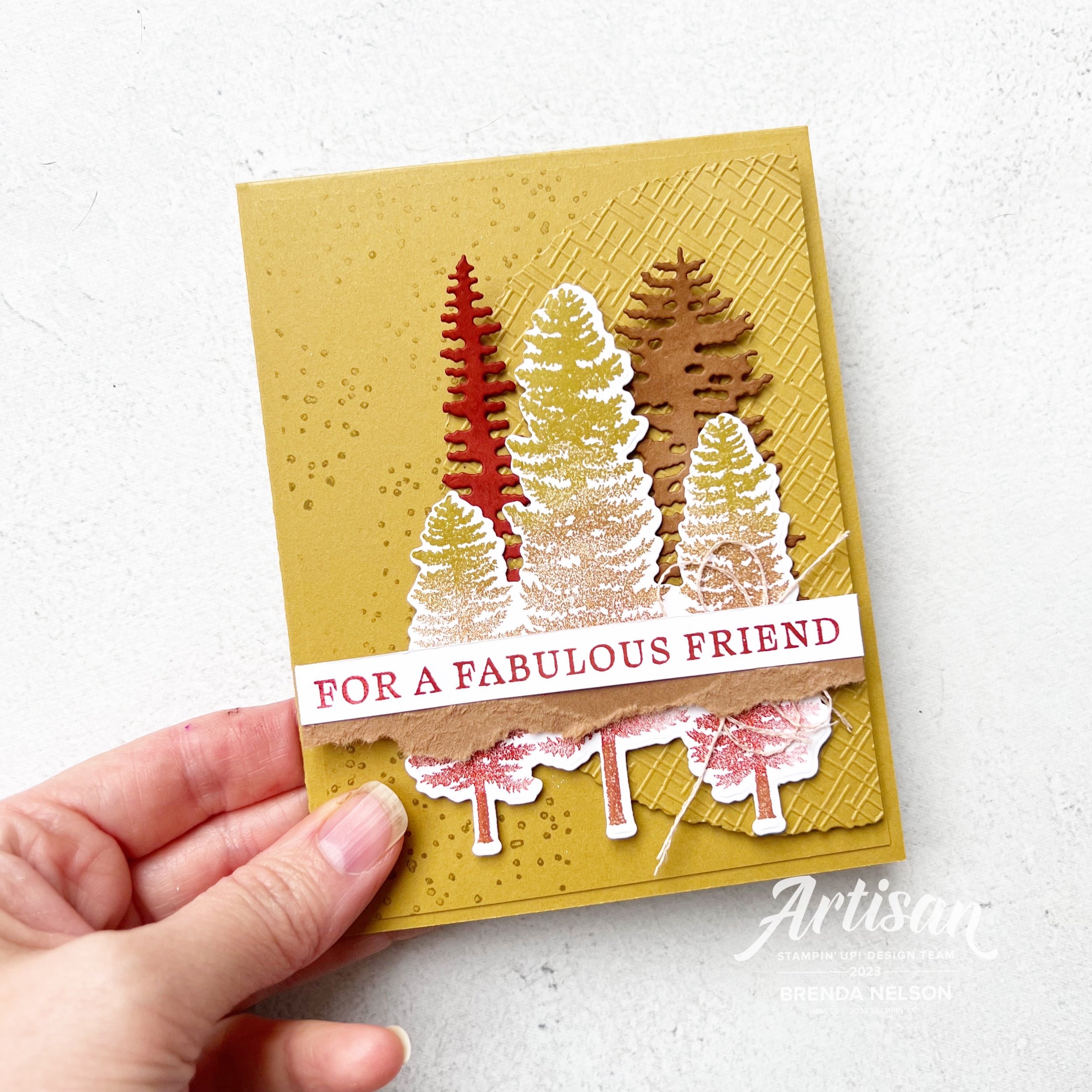
My trio of trees is created using Blending Brushes and the 3 feature colors—Wild Wheat, Pecan Pie and Cajun Craze. I layered the colors on with my brushes to give the illusion of trees changing colors. I think they turned our really well.

I die cut two other trees from the die set in Cajun Craze and Pecan Pie and did a little blending with my brushes around the edges of the trees for some dimension.

I nestled them all together to feel like a forest and added the sentiment “For a Fabulous Friend” over top. The sentiment is from the Beautiful Bouquet stamp set. A bit of torn Pecan Pie card stock layered underneath felt like it tied in the torn look of the Deckled Circle.

Next up our awesome team hop is the amazing Sue Vine! I know you will love what she has created!

You can always go backwards from this point as well, you will heading over to my awesome friend Melanie Hockins page!

Thank you so much for stopping by today! If you are not, please feel free to follow me on Facebook and Instagram @stampwithbrenda and if I have inspired you in any way, please shop my online store! I would love to be able to keep doing what I love!

Around the World on Wednesday--Let's Take a Walk

Hello friends! I have been a little bit absent from this Blog Hop but after meeting, in person, some of the other gals from ‘Around the World’ at our Backstage Leadership conference in Las Vegas, I have become motivated again!

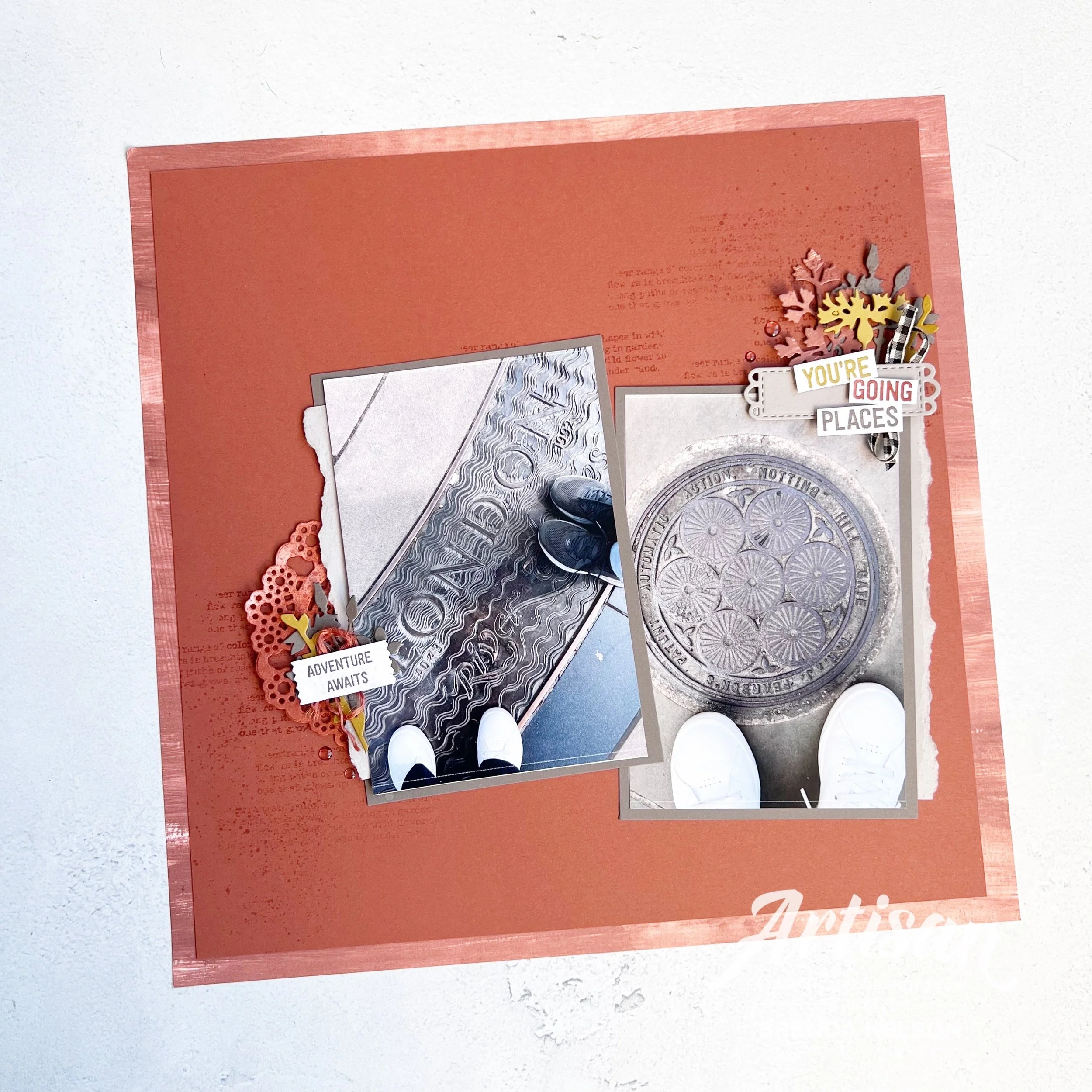
The theme for this month is ‘Let’s Take a Walk’ which I found really intriguing! I immediately began to think of some of the places that I have been fortunate enough to walk in, and the most recent one was a trip to London that I took my youngest son, Shepard on this past spring.

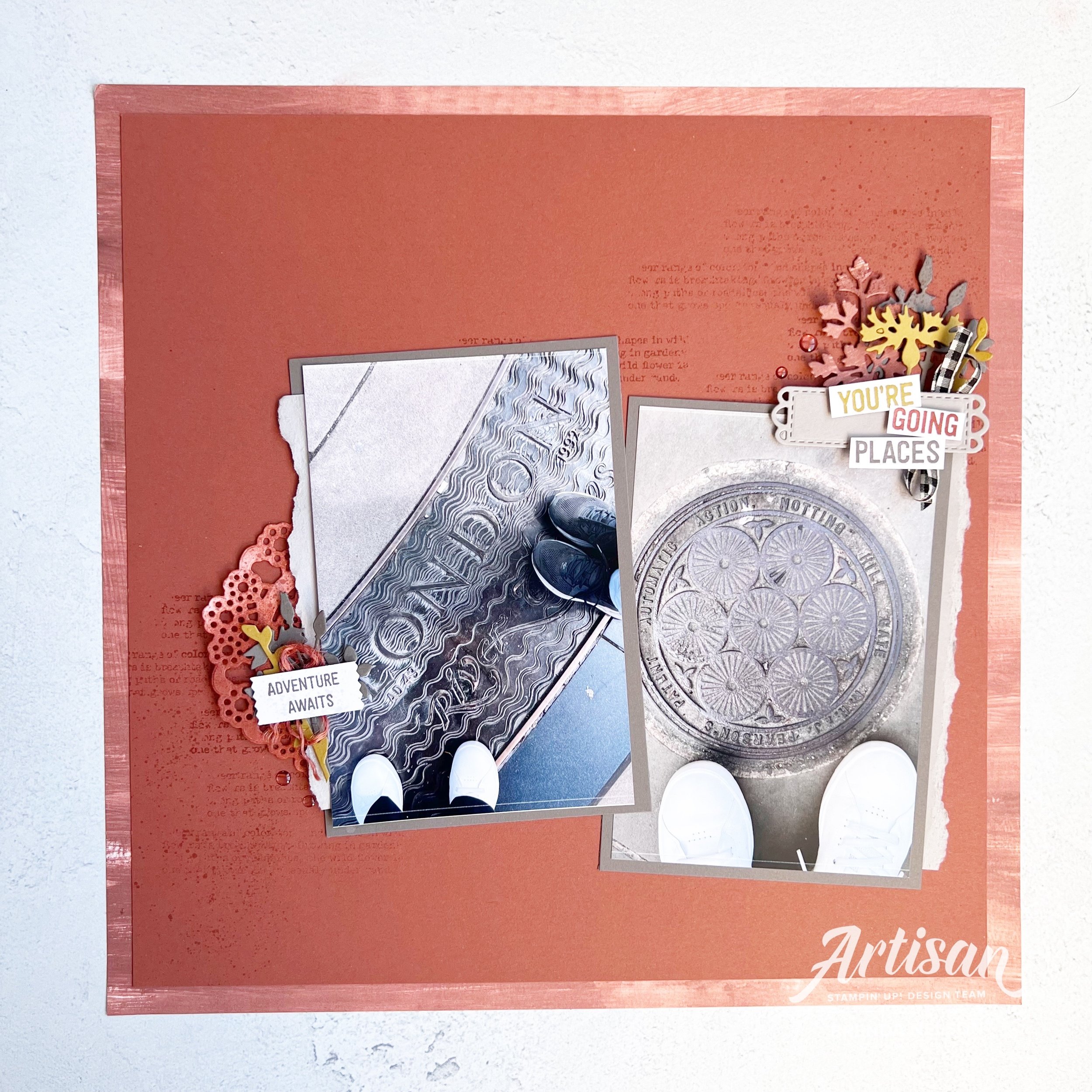
Whenever I travel I like to snap pictures of our feet with cool things underneath and I decided to scrapbook two pictures from our recent trip together!

The first picture on the left side of my scrapbook page is taken just outside of the London Tower and the second is in the Notting Hill area (no I did not run into Julia Roberts or Hugh Grant, but wouldn’t that have been amazing?).

I started with a base 12x12 DSP from the Fresh as a Daisy collection. I love how this collection of DSP features all of the new In Colors. I added a layer of Copper Clay card stock over top and I did some background stamping using Quiet Meadow stamp set and a bit of flicking with my Copper Clay Stampin’ Blend.

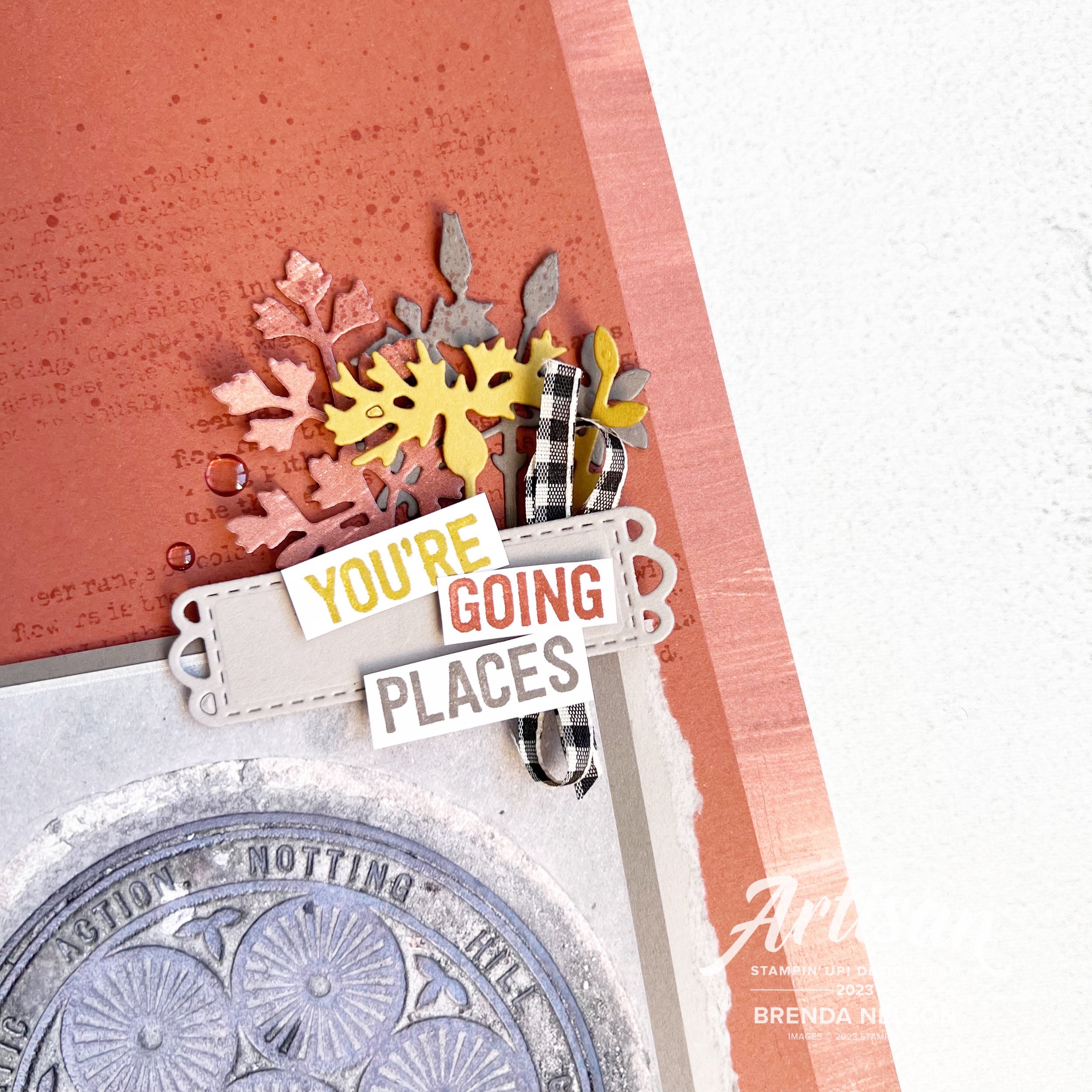
Because I was creating this page solely for myself, not a class or scrapbook group meeting, I took liberty to use retired stamp set En Route. I love any of our stamp sets that have to do with travel or adventure. I rarely part with them and used it for the 2 sentiments on my page.

I though the sentiment “You’re Going Places” worked well with our theme of taking a walk—it probably is the most common way to get places isn’t it? I also find it intriguing to be in another county, one with so much history like Britain, and ponder the thought of how many people in the course of history have stood right here? Have walked this same path. It makes you feel very small in the scheme of things.

I love the dies from the Quiet Meadow and I hadn’t use them in a while so I decided to incorporate them into this layout. It was May when I visited so I few florals felt necessary with the moody colors of Copper Clay and Pebbled Path (the photo mat card stock color). These colors remind me of London, old brick and concrete and metal.

also…notice my fresh white shoes? they did not look like this at the end of this trip!

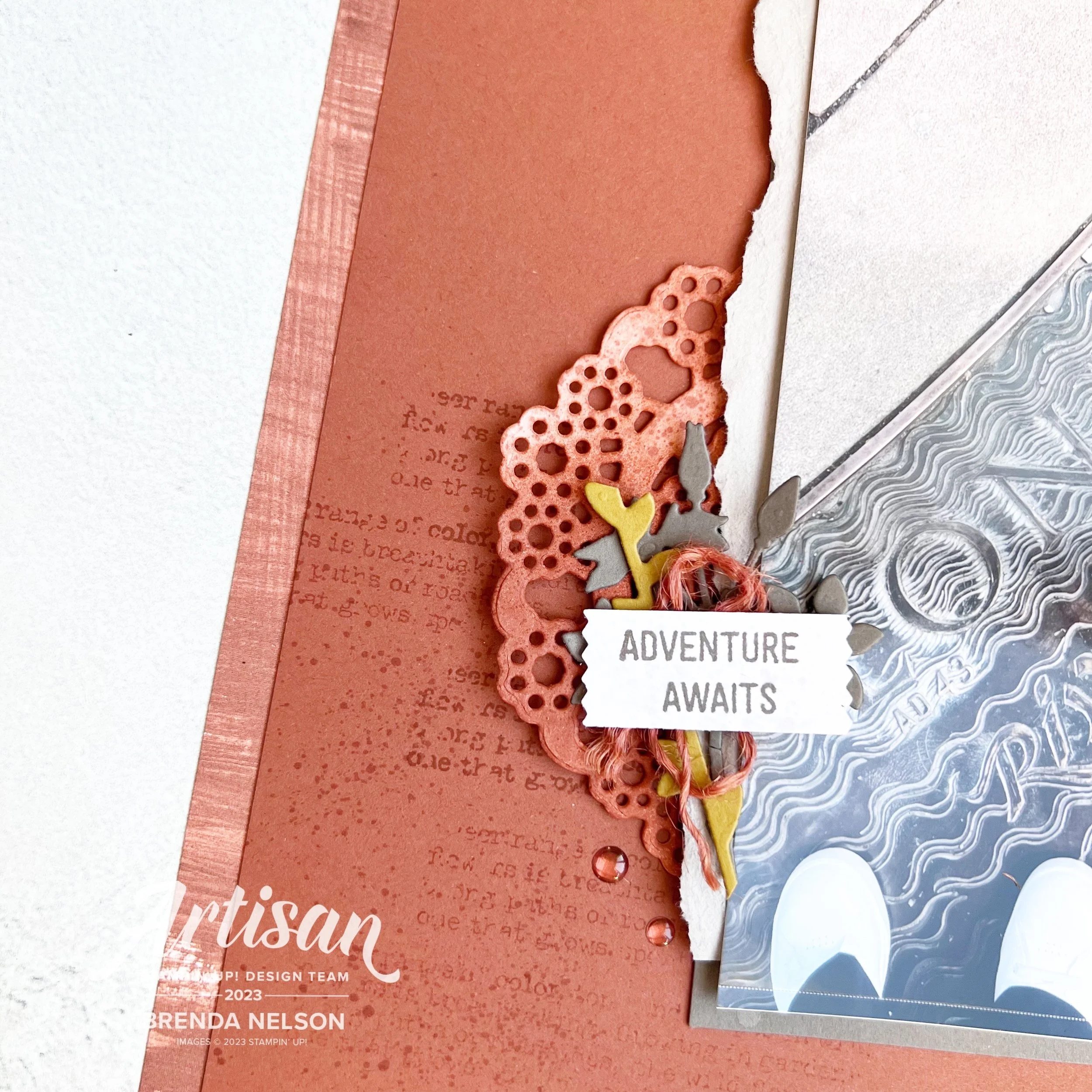
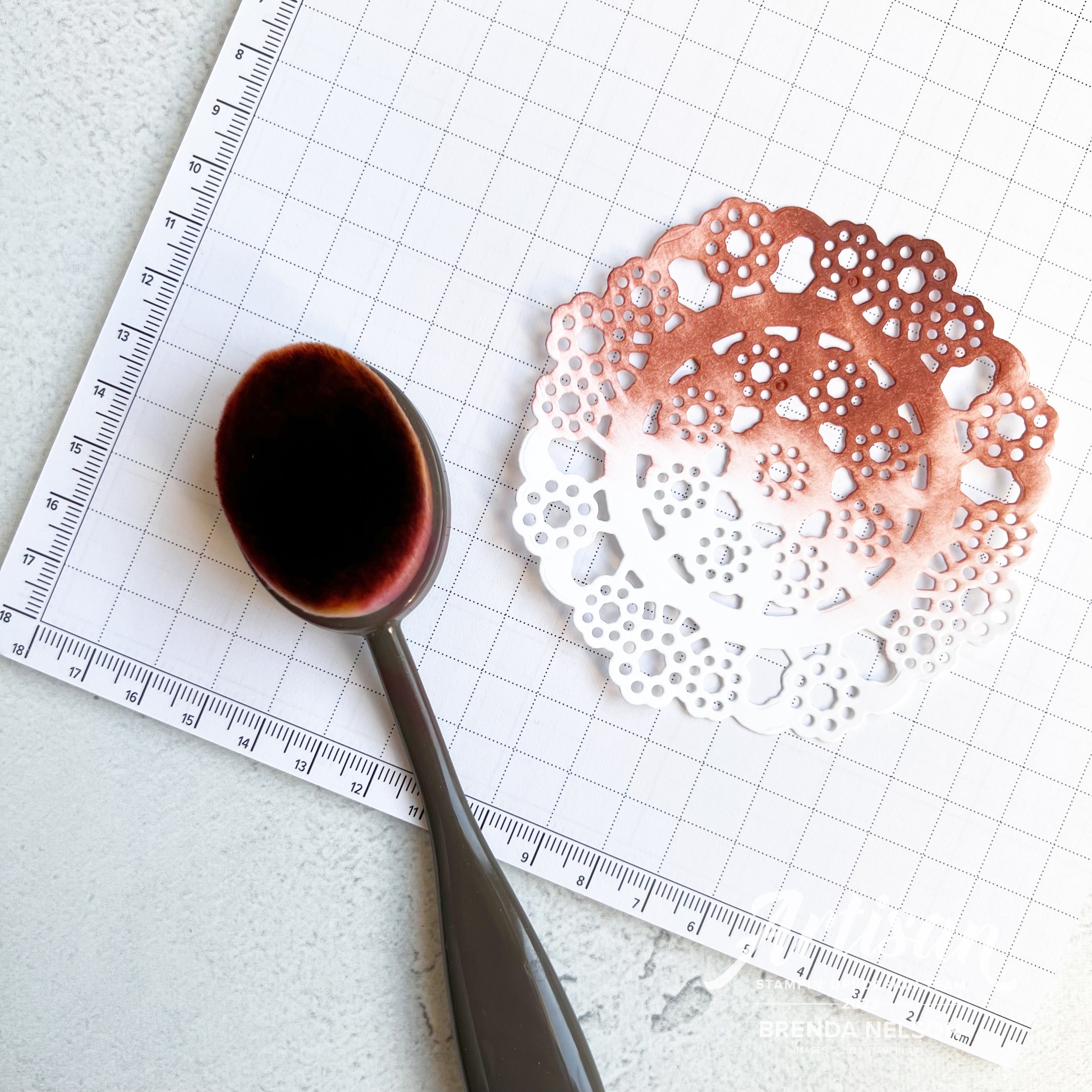
Now let me share a product you didn’t know you need—the Delightful Doilies Hybrid Embossing Folder and Die Bundle—particularly the DOILY DIE. Now who has been around long enough to remember when we sold doilies? I still have some. I greedily hoard them. I don’t need to anymore because now I can cut my OWN and make them ANY COLOR I want!

See, I told you!! You just discovered that you need this bundle!

It is so easy to color your Basic White card stock with our Blending Brushes. I trimmed the doily in half (why waste, you are only seeing a partial of it anyway) and I will keep the rest for another project.

I used one of my favorite punches of all time, the Washi label punch, for the sentiment “Adventure Awaits”…truly, it always does. Even in our every day lives! I added some of the Copper Clay twine that I unravelled and did a little spray of Smoky Slate marker over top of the sentiment.

I added a few Copper Clay embellishments and my page was complete. This actually didn’t take me too long to put together either! I hope this Blog Hop inspires you!

Thanks for stopping by today and make sure to go and visit all of the amazing designers from around the world on our hop! I am so excited to see how everyone thought of this challenge.


Next up on the Blog Hop is Tricia Butts in the United States!

Please feel free to leave me a comment, I would love to know what you think of my page!

Here are all the participants in our Blog Hop this month!

Jan Clothier - AU

Leonie Stuart - AU

Rochelle Laird-Smith - AU

Cheryll Miller - AU

Danielle Kassing - NL

Aurélie Fabre - FR

Mikaela Titheridge - UK

Annette Ball - CA

Angie McKenzie - US

Kelly Taranto - US

Shel Anderson - CA

Sharon Hashimoto Burkert - US

Chris Smith - US

Brenda Nelson - CA

Tricia Butts - US

Theresa McEntee - US

Bree Renwick - US

Lori Willcox - CA

Teri West - US


Color Fusers--September--Hello fall!

Hi friends! Welcome back to another Color Fusers Blog Hop! I am happy to be back after taking a little hiatus last month! Sometimes we just need to recharge our creative batteries! I am happy to be back crafting, especially this month, afterall, I do love fall most of all!

NOTE; I have made a boo boo and created a project using the August colors (the month I had skipped) so everyone else in the hop is creating with LOST LAGOON, BLACKBERRY BLISS AND BERRY BURST! You will love what they have made, I am just the odd one out this month!

The team this month is creating with Pebble Path, Boho Blue and Misty Moonlight and while these are gorgeous colors with 2 of 3 being from our new In Color Collection 2023/25— they are probably not conventional ‘fall’ colors. However, that didn’t stop me from creating a scrapbook page!

I new I wanted to start with Pebbled Path as my base. I really really love this color and I am already sad knowing it will only be here for another 18 months! In my opinion it could replace Grey Granite in the Neutrals!

The Let’s Go Fishing DSP was another natural choice for this layout as I knew it had some coordinating patterns that would work well for my layout. I used a stripped piece featuring Pebbled Path and they layered my card stock over top. I added a photo mat and the letters ‘FALL’ using a wood grain pattern in Misty Moonlight. The letters are from the Alphabet A La Mode dies—a definite #addtocart item if you have not already! I also used the Foam Adhesive Sheets so that my letters are raised up on my scrapbook page.

It was a happy coincident that we happen to take some family pictures a few years back that happen to coordinate with this months color palette. Our photo shoot was in October as well so everything lined up well to design a fall themed page

There are also only 2 sets of legs that haven’t grown in height either since this picture was taken! hahaha!

I used the new Autumn Leaves Bundle as the main focus of this page. I love this big bold maple leaf image and how nicely it stamped onto the background of my page. I used my Blending Brush with some Pebbled Path ink around the edges of my page and flicked my dark Stampin’ Blend over top of the stamped leaves.

I used 2 of the smaller leaf dies from the set to cut out leaves in Boho Blue, Misty Moonlight and Pebbled Path. I ran half through the new Distressed Tile 3D folder to give them a bunch of texture.

You can find the sentiment ‘A Harvest of Blessings’ in the Pick of the Patch stamp set. I thought it was the perfect addition to this page especially with a little bit of the Pebbled Path Textured Ribbon underneath.

TOP TIP: If the ribbon is to wide, simply cut it in half to fit your project!

You can find ‘October’ in the Days to Remember stamp set—every memory keeper needs this set as a permanent addition to their repetoire!

Lastly I added some of the In Color Dots in Pebbled Path and Boho Blue onto my page. They are a great finishing touch. I am really really pleased with how this page turned out and I hope it inspires you to think outside the box with your designs.


I can’t wait to see what the rest of the Color Fusers Team has created! I know you will be amazed at the variety of things you can create with THREE colors! Next up on the hop is my amazing friend and former Artisan teammate Tami Hewlett. I am always blown away by what she creates!

If you would prefer to go in reverse or we experience a broken link you can go back to Stacy Marsh—another uber talented demo!

Be Inspired Blog Hop--Friends & Family!

Hello friends! I am so happy to be back after taking a little creative break last month! I could not resist this awesome theme of Friends & Family!

Do you ever find that you are using a color or color palette on repeat? For me the past few weeks its been Fresh Freesia—I mean, seriously, the color goes with EVERYTHING! I even found myself buying some Fresh Freesia inspired running shoes!
I decided to make a scrapbook page that features a picture of one of my fav friends who was up in Canada for a visit this past summer. The last time I saw her was when I went to visit right before Covid! I flew home to Canada on a Monday and on Wednesday they made the announcement that if you arrived back that day you would have to quarantine for 2 weeks. Doesn’t this all seem like a million years ago? So its been a LONG TIME coming for a visit and I am happy we got to have one this summer! So of course I had to make a scrapbook page for our Friends & Family themed blog hop this month!

This is my and my buddy Brett enjoying a coffee together and a canadian coffee house!

Was I the only one who stockpiled the Dandy Designs 12x12 paper? I absolutely LOVED the color palette of that paper collection and its perfect for scrapbooking!

I started with a Fresh Freesia pattern and then added a layer of Fresh Freesia card stock over top that is trimmed to 11 1/2 x 11 1/2. I had recently made a different card project with some triangles and that inspired me to cut our 6x6 DSP (here I used 4 colors from the Subtles Family—Highland Heather, Fresh Freesia, Petal Pink and Bubble Bath) into a triangle. Its such a cool way to layer DSP on a page and to think about using this paper size in your scrapbook designs!

I love the flowers in the Darling Details stamp set. I stamped them here with Pebbled Path ink (a nice alternative to Momento) and colored them with coordinating Stampin’ Blend colors. I used the Darling Details dies to cut out some floral images from the set with the Vellum Basics. I love to use vellum on scrapbooking projects. I decided to use Highland Heather as my photo mat as its the color furthest away from where I was placing my photo and it helps to tie in the DSP and the photo mat by anchoring them on each side of the layout.

You can find the sentiment “Fabulous Friend” in the Bold Bouquet stamp set. I trimmed it down from its original format and added a bit of Linen Thread behind. I added a few retired gems as well, because, Why Not? Why am I hoarding things…

One of my favorite dies is the heart from the Radiating Stitches Dies—these are an Online Exclusive. You definitely need #addtocart if you do not have these dies! The little tiny ‘love’ is from the Best Family Ever stamp set. It has such a great collection of descriptive words, it is really a set worth having in your long term collection.

‘Oh, Happy Day!’ can be found in the Kindest Expressions stamp set. This is a fabulous set for memory keeping because the sentiments are oversized which I love. I cut it out with the Stylish Shapes Dies—another craft room must have!

I hope this page encourages you to pull out some of your 6x6 paper in your favorite color combination or give this one a try:

Highland Heather, Fresh Freesia, Petal Pink and Bubble Bath!

I would love to see what you can come up with and I am excited to see what the rest of the team created with our them of Family & Friends. Make sure to ‘hop’ all the way around and please leave me a comment! I really look forward to them. And if I have inspired you to order anything, please consider using this button to shop with me!

Up next on the Hop we have my amazing former Artisan teammate Janneke! I know you will love what they have created!

I hope you visit everyone on our blog hop and please feel free to leave us some encouraging comments! I love to know what you think of my projects! And if you are not following me on Instagram, please do @stampwithbrenda

Creative Convention--Day 6!

Welcome back friends! I hope you are enjoying everything I am sharing so far! I have had some much fun preparing all of these “Creative Convention” project ideas for you in anticipation of the new upcoming Holiday Catalogue! We are getting so close to the happiest time of year (which is my world is Sept-Dec!)

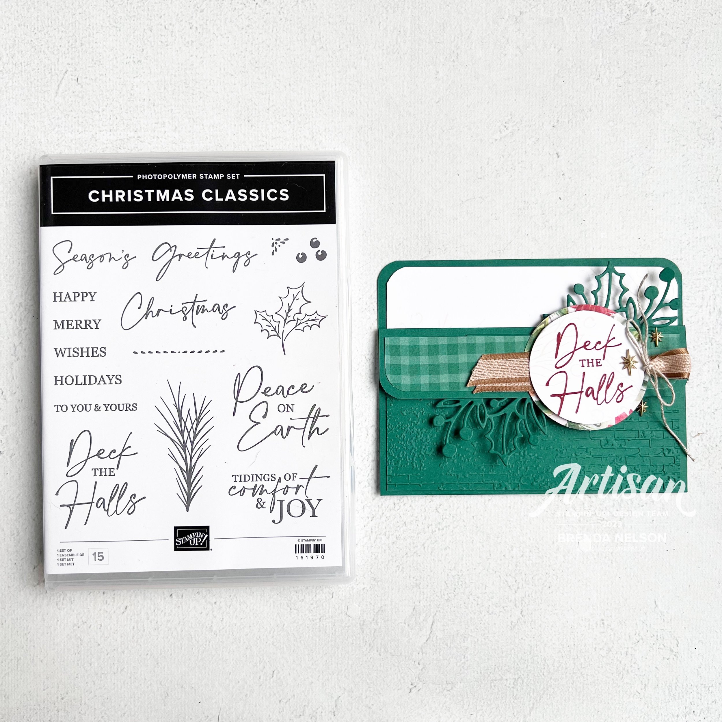
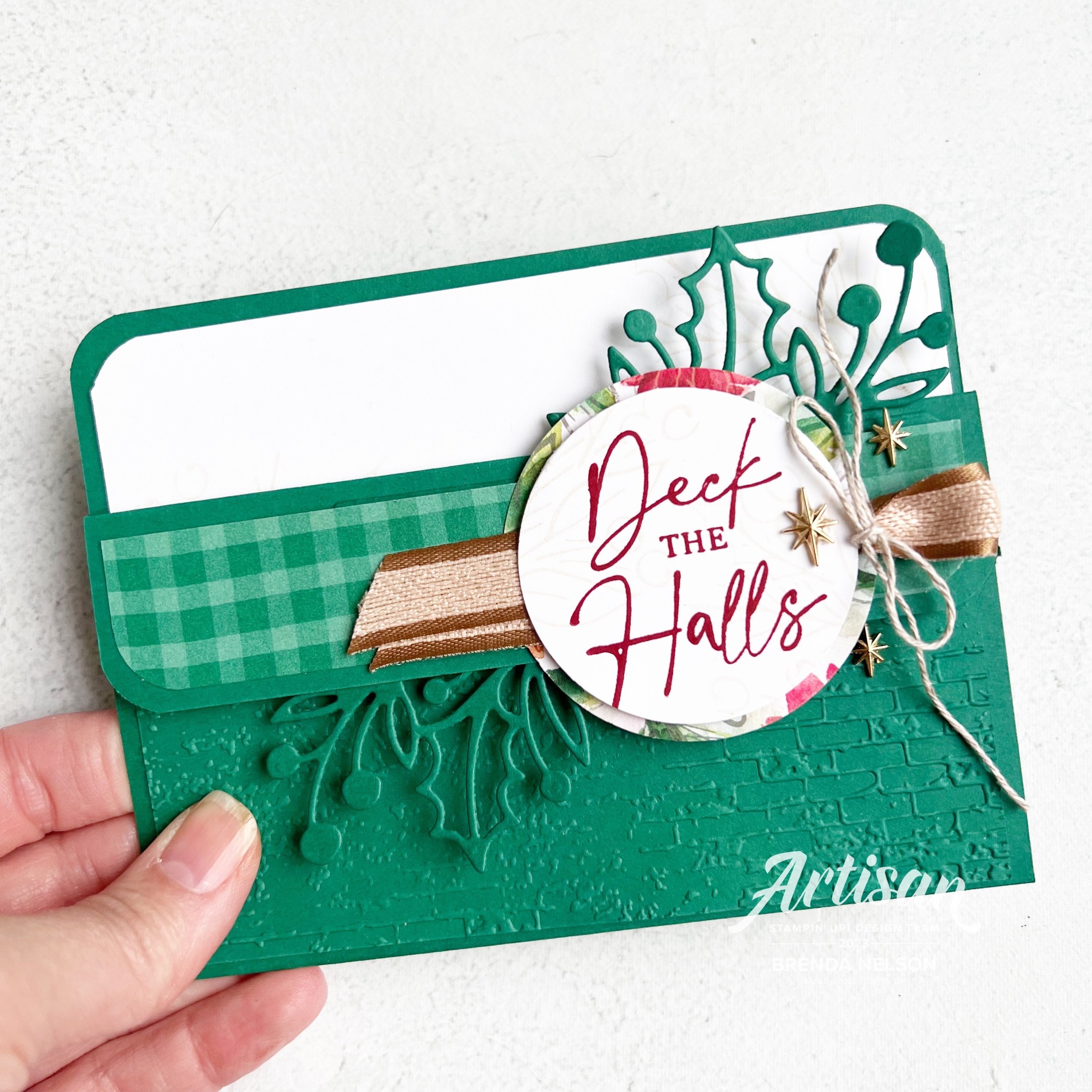
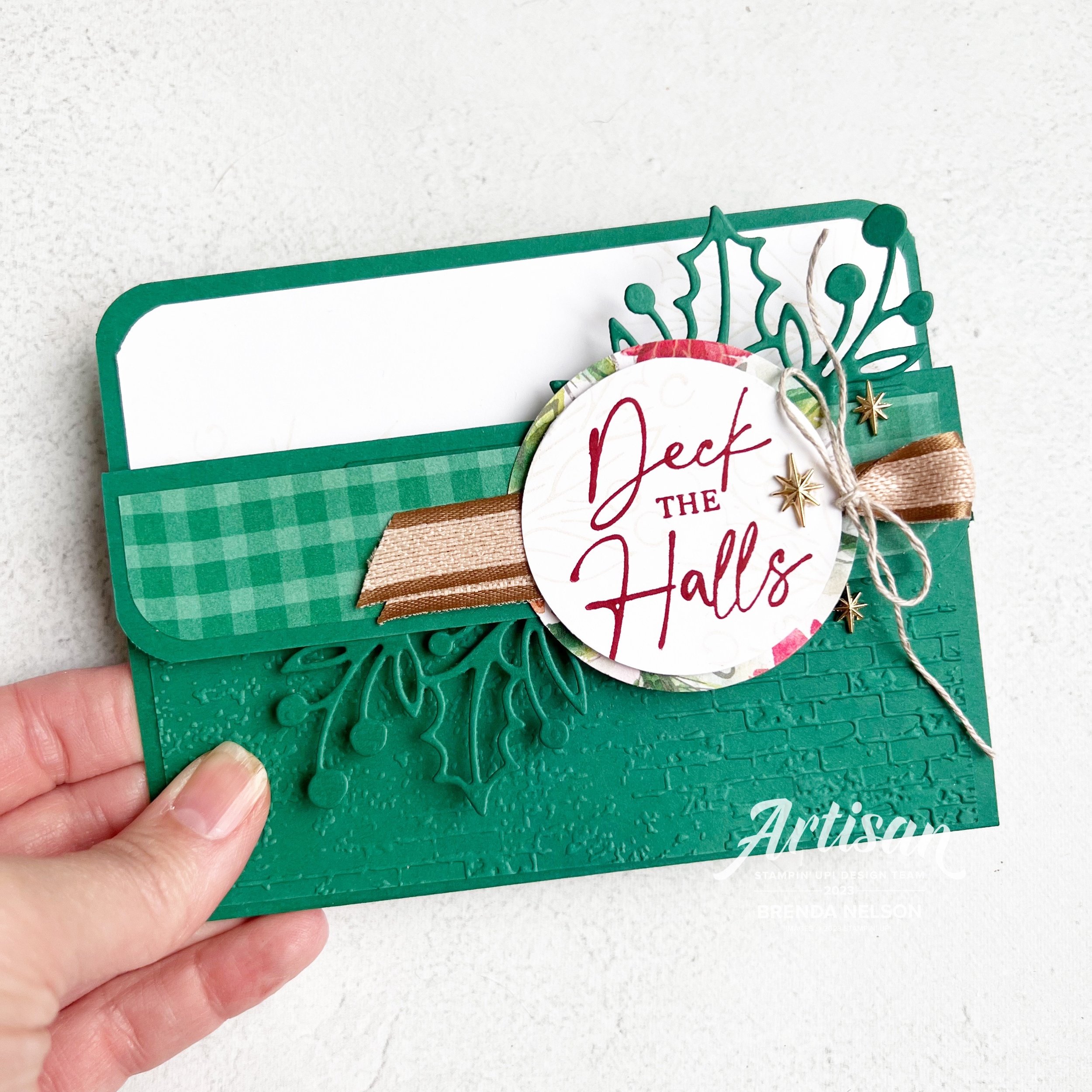
My project for today is a card with a fun fold that I make EVERY SINGLE YEAR! Its just one of my go to favorites as its a great way to give a gift card inside or hide some money or even a flat little chocolate.

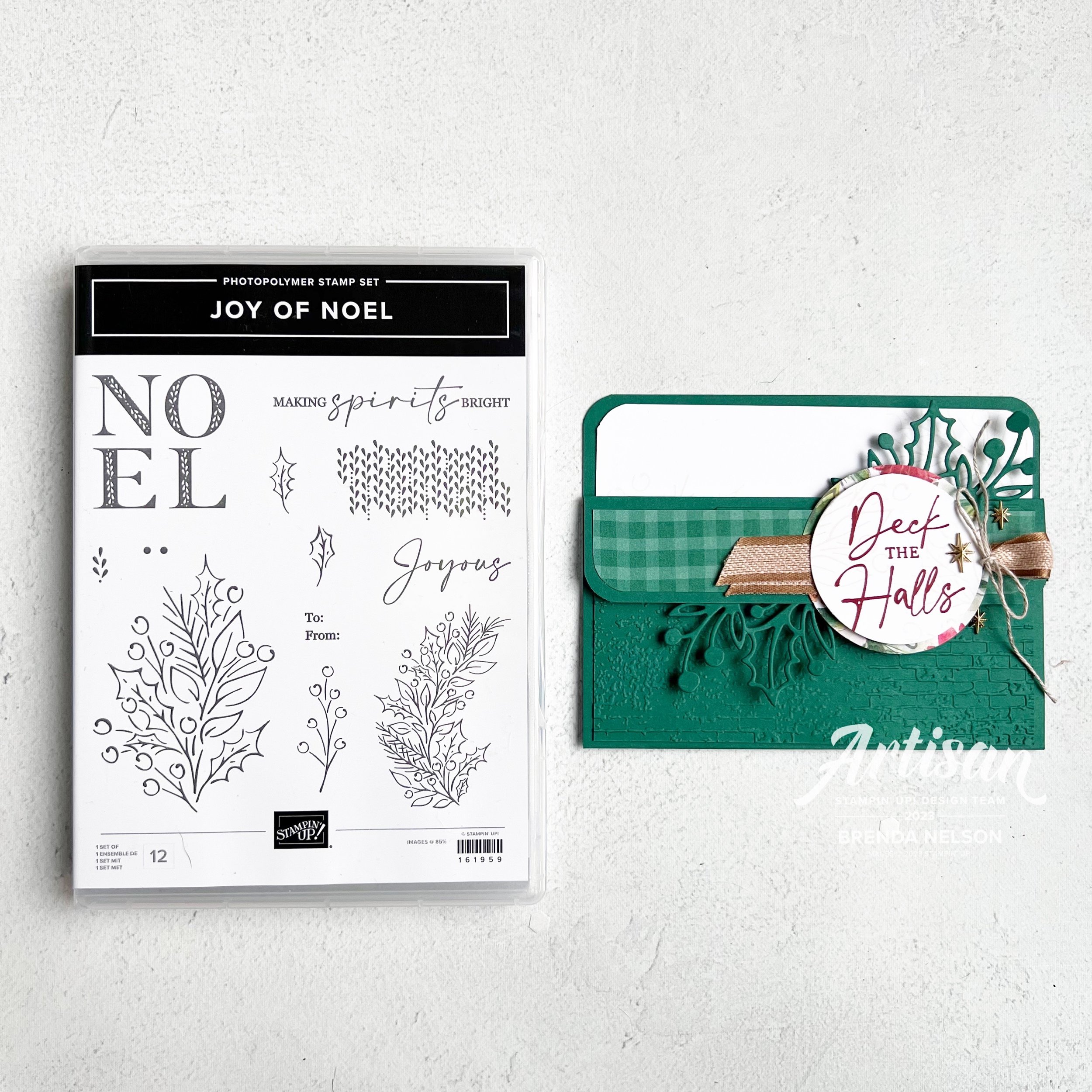
This project is a combo one that uses both of the stamp sets from the Joy of Christmas Suite collection!

I love how these bundles work together so that you can build off of each one of them and I do appreciate the traditional aspect of this suite. I knew I wanted to add the Shaded Spruce gingham pattern from the Joy of Christmas 12x12 paper so I decided to make the card base the same color.

This is a standard card that is scored at 4 1/4, and then you score one side at 1 1/4 to make the flap that folds down creating the ‘pocket’. I also rounded the pocket on the flap and base for a little extra touch.

I added a 2 1/4 x 5 1/4 layer of Shaded Spruce that I ran through the Exposed Brick 3D folder in the annual catalogue—if you do not have this folder you need #addtocart now as its awesome and works with SO MANY things!

Both the Joy of Noel and the Christmas Classics stamp sets are a part of a bundle and the Christmas Classics dies have all the labels and some greenery, while the Joy of Noel dies of the word ‘Noel’ and some larger greenery. I am going to say that you will just need them both, hahaha!

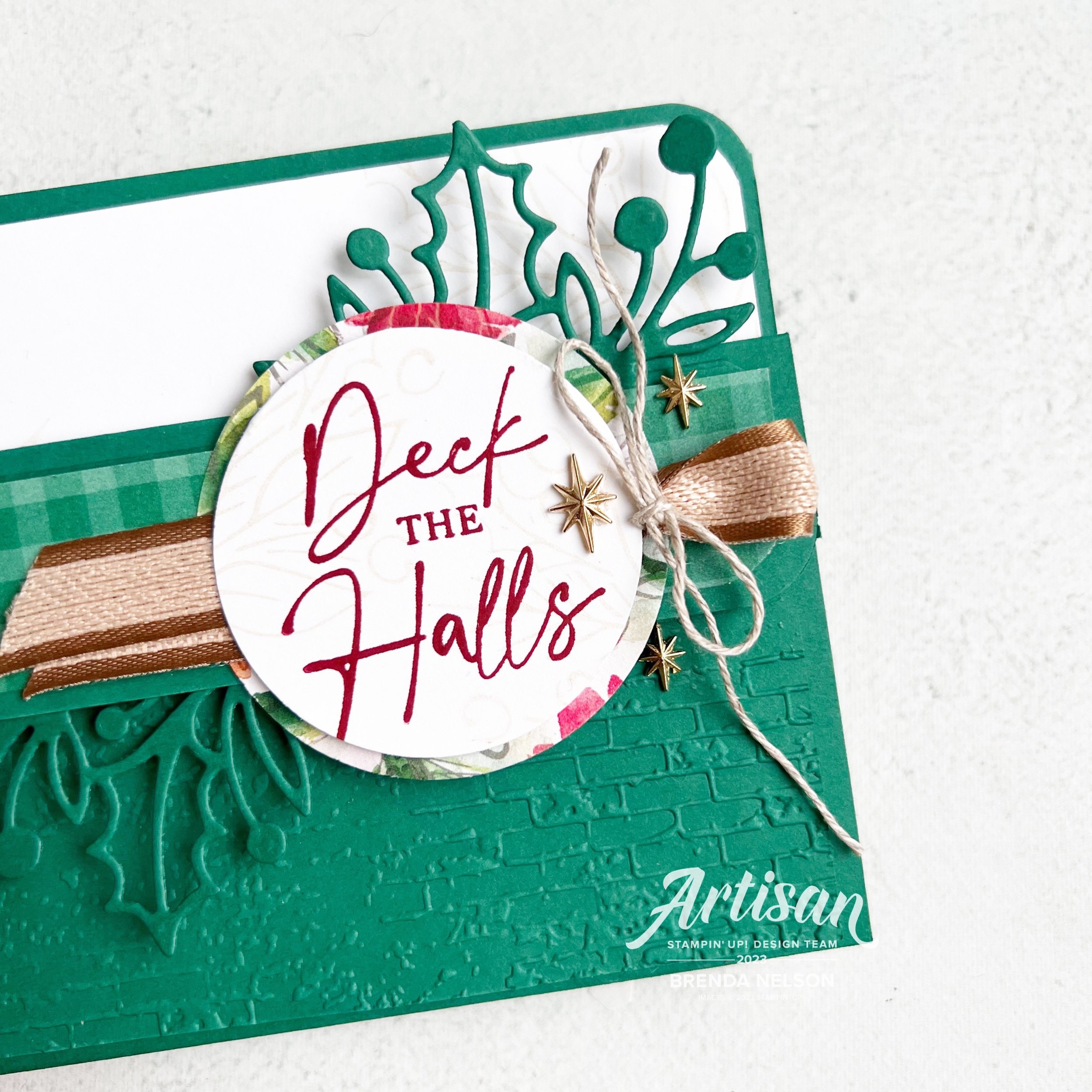
The fun part of this card for me is the greenery that you see emerging from the top and bottom of this fold. I die cut this shape, which is really designed to be a label with the greenery and I cut it in half!


I then tucked this greenery under the DSP on the right and under the flap more in the middle leftish.

I sealed the card with 2 staples that you don’t see, to make the pocket. The I sealed the flap down with some Dimensionls.

Sometimes to keep the card closed I will use twine or ribbon. However, this time I wanted the Pecan Pie ribbon to be more of an accent in between the layers of my sentiment.

The sentiment is stamped in Cherry Cobbler and then I used one of the large images from the Joy of Noel set to stamp some imagery behind the sentiment. I used Crumb Cake ink that I stamped off on my scratch paper (or grid paper) so that it would be faint. I added the sentiment onto of a 2 1/4 inch circle of DSP to bring in a few color just peeking from the outside ring.

Lastly I added some embellishments, Adhesive-Backed Star Trinkets, from the O Holy Night suite. I thought they were a more unique touch to this project than just a gold sequin or such.

I am really really pleased with how this card turned out and I will no doubt be sharing it at my upcoming ‘Joy of Christmas’ Virtual Stamp Camp/Retreat.

Joy of Christmas Stamp Camp —co hosted with Tricia Schaelow from @stampint—if you are not following her, please do!

When: Saturday, Oct 21 at 10:30 am on Zoom (which is awesome as anyone from Canada can join in the fun with us)

Fun Stuff: The stamp camp is $75 and includes everything you see below —Joy of Noel stamp set, full roll of Black & Very Vanilla ribbon, and half a pkg of the Joy of Christmas 12x12 paper PLUS a special guest demonstration from my friend Julie @thepaperhaven and 6-8 make’n takes! These won’t be your ordinary make’n takes either—they will be a mix of 3D, holiday decor and cards!

Registration closes on Sept 30th for this event and your kit can be shipped anywhere in Canada at your expense! Please reach out if you are interested in registering (one of these days I will figure out how to take payment through Squarespace!)

I have one more project to share with you tomorrow as a part of my ‘Creative Convention’ weeklong extravaganza! I hope you will come back and please feel free to leave any comments!