Father's Day Projects!

Hi friends! I wanted to share a really adorable Father’s Day project that I designed for a recent kids class! We had so much fun putting everything together and I know the lucky dad’s will be truly touched by this gift!

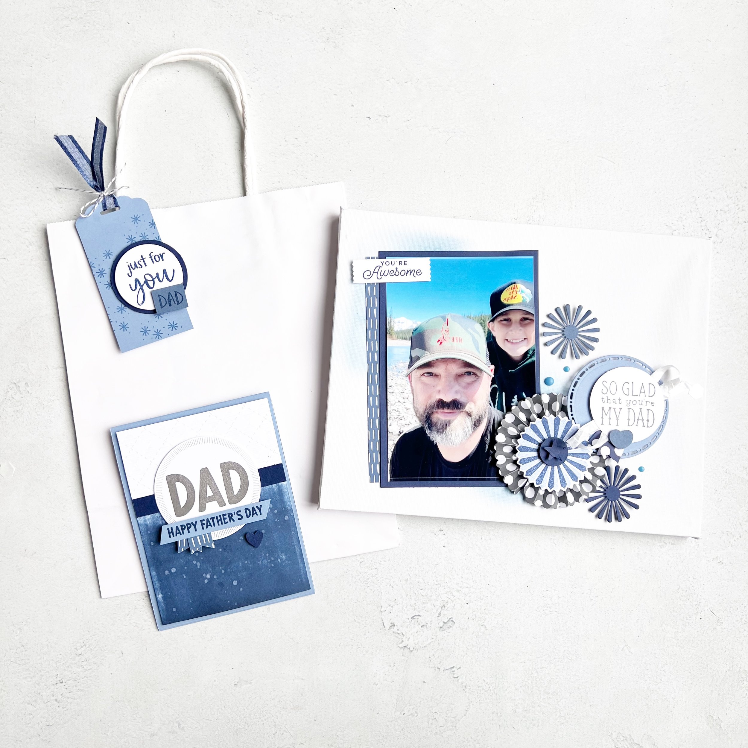
Of course you need to make things a ‘gift set’ right? We have our fun project, a coordinating card and tag for our gift bag! I do love matchy matchy stuff and its always so easy with Stampin’ Up!


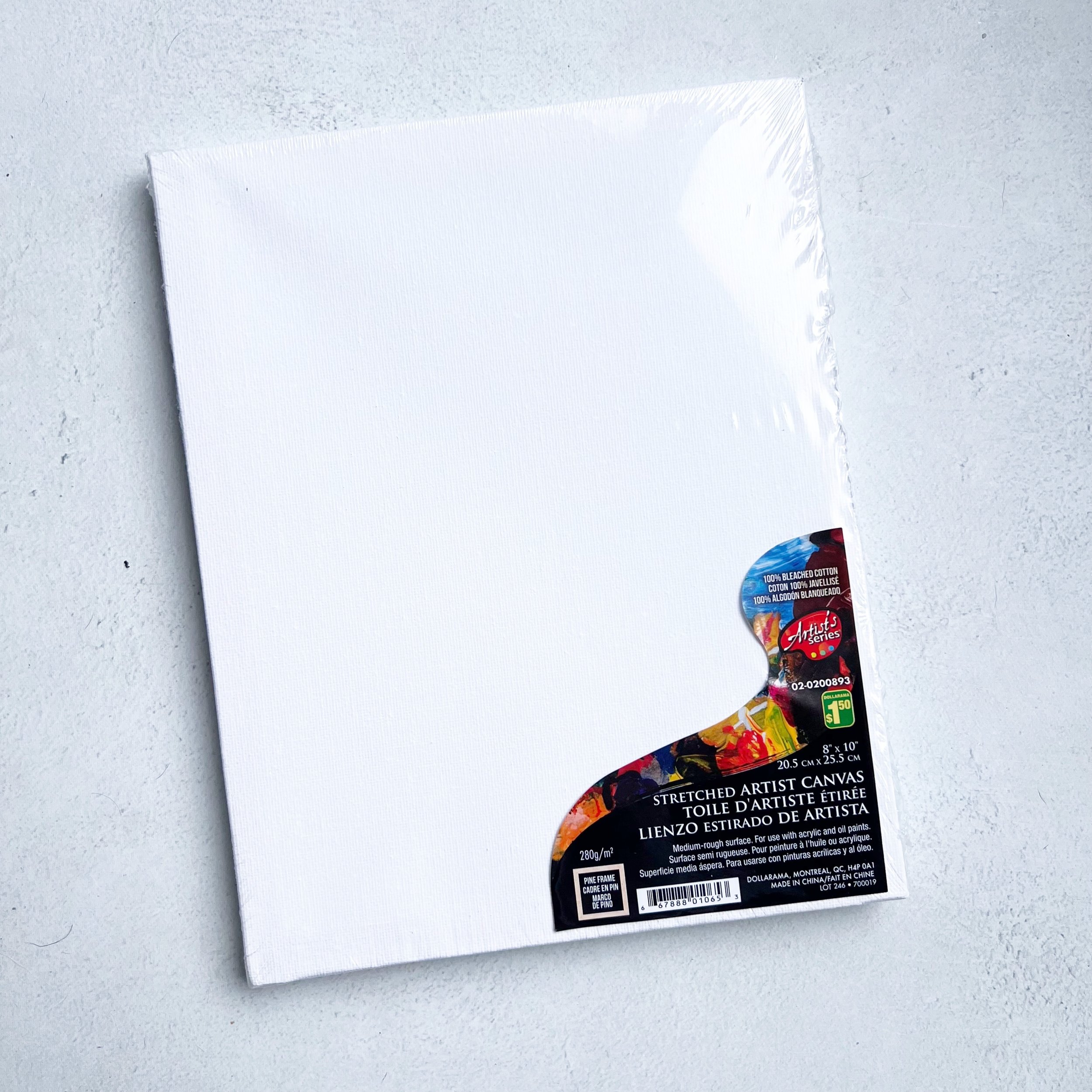
I started with an inexpensive canvas that I got at our local ‘dollar’ store.

I did a bit of ink blending with Boho Blue and a Blending Brush on the canvas around the top left and bottom right of where my photo was going to be placed.

I used a cute 4x6 picture of my youngest son and his dad on a Night of Navy base. I love the combination of Boho Blue, Misty Moonlight, Night of Navy and Pebbled Path! It worked so well on this project!

I added a little strip of Misty Moonlight DSP along the left side of the picture and used a Pebbled Path piece to create the rosette. I am loving the Round We Go bundle! The rosettes are pretty easy to assemble and make this project come to life!

The sentiment ‘So Glad You are My Dad’ is from the Gone Fishing stamp set and ‘You’re Awesome’ is from the retired Circle Saying Stamp set. I also used the Encircled in Nature Dies as well to layer ‘So Glad’ in Boho Blue.

I think this project turned out so adorable and you could modify it for any occasion like a birthday or celebration (think Grad or even a wedding shower!).

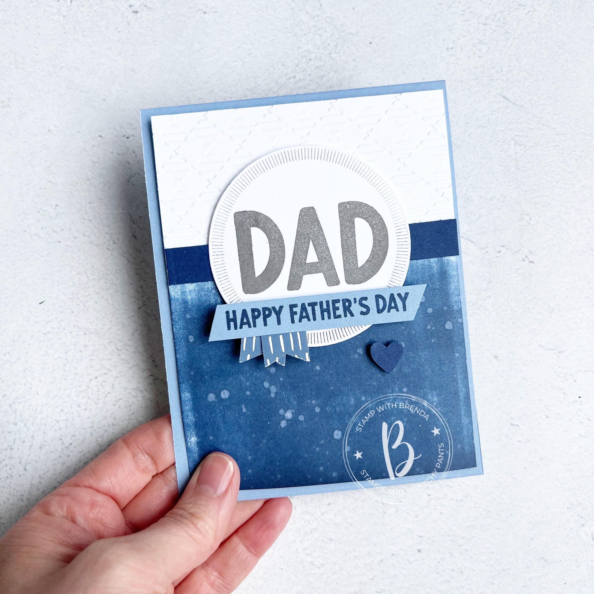
And of course we have a coordinating card and I used our new Brayer for the first time on the bottom section! I inked it up in Night of Navy and brushed it over Basic White card stock, leaving a section at the top to run through an embossing folder. I used a strip of Night of Navy card stock to hide where it was uneven and to create separation between the two section.

I used our Water Painter to flick water over the inked section so the water droplets would ‘remove’ some of the ink. It basically happens on contact and is pretty cool technique.

The Trusty Tools stamp set was perfect for the front and inside of the card. ‘Dad’ is stamped in Pebbled Path ink on another shape from the Encircled in Nature Dies and ‘Happy Father’s Day’ is on Boho Blue in Night of Navy ink.


I decorated the inside of the card as well with a little strip of DSP and ‘You’re the most Awesome’ from Trusty Tools. The frame around the sentiment is from the Labeled with Love Bundle.

I think this is such a fun gift to give Dad and I loved how all the kids had their own creative spin on how to assemble the project! As you can see from the smiles below I think they really did enjoy putting things together!

Please feel free to shop my store or DM to place an order if you are inspired by this project! All of your support allows me to continue to ‘love what I do’!

Color Fusers--June--New In Colors!

Hi friends! I am so excited to be sharing a project, a scrapbook page, with the new 2024-2026 In Colors! I am absolutely in love with this new collection—I dare say, its my favorite yet! Definitely in the last decad!

I new I had to make a scrapbook page with these colors and they literally pop off the page when added to a Basic White base. Do you have a favorite of the 5? Mine seems to switch with each new project I create, however, the fact that all of these colors work so well as a family, makes me so happy!

I decided to scrapbook myself, because really—who else is going to do it? I started with a 5x 7 picture that I matted with Summer Sky and then on a larger piece of Basic White that I ran through the Zinnia folder for some texture.

This page is a mashup of some of my favorite stamp sets, past and present! Because I was making this page for myself, to hang in my craft room, I didn’t work about things all being ‘current’. My very first Artisan Assignment in 2021 featured the In Bloom Bundle. It is still one of my favorites! I also used Color & Contour which is retired and the Paper Florist Dies (I was so so sad when they retired them, I will not quit using them!).

I love mixing and matching stamp set and dies and I used all five of the new colors on this layout—either in stamped or die cut form!

Many of these stamps actually have dies, but sometimes I like to just sit in one spot and be creative so I actually don’t use the Stamp Cut & Emboss Machine—gasp!

I like to layer images on top of each other and have things tucked in and behind and right on top of my photo too.

I created a really easy ombre effect on ‘Celebrate’ with my Stampin’ Blends markers which I think makes things a little more interesting. I also used the Everyday Details behind the ‘Celebrate’ to help it pop.

I didn’t want to favor a specific color so I used some of the silver ribbon from the Gold & Silver Trim Combo Pack.

I also stamped a few neutral leaves in Grey Granite so that they almost blend into the background.

I think this layout is one that you can also recreate by mixing up colors, stamp sets and die cuts. I love how the flowers frame my photo making it the feature of my page. I never think your picture should compete with the elements on your scrapbook layout.

I can’t wait to see if the rest of the Color Fusers team focused on a specific color or created a project that combined all of the colors like mine. I am so happy with how it turned out and I am excited to have it up in my craft room.

Up next on the Hop is Janneke, a former Artisan teammate! I know you will love what she has created.

If the hop links get broken or you want to go backwards, you will be visiting another former Artisan teammate, Tami’s blog! I love everything she makes so I know you will be inspired too!

If you are inspired by my design and need a few things, please hit #addtocart by shopping my online store! I would love to keep doing what I love!

Be Inspired May--Monochromatic!

Hi friends! Welcome to another Be Inspired Blog Hop! This month our theme is ‘monochromatic’ which I have decided to use the 5 NEW In Colors to create 5 monochromatic cards with! This is something that I do every new year when we get our new color options!

I just love when we have new colors to play with, which is why I could not wait to make a batch of cards using our 5 new colors:

—Peach Pie

—Shy Shamrock

—Summer Splash

—Petunia Pop

—Pretty in Pink (if you have been stamping a while you might have thought this color name sounded familiar and you would be right—it was a core color many years ago!)

This is my take on monochromatic! I created one card featuring each of our new colors—repeating the same design and only using Basic White as my neutral element.

I wanted these card to have a bit of a ‘technique’ to them so I used the ink pad swiping technique. You simply drag your ink pad from the top to the bottom of your card stock. Each attempt with look a bit unique as well as you can see in my 5 cards. Don’t apply too much pressure when you are dragging, you want it to look like a swipe! That is part of the charm!

Each ‘monochromatic’ card has the same base elements—card base matches the color of choice, a die cut from the Spotlight on Nature Dies, which are a definite #addtocart item!

A die cut using the new Flowers of Beauty Dies, a sentiment and stamped flowers from the Labeled with Love stamp set, white Bakers Twine and a little bit of the In Color Glimmer Paper and In Color Shimmer Gems!

Once you have your initial design done, its so easy to create a batch of these fun monochromatic cards!

I added a bit of background stamping on top of the ink pad swiping as well as you get that tone on tone look which is really fun.

If you look close at the die cut image you can see that each is cut from the new 6x6 In Color DSP stack—this year they also changed up the patterns on the paper as well. So each card has a bit of different look to the die cut depending on the pattern that was used.

I really enjoyed putting these 5 cards together—I think the little strip of Glimmer Paper underneath the sentiment helps it shine a bit too! And everything is better with glitter—right?

I can’t wait to see what the rest of the design team created and their unique interpretations of ‘monochromatic’! I can’t even pick a favorite version of the cards above because each of our new 5 In Colors are so amazing. They look fabulous together and work so well with our existing color line up!

You can click on the ‘NEXT’ button to see what the amazing Artisan Design Team member, Maheswari, has designed this month!

And if you are inspired, please consider shopping my online store so I can continue to LOVE WHAT I DO :)

Color Fusers--May Color Challenge!

Hi friends! Welcome to another fun Color Fusers Blog Hop! We are so happy you are here. Each month our Blog Hop team creates projects with our monthly color challenge—sometimes it really is a challenge! But its a fun way to create with a color combos that are unique and different, and this month is no exception as we are crafting with Pebbled Path, Bubble Bath and Moody Mauve!

This past weekend was National Scrapbook Day so in honour of that, I have created a scrapbook page with this color combination for May.

I won’t lie, I actually found this a tough color combination as Moody Mauve isn’t necessarily a color I gravitate too.

I started with Bubble Bath as my base and I traced a paper plate with pencil onto the middle of my 12x12 page. This gave me the ‘cicle’ shape to use as guideline for my design.

Isn’t this a cute picture of Hawkins? I came across it recently and I thought it was pefect for this page

My picture is matted on Pebbled Path and offset to the left. From here I did some stamping to poke out from underneath the picture following the circle that I traced. I added a little tab of Pebble Path ribbon at the top of the picture and a scallop border along the edge.

I cut ‘My Bestie’ out with the Alphabet a la Mode Dies with a Foam Adhesive Sheet underneath to give them some lift. After that I just started stamping and collaring a variety of flowers to place around my traced circle, erasing the pencil as I went.

I used a combination of dies with card stock and DSP to help create my page. I even pulled out some retired heart embellishments that I have been hoarding!

I really love the design of this scrapbook page and I will probable recreate it with a different picture and color combination in the future. YES! I often use my own pages for inspiration, especially when I am feeling stuck. Plus, I have 3 kids—so eventually all of these pages will be divided up amongst then, so why not use a design you love more than once?

The stamp sets I used to create this layout were:

  1. Flowers of Beauty

  2. Textured Floral

I found that they worked really well together!

I can’t wait to see what the rest of the Team has created with Bubble Bath, Moody Mauve and Pebbled Path this month. I do know that you will find lots of inspiration throughout the blog hop. Next up you can visit former Artisan Design Teammate, Janneke, to see what she has designed. Just click on the link below:

If my scrapbook page has inspired you, please consider shopping my online store to help me love what I do!

Be Inspired April--Anything Goes!

Hi friends! Welcome to our April ‘Be Inspired’ Blog Hop! The theme for this month is anything goes, so I decided to share one of my favourite new product suites—A Little Latte Suite!

I think this suite is super fun for creating cards, but I was more excited to actually create some scrapbook pages! I have a TON of Starbucks selfie’s of myself (and no one is going to scrapbook ME, so I need to be on it!) that I want to capture as a paper legacy.

I started with a base of Early Espresso 12x12 and layered a really fun strip of DSP from the A Little Latte collection of papers. I added a strip of Pecan Pie 12x12 that I tore the edge of for some added texture and then a strip of the recently retired vellum in the stripe pattern.

I love how the main piece of DSP has a splatter and swirl element to it.

This is such a great starting point for a layout as you can simply pick any three of our fabulous papers and begin your scrapbook page!

I think it was a happy accident that my winter puffer coat and the wall behind me just happen to be starbucks green! hahaha!

In the awesome Latte Love stamp set you will find this fun coffee splatter stamp so I used it to add interest to my Early Espresso base piece in the matching ink.

My 4x6 photo is on a double photo mat of Pecan Pie and Basic White. And I went a little old school and wrapped some of the Natural Polka Dot Trim ribbon as a band over my photo mats. I added it to my tag as well as a fun tag topper!

The heart is from the Hooray for Surprises Dies which I love so much! I am so happy they will be in our new upcoming Catty in the Encore section.

The tag is created using the Tailor Made Tag Dies and some of the coffee bean print from the DSP. I added ‘Hello There’ from the Latte Love stamp set. I used my Pecan Pie Stampin’ Write marker to isolate that section of the phrase. It is cut with the County Corners Dies.

I thought it would be fun to use the ‘heart’ stamp as an element instead of a coffee cup filler. That is what I love about this stamp set—it has so much potential!

I think the sentiment ‘You’re the Best Part of my Day’ can also be used on a variety of things! I know we all look forward to our daily coffee’s or maybe they are a special treat for you, but either way, I think the sentiment is a really fun addition to this page.

This was a quick and easy page to put together and a design that you can easily replicate by changing up the elements! I hope you will give it a try.

I can’t wait to see what the rest of the Team creates this month for our ‘Anything Goes’ theme! You can check out Janneke’s creation by clicking this link!