Color Fusers--April 2021 Blog Hop!

Welcome friends to another monthly Color Fusers Blog Hop! I love this hop because it really gets me out of comfort zone for color coordination!

This month we are all tasked with creating projects featuring Seaside Spray (which is also retiring), Old Olive and Real Red. I wanted to challenge myself to use these colors to create a scrapbook page!

colorfuserapril.jpg

By chance, I happened to have this photo of my youngest son, laying on my craft table. As soon as I glanced at it and saw our color challenge, I thought it was a perfect fit!

final (8).jpg

It worked so well to use the Real Red for apples with Old Olive green accents and a nice Seaside Spray background. I am really going to miss Seaside Spray. I was a blue that I used quite often. However, the new In Colors are also pretty fabulous too!

I added some large polka dots in the coordinating ink onto the background with the Circle Celebration stamp set. The photo mat is made up of a retired piece of 6x6 DSP in Seaside Spray (from the first round of this In Color), Old Olive and Real Red card stock.


I used the stamp Harvest Hello’s to do most of the design work for me on this page. I stamped the apples in Momento Ink and colored them with my Real Red Stampin’ Blends. You can punch out all of the elements of the apple with the coordinating Apple Builder Punch!

I love this stamp set and it will be a keeper for me, especially because I am nowhere near being done scrapbooking school memories of my 3 kids.

final (9).jpg

I added in the A+ and some Old Olive ribbon from the Ornate Garden Ribbon Combo Pack and a few cute red Resin Hearts to create a fun focal point on the corner of my photo. I love how I was able to tuck a cute little apple up underneath the photo too.

One of my favorite sets from this catalogue was Ridiculously Awesome. I can’t tell you how many times i have used it! It is such a fantastic set to use for scrapbooking!

final (4) 3.jpg

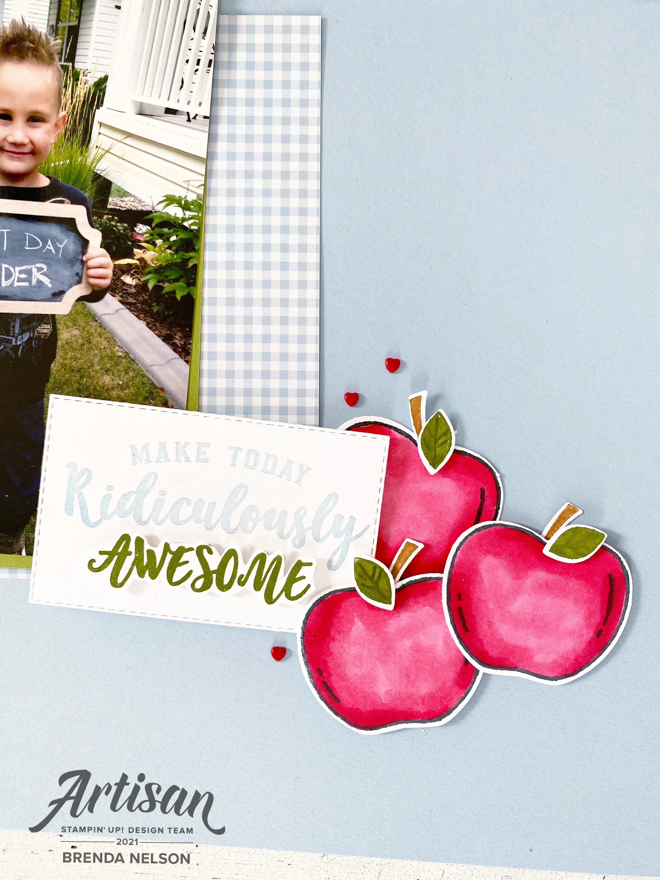
I stamped the phrase in Seaside Spray and then again in Old Olive so I could hand trim out the word ‘Awesome’. I really wanted it to pop and this is an easy way to draw the eye to a certain word out of your sentiment.

Of course I added a few more apples and Resin Hearts!

final+%281%29+3.jpg
 

I created another area of interest on the top left by adding in “You Make me Smile” and another A+, plus a couple different twines and Resin Hearts.

final (8).jpg

I love how this page turned out and am so happy I have this memory recorded of Shepard. This color challenge worked perfectly for me!

I can’t wait to see what everyone else on the Design Team creates this month! You won’t want to miss what anyone has designed. You can go back to see what Tami Hewlett has created or next to see what Melissa Kerman has stamped for us. Make sure to visit everyone, we are a small awesome group!

Please feel free to leave a comment and if you are in Canada and would like to order any of the supplies I used, please use Hostess Code on the side bar!

Color Fusers-March 2021 Blog Hop

Welcome to the Color Fusers March Blog Hop! We have sort of a masculine color combo to work with this month but I put a bit of a girly spin on these colors—Seaside Spray, Grey Granite and Early Espresso!

03_2021 Graphic (1).jpg

I knew that I wanted to use Early Espresso as my base and to create some extra texture to the cards I decided to add some strips of Early Espresso card stock in 3/4 inch widths across the base of the cards. It almost looks like panelling! I have been watching a lot of HGTV lately so maybe that is what influenced me! ha ha ha!

final 13.jpg

I cut a Basic White Stitched Rectangle to use as my focal point on the card. Using my Blending Brush (new favorite tool alert!) I added a bit of Grey Granite to the base and flicked my Grey Granite Stampin’ Write Marker over top. I love the look of a good marker spray over your projects!

final 15.jpg
 

The In Bloom bundle was used to embellish the rest of this card. The dies are AAAMAZING! I haven’t even put them away since I got them! I cut a few flowers in Seaside Spray, the stitched detail in the flowers plays into the stitched rectangular layer which I really like.

I added a few small Early Espresso flowers with some Silver Metallic Pearls.

I stamped and hand trimmed a couple of flowers in Grey Granite ink. You might wonder why I didn’t use a die and that is because the stamped images in this set do not have dies. The dies are all independent stitched shapes that coordinate with the stamped images.

The sentiment is from the In Bloom stamp set and is stamped with Early Espresso ink on Grey Granite card stock. I added a strip of the Seaside Spray Metallic Ribbon (found in the annual catalogue) behind it and popped it up on Dimensionals for a little lift.

final+%281%29+2.jpg

Whenever you use a dark card stock color as a base you need to add a lighter layer on the inside so you can write a message. I added in a Basic White base and of course had to do a little stamping. I stamped some little Grey Granite flowers and ‘You Mean so Much to Me’ in Seaside Spray. I added a few more teeny flowers in Early Espresso and a Silver Metallic Pearl to pull all of the outside elements of the card inside.

I can’t wait to see what the other members of the team have created with this color combo! I love to challenge myself with color combos and I hope this Hop inspires you as well!

The fantastic Melanie Hockin is up next so let’s see what she has designed!

If you are starting here you can always go back as well to see what Bonnie O’Neill has designed! I know you will find inspiration all through this hop!

Create with Connie and Mary--Valentine's with a Twist!

Welcome friends! Thanks for checking in this week to see what we are creating! This week we are making valentines projects with a color twist or untraditional colors. I immediately thought of using the color blue as we have so many fabulous blue shades to choose from! And I felt like blues would lend themselves to making a more masculine feeling valentine.

Design Team.jpg

If you have been following along on my recent crafting journey (please follow me on Instagram—@stampwithbrenda) than you would know I have been having a lot of fun with our new fantastic Blending Brushes. I decided to use three shades of blue to create a background to cut with the Floral Heart Dies and unexpectedly ended up with an idea to create a partner card!

final (1) 15.jpg

My original idea was for the card on the left. I used my Blending Brushes with Seaside Spray, Balmy Blue and Misty Moonlight. Once I cut out the floral heart I was left with this amazing free floating heart that I couldn’t waste—so I used it to create the card on the right.

final 22.jpg

I ended up using a variety of products to create these two cards. I wanted smaller sentiments that wouldn’t take away from the floral or heart dies. The Valentine Keepsake stamp set was a perfect fit as the “Be Mine” and the “With Love” phrases fit perfectly in a 1 inch circle punch. Both sentiments are stamped on Balmy Blue card stock with Misty Moonlight ink.

final 23.jpg

I really wanted this card to showcase the Pearlescent Specialty Paper too. You can see how it looks when added to a white card base and the blended die cut background really pops on this clean canvas. The accent hearts on the bottom of the card are stamped in Seaside Spray and are found in the Always in My Heart stamp set.

final (2) 5.jpg

I made this second card because I had this amazing blended heart cut out and couldn’t waste it. This card base is Misty Moonlight with the same little hearts stamped along the bottom. The designer series paper layer is from the Flowers for Every Season collection. The floral heart die is used to cut out the Seaside Spray card stock and the banner on this card is also cut from the same die set using the Pearlescent Specialty Paper. I really love how both of these cards turned out!

I can’t wait to see what amazing creations Melissa and Connie have designed for this week. You can go BACK to visit Melissa if you are starting here and NEXT to continue on the hop and see what Connie has created.

In a While Crocodile!

Are you loving the new January to June catty as much as I am? I love the variety of stamp sets in this catalogue. We have fun whimsy sets, vintage inspired sets, line image, Reversibles and much much more! I created this super cute and fun card with the new Oh Snap stamp set on page 47. Who doesn’t love a cute crocodile?

final (10).jpg

I wanted to create a soft water background so I used the new Blending Brush with Seaside Spray ink. I added a few little waves in the same ink color near the bottom.

The Croc is stamped in Momento Ink on Whisper White card stock (which has now been replaced with Basic White card stock). I colored this cute croc in with our Stampin’ Blends in Granny Apple Green, Shaded Spruce and Seaside Spray.

final (6).jpg


I wanted it to look like my crocodile was snacking on “Its Your Birthday”, so I used Highland Heather ink on Purple Posy card stock punched into a 1 inch circle which fit perfectly in his mouth.

My croc is popped up on Dimensionals as well to give it some height.


I added a couple little banners to the top left using the In Color 6x6 DSP stack and the woodgrain pattern. I added the Gorgeous Grape little heart on top. This cute little heart can be found in the Kangaroo Dies (pg 17).

I don’t think it matters how old you are, receiving this card is enough to put a smile on anyone’s face!

final (11).jpg


Hot Pink House!

Who would not love to live in a hot pink house? I mean its just beyond cute! I bet if I searched there are people on the east coast of Canada living in a hot pink house as it seems to be an east coast thing! Sadly on the prairies we are pretty boring! When I was a kid I would see images like this and imagine the life I would be living inside, did you ever do that? I can safely say I didn’t see myself designing cards as a living but I am so blessed to be doing so!

This is a card I shared with my Christmas Card group the other night and I couldn’t keep it to myself. It uses the Trimming the Town Suite from the Handmade for You catalogue. This suite is extra special because proceeds of the stamp set or bundle go towards charities devoted to adoption, infertility and foster care. Three things that I have a connection too so this suite has a bit of extra meaning to me.

final.jpg

I am not exactly sure what inspired this unique color combo but it is Magenta Madness, Granny Apple Green and Seaside Spray! And I could not love it more. I stamped the ‘Be Merry’ in Seaside Spray across the background and flicked it with the coordinating Stampin’ Write marker. The sentiment is from the Banner Year stamp set in the catalogue. It is a perfect set to recommend to new stampers because it has imagery and sentiments for fall, halloween, Christmas, and Valentine’s Day so they can get quite a bit of mileage out of it.

I cut the snow bank using the Home Together dies and used Shimmery White card stock so it was one or two tones different than the background. The hot pink house (sounds so fun) and the trees are all coloured with our Stampin’ Blends.

This is a card you can recreate in a million different color combos! I hope you are inspired and if you need any of the supplies, please feel free to order from my online store!